AngularX Dropdown Multiselect for Bootstrap CSS
Works with Angular Final and AOT compilation
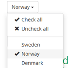
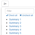
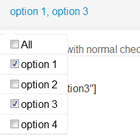
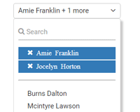
Customizable dropdown multiselect in AngularX, TypeScript with bootstrap css.
See demo: http://softsimon.github.io/angular-2-dropdown-multiselect
Dependencies
- Bootstrap CSS 3 or 4
- Font Awesome (optional)
Quick start options
- Download the latest release.
- Clone the repo:
git clone https://github.com/softsimon/angular-2-dropdown-multiselect.git. - Install with Bower:
bower install angular-2-dropdown-multiselect --save. - Install with npm:
npm install angular-2-dropdown-multiselect --save.
Usage
Import MultiselectDropdown into your @NgModule.
import { MultiselectDropdownModule } from 'angular-2-dropdown-multiselect'; @NgModule({ // ... imports: [ MultiselectDropdownModule, ] // ... })Define options in your consuming component:
import { IMultiSelectOption } from 'angular-2-dropdown-multiselect'; export class MyClass implements OnInit { optionsModel: number[]; myOptions: IMultiSelectOption[]; ngOnInit() { this.myOptions = [ { id: 1, name: 'Option 1' }, { id: 2, name: 'Option 2' }, ]; } onChange() { console.log(this.optionsModel); } }In your template, use the component directive:
<ss-multiselect-dropdown [options]="myOptions" [(ngModel)]="optionsModel" (ngModelChange)="onChange($event)"></ss-multiselect-dropdown>Customize
Import the IMultiSelectOption and IMultiSelectTexts interfaces to enable/override settings and text strings:
// Default selection optionsModel: number[] = [1, 2]; // Settings configuration mySettings: IMultiSelectSettings = { enableSearch: true, checkedStyle: 'fontawesome', buttonClasses: 'btn btn-default btn-block', dynamicTitleMaxItems: 3, displayAllSelectedText: true }; // Text configuration myTexts: IMultiSelectTexts = { checkAll: 'Select all', uncheckAll: 'Unselect all', checked: 'item selected', checkedPlural: 'items selected', searchPlaceholder: 'Find', searchEmptyResult: 'Nothing found...', searchNoRenderText: 'Type in search box to see results...', defaultTitle: 'Select', allSelected: 'All selected', }; // Labels / Parents myOptions: IMultiSelectOption[] = [ { id: 1, name: 'Car brands', isLabel: true }, { id: 2, name: 'Volvo', parentId: 1 }, { id: 3, name: 'Honda', parentId: 1 }, { id: 4, name: 'BMW', parentId: 1 }, { id: 5, name: 'Colors', isLabel: true }, { id: 6, name: 'Blue', parentId: 5 }, { id: 7, name: 'Red', parentId: 5 }, { id: 8, name: 'White', parentId: 5 } ]; <ss-multiselect-dropdown [options]="myOptions" [texts]="myTexts" [settings]="mySettings" [(ngModel)]="optionsModel"></ss-multiselect-dropdown>Settings
| Setting | Description | Default Value |
|---|---|---|
| pullRight | Float the dropdown to the right | false |
| enableSearch | Enable searching the dropdown items | false |
| checkedStyle | Style of checked items one of 'checkboxes', 'glyphicon' or 'fontawesome' | 'checkboxes' |
| buttonClasses | CSS classes to apply to the trigger button | 'btn btn-default' |
| itemClasses | CSS classes to apply to items | '' |
| containerClasses | CSS classes to apply to container div | 'dropdown-inline' |
| selectionLimit | Maximum number of items that may be selected (0 = no limit) | 0 |
| minSelectionLimit | Minimum number of items that may be selected | 0 |
| autoUnselect | Unselect the previous selection(s) once selectionLimit is reached | false |
| closeOnSelect | If enabled, dropdown will be closed after selection | false |
| showCheckAll | Display the checkAll item to select all options | false |
| showUncheckAll | Display the uncheckAll item to unselect all options | false |
| fixedTitle | Use the default title (do not apply the dynamic title) | false |
| dynamicTitleMaxItems | The maximum number of options to display in the dynamic title | 3 |
| maxHeight | The maximum height for the dropdown (including unit) | '300px' |
| displayAllSelectedText | Display the allSelected text when all options are selected | false |
| searchRenderLimit | If enableSearch=true and total amount of items more then searchRenderLimit (0 - No limit) then render items only when user typed more then or equal searchRenderAfter charachters | 0 |
| searchRenderAfter | Amount of characters to trigger rendering of items | 1 |
| searchMaxLimit | If more than zero will render only first N options in search results | 0 |
| searchMaxRenderedItems | Used with searchMaxLimit to further limit rendering for optimization. Should be less than searchMaxLimit to take effect | 0 |
| displayAllSelectedText | Display the allSelected text when all options are selected | false |
| closeOnClickOutside | Close dropdown when clicked outside | true |
| isLazyLoad | An event, onLazyLoad, triggers on scrolling to a specified distance from the bottom of the dropdown, allowing additional data to load | false |
| loadViewDistance | Distance from bottom of dropdown to trigger lazy load, in units of dropdown viewport height | 1 |
| stopScrollPropagation | Scrolling the dropdown will not overflow to document | false |
| selectAddedValues | Additional lazy loaded Select All values are checked when added on scrolling | false |
| ignoreLabels | Ignore label options when counting selected options | false |
| maintainSelectionOrderInTitle | The title will show selections in the order they were selected | false |
| focusBack | Set the focus back to the input control when the dropdown closed | true |
Texts
| Text Item | Description | Default Value |
|---|---|---|
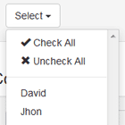
| checkAll | The text for the "check all" option | 'Check all' |
| uncheckAll | The text for the "uncheck all" option | 'Uncheck all' |
| checked | Text for "checked" with single item selected (used in dynamic title) | 'checked' |
| checkedPlural | Text for "checked" with multiple items selected (used in dynamic title) | 'checked' |
| searchPlaceholder | Text initially displayed in search input | 'Search...' |
| defaultTitle | Title displayed in button before selection | 'Select' |
| allSelected | Text displayed when all items are selected (must be enabled in options) | 'All selected' |
| searchEmptyResult | Text displayed when no items are rendered | 'Nothing found...' |
| searchNoRenderText | Text displayed when items rendering disabled by the searchRenderLimit option | 'Type in search box to see results...' |
Other examples
Single select
Although this dropdown is designed for multiple selections, a common request is to only allow a single selection without requiring the user to unselect their previous selection each time. This can be accomplished by setting selectionLimit to 1 and autoUnselect to true.
{ ... selectionLimit: 1, autoUnselect: true, ... } Lazy Loading
This Stackblitz link demonstrates an implementation of lazy loading: Lazy loading Stackblitz
If using search during lazy load, the search term must be supplied to the back end to return the appropriate number of results. Standard inline search will not work, since the front end does not know how many items to load to retrieve the desired number of matches.
If selectAddedValues is set to true for lazy loading, all values loaded to the checklist are checked when matching Select All criteria. If a search is used with Select All, each search is added to a collection to be matched against when scrolling in. If selectAddedValues is false, only presently viewed matches will check on Select All.
If a user searches countries on al and clicks Select All, all matches will be selected as they load in on scrolling. If the user clears the search box, only matches to al will select upon scrolling in all country values.
If the user then searches an and clicks Select All, all matches to an and al will select upon scrolling in. If the user then clicks Unselect All while an is the search criteria, all matches to an will clear, except those that match al, which is still stored.
Clicking Select All or Unselect All with no search criteria present will clear all previously stored searches. Any search match that is manually unchecked will remain unchecked unless matched by a new search Select All.
The implementor will be responsible for completing checks when the form is submitted. This could possibly either consist of completing the load of all lazy load checklists before submitting or sending checked items and search criteria to a back-end api to complete.
Use model driven forms with ReactiveFormsModule:
import { IMultiSelectOption } from 'angular-2-dropdown-multiselect'; export class MyClass implements OnInit { model: number[]; myOptions: IMultiSelectOption[] = [ { id: 1, name: 'Option 1' }, { id: 2, name: 'Option 2' }, ]; ngOnInit() { this.myForm = this.formBuilder.group({ optionsModel: [1, 2], // Default model }); this.myForm.controls['optionsModel'].valueChanges .subscribe((selectedOptions) => { // changes }); } }<form [formGroup]="myForm"> <ss-multiselect-dropdown [options]="myOptions" formControlName="optionsModel"></ss-multiselect-dropdown> </form>Developing
Pull requests are welcome!
License
[MIT]
