Ngx-tree-select
Features:
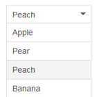
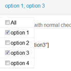
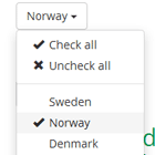
- Dropdown with 'flat' items (Like normal select)
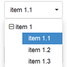
- Dropdown with hierarchical items
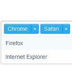
- Simple or multiple selected items
- With hierarchical datas you can force child selection or allow select parent
- ngModel & standard validation compliant
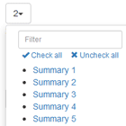
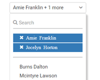
- Can limit displayed selected items (... link allow your user to see entire selection)
Installation
This is how to install the components:
npm install ngx-tree-selector
yarn add ngx-tree-selectAnd on your application module:
import {NgxTreeSelectModule} from 'ngx-tree-select'; @NgModule({ declarations: [ ...], imports: [ BrowserModule, ...., NgxTreeSelectModule.forRoot({ allowFilter: true, filterPlaceholder: 'Type your filter here...', maxVisibleItemCount: 5, idField: 'id', textField: 'name', childrenField: 'children', allowParentSelection: true }) ], }) export class AppModule { }See below for SystemJs / UMD installation.
Default options
When you call NgxTreeSelectModule.forRoot you must pass default options. This options can be empty object "{}" or you can add one or more settings :
- allowFilter : display filter input on dropdown
- filterPlaceholder : determine placeholder text for filter
- maxVisibleItemCount : determine maximum number of items are displayed on multiple select
- idField : determine which property of your items is used as unique identifier
- textField : determine which property of your items is displayed
- childrenField : determine which property of yours items contains children items
- allowParentSelection : if set to true, you can select parent, else when you select parent all children are selected
- expandMode : Define which item are expand at initilization. Possible value are : None, Selection or All
Using the Tree Select
We will need to add first a version of Font Awesome to our page, for example:
<link href="https://maxcdn.bootstrapcdn.com/font-awesome/4.7.0/css/font-awesome.min.css" rel="stylesheet">Then we can use the Tree Select like this:
<form novalidate> <tree-select name="simpleSelect" [items]="items" childrenField="children" [(ngModel)]="simpleSelected" required=true #simpleSelect="ngModel" [filterPlaceholder]="FilterPlaceholder" [allowFilter]="ShowFilter" [disabled]="Disabled" [allowParentSelection]="AllowParentSelection" expandMode="all"></tree-select> <div *ngIf="simpleSelect.errors && (simpleSelect.dirty || simpleSelect.touched)" class="alert alert-danger"> <div [hidden]="!simpleSelect.errors.required">Simple select is required</div> </div> </form> <form novalidate> <tree-select name="multipleSelect" [items]="items" childrenField="children" [multiple]="true" [(ngModel)]="multipleSelected" filterPlaceholder="Type item filter..." required=true minlength="2" maxlength="4" [allowParentSelection]="AllowParentSelection" #multipleSelect="ngModel" [filterPlaceholder]="FilterPlaceholder" [maxVisibleItemCount]="MaxDisplayed" [allowFilter]="ShowFilter" [disabled]="Disabled"> </tree-select> <div *ngIf="multipleSelect.errors && (multipleSelect.dirty || multipleSelect.touched)" class="alert alert-danger"> <div [hidden]="!multipleSelect.errors.required">Multiple select is required</div> <div [hidden]="!multipleSelect.errors.minlength">You must choose at least 2 items on Multiple select</div> <div [hidden]="!multipleSelect.errors.maxlength">You must choose maximum 4 items on Multiple select</div> </div>Component attributes
When you place tree-select on HTML template you can define :
- items : list of items
- multiple : allow multiple selection
- disabled : disable component
- allowFilter : display filter input on dropdown
- filterPlaceholder : determine placeholder text for filter
- maxVisibleItemCount : determine maximum number of items are displayed on multiple select
- idField : determine which property of your items is used as unique identifier
- textField : determine which property of your items is displayed
- childrenField : determine which property of yours items contains children items
- allowParentSelection : if set to true, you can select parent, else when you select parent all children are selected
- expandMode : Define which item are expand at initilization. Possible value are : None, Selection or All
tree-select component use default options define when you call NgxTreeSelectModule.forRoot except if you override it with attribute on HTML template.
Running the Demo Application
This command will build and start the demo application:
npm startRunning This Module In Development
First let's build the library using this command:
npm run lib:buildThen let's link it:
cd dist_package\ngx-tree-select npm linkOn another folder on the same machine where we have for example a running Angular CLI, we then do:
npm link ngx-tree-selectRunning the Tests
The tests can be executed with the following commands:
npm run test npm run e2eUsing SystemJs via the UMD bundle ?
Make sure to add this to your map configuration, if you need the module served from a CDN:
map: { ... 'ngx-tree-select': 'https://unpkg.com/ngx-tree-select@<version number>/ngx-tree-select.rollup.umd.min.js' }Otherwise if serving from node_modulesdirectly:
map: { ... 'ngx-tree-select': 'node_modules/ngx-tree-select/bundles/ngx-tree-select.umd.min.js' }And in our packages property:
packages: { ... 'ngx-tree-select': { main: 'index.js', defaultExtension: 'js' } }