vue-svgicon

A tool to create svg icon components. (vue 2.x) 中文
Try next version: 4.x
Inspiration
https://github.com/Justineo/vue-awesome
demo
https://mmf-fe.github.io/vue-svgicon/v3/
Some issues
Usage
Generate icon
Install
# install global npm install vue-svgicon -g # install for project npm install vue-svgicon --save-devCommand
# generate svg icon components vsvg -s /path/to/svg/source -t /path/for/generated/componentsUse as npm scripts
{ "scripts": { "svg": "vsvg -s ./static/svg/src -t ./src/icons" } }# bash npm run svgIt will generate icons to the specified path.
Use programming api
import build from 'vue-svgicon/dist/lib/build' build({ sourcePath: ''; targetPath: ''; ext?: 'js'; es6?: false; tpl?: ''; idSP?: '_'; svgo?: 'Configuration file path' || {/* svgo config object */} })Custom icon content format
# specify template path vsvg -s /path/to/svg/source -t /path/for/generated/components --tpl /path/for/icon-templateDefault template is:
var icon = require('vue-svgicon') icon.register({ '${name}': { width: ${width}, height: ${height}, viewBox: ${viewBox}, data: `${data}` } })Custom icon file extension
vsvg -s /path/to/svg/source -t /path/for/generated/components --ext tsSuport ES6 modules
vsvg -s /path/to/svg/source -t /path/for/generated/components --ext ts --es6Custom svgo
vsvg -s /path/to/svg/source -t /path/for/generated/components --svgo svgo.jsUse generated icon
First of all, your should write some css code for vue-svgicon in global scope. Recommended code is below:
/* recommended css code for vue-svgicon */ .svg-icon { display: inline-block; width: 16px; height: 16px; color: inherit; vertical-align: middle; fill: none; stroke: currentColor; } .svg-fill { fill: currentColor; stroke: none; } .svg-up { /* default */ transform: rotate(0deg); } .svg-right { transform: rotate(90deg); } .svg-down { transform: rotate(180deg); } .svg-left { transform: rotate(-90deg); }you can use
classPrefixoption to set the default class name. The default prefix issvg
Use plugin
// main.js import Vue from 'vue' import App from './App.vue' import SvgIcon from 'vue-svgicon' // Default tag name is 'svgicon' Vue.use(SvgIcon, { tagName: 'svgicon' }) new Vue({ el: '#app', render: h => h(App) })Use icon in component
<!-- App.vue --> <template> <div id="app"> <p> <svgicon name="vue" width="200" height="200" color="#42b983 #35495e" ></svgicon> </p> </div> </template> <script> import 'icons/vue' export default { name: 'app', data() { return { msg: 'Welcome to Your Vue.js App' } } } </script>You can import all icons at once
import 'icons'Options
tagName
Custom component tag name. Default is svgicon
Vue.use(svgicon, { tagName: 'svgicon' })<svgicon name="vue"></svgicon>classPrefix
your can use classPrefix option to set the default class name. The default prefix is svg
Vue.use(svgicon, { classPrefix: 'vue-svg' })It will be generated like this:
<svg version="1.1" viewBox="0 0 4 7" class="vue-svg-icon vue-svg-fill vue-svg-up" > <!-- svg code --> </svg>defaultWidth / defaultHeight
Set default size if size props not set.
Vue.use(svgicon, { defaultWidth: '1em', defaultHeight: '1em' })isStroke
Use stroke style by default
Vue.use(svgicon, { isStroke: true })isOriginalDefault
Use original color by default.
Vue.use(svgicon, { isOriginalDefault: false })Props
icon / name
icon name.
<svgicon icon="vue"></svgicon> <svgicon name="vue"></svgicon>dir
The direction of icon.
<svgicon name="arrow" width="50" height="50" dir="left"></svgicon> <svgicon name="arrow" width="50" height="50" dir="up"></svgicon> <svgicon name="arrow" width="50" height="50" dir="right"></svgicon> <svgicon name="arrow" width="50" height="50" dir="down"></svgicon>fill
Whether to fill the path/shape. Default value is true
<svgicon name="arrow" width="50" height="50"></svgicon> <svgicon name="arrow" width="50" height="50" :fill="false"></svgicon>You can use r-color to reverse the fill property
<!-- the first one is fill(default), the second use stroke --> <svgicon name="clock" color="#8A99B2 r-#1C2330" width="100" height="100" ></svgicon> <!-- the first one is stoke, the second is fill --> <svgicon name="clock" color="#8A99B2 r-#1C2330" width="100" height="100" :fill="false" ></svgicon>width / height
Specify the size of icon. Default value is 16px / 16px. Default unit is px
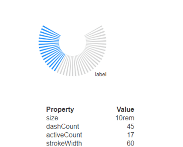
<svgicon name="arrow" width="50" height="50"></svgicon> <svgicon name="arrow" width="10em" height="10em"></svgicon>scale
Scale icon size, it will overwrite width/height prop
<svgicon name="arrow" scale="10"></svgicon> <svgicon name="arrow" scale="10" width="10em" height="10em"></svgicon>color
Specify the color of icon. Default value is inherit.
<p style="color: darkorange"> <svgicon name="arrow" width="50" height="50"></svgicon> <svgicon name="arrow" width="50" height="50" color="red"></svgicon> <svgicon name="arrow" width="50" height="50" color="green"></svgicon> <svgicon name="arrow" width="50" height="50" color="blue"></svgicon> </p>If the icon is mutil path/shape, you can use mutil color. It is defined in the order of path/shape.
<svgicon name="vue" width="100" height="100" color="#42b983 #35495e"></svgicon>Also, you can use CSS to add colors.
<svgicon class="vue-icon" name="vue" width="100" height="100"></svgicon>.vue-icon path[pid='0'] { fill: #42b983; } .vue-icon path[pid='1'] { fill: #35495e; }Use gradient
<template> <svg> <defs> <linearGradient id="gradient-1" x1="0" y1="0" x2="0" y2="1"> <stop offset="5%" stop-color="#57f0c2" /> <stop offset="95%" stop-color="#147d58" /> </linearGradient> <linearGradient id="gradient-2" x1="0" y1="0" x2="0" y2="1"> <stop offset="5%" stop-color="#7295c2" /> <stop offset="95%" stop-color="#252e3d" /> </linearGradient> </defs> </svg> <svgicon name="vue" width="15rem" height="15rem" color="url(#gradient-1) url(#gradient-2)" ></svgicon> </template>original
use original color
<icon name="colorwheel" width="100" height="100" :original="true"></icon> <!-- overwrite original color --> <icon name="colorwheel" width="100" height="100" :original="true" color="_ black _ black _" ></icon>title
SVG title
<icon name="vue" title="vue icon"></icon>It will be generated like this:
<svg version="1.1" viewBox="0 0 256 221" class="vue-svg-icon vue-svg-fill"> <title>vue icon</title> <!-- svg code --> </svg>Multiple directory (Namespace)
You can use multiple directory to discriminate the icons which has the same name.
├── arrow.svg ├── sora │ ├── arrow.svg │ └── fit │ └── arrow.svg <svgicon name="arrow" width="50" height="50"></svgicon> <svgicon name="sora/arrow" width="50" height="50"></svgicon> <svgicon name="sora/fit/arrow" width="50" height="50"></svgicon>Work on IE and old browser
This component doesn't work on IE because IE don't support innerHTML in SVGElement. You can use innersvg-polyfill to make it work. You can also use the polyfill provided by this component.
// in main.js first line import 'vue-svgicon/dist/polyfill'This polyfill is a wrapper of innersvg-polyfill.