vue-popover


Reusable popover component for Vue. This is purely functional, it's a completely "naked" and blank canvas component. There are no styles for this component except a z-index, which you can override.
Demo
https://jfusco.github.io/vue-popover
Getting Started
Installation
From the root of your project.
npm install vue-popover --saveUsage
Simple implementation of popover. See options available below.
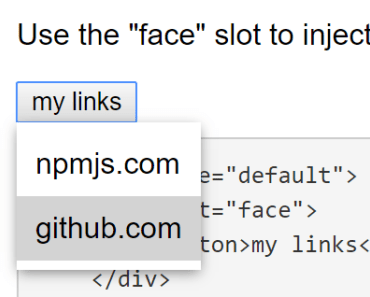
<template> <div> <popover name="example"> <div slot="content"> <ul> <li><a href="#">npmjs.com</a></li> <li><a href="#">github.com</a></li> </ul> </div> </popover> </div> </template> <script type="text/babel"> import popover from 'popover' export default { components: { popover } } </script>Options
name ~ required
The string to be used for a unique ID for the component instance, also used to set aria attributes
<template> <div> <popover name="example"></popover> </div> </template>popover:open ~ optional
An function triggered any time the instance of the popover is opened
<template> <div> <popover name="example" v-on:popover:open="onPopoverOpen"></popover> </div> </template> <script type="text/babel"> import popover from 'popover' export default { components: { popover }, methods: { onPopoverOpen(){ console.log('popover open') } } } </script>popover:close ~ optional
An function triggered any time the instance of the popover is closed
<template> <div> <popover name="example" v-on:popover:close="onPopoverClose"></popover> </div> </template> <script type="text/babel"> import popover from 'popover' export default { components: { popover }, methods: { onPopoverClose(){ console.log('popover close') } } } </script>available slots
face- Set custom face for the popovercontent- Set custom content for the popover
<template> <div> <popover name="example"> <div slot="face"> <button>popover face</button> </div> <div slot="content"> <p>Some custom content for popover</p> </div> </popover> </div> </template>closeOnContentClick ~ optional
Set to false if you don't want the popover to close if you click its contents. Useful if the popover contains elements you interact with (e.g. buttons and textboxes). This defaults to true when not set.
<template> <div> <popover name="example" :closeOnContentClick="false"> <div slot="face"> <button>popover face</button> </div> <div slot="content"> <button>Some button</button> <input type="text"> </div> </popover> </div> </template>slim ~ optional
Defaults to false, if enabled, it means the "face" slot is required and the rendered component will be wrapper-less, there will be no further elements around the "face" slot. To do this the onPopoverToggle method is passed to the slot (with slim the slot becomes scoped).
Important: the content slot will render inside the root element of the face slot. As the content slot still has a wrapper and will appear absolutely positioned, the face slot will probably need to be positioned, relative will work well for most use cases.
<template> <div> <popover name="example" slim> <a slot="face" slot-scope="{ onPopoverToggle }" href="#" @click.prevent="onPopoverToggle"> slim popover</a> <div slot="content"> <p>Some custom content for popover</p> </div> </popover> </div> </template>Styling
Installation
Import the main SCSS file in to your application SCSS files ```scss @import "node_modules/vue-popover/src/component/scss/styles.scss";
There are a few variables set to `!default` that can be overriden. If you need to change it more just override the actual styles. **Any overriden variables needs to go above the `@import` statement to take effect** ```scss //-- Global UI $popover-z-index If you don't care to override variables and just want to override actual styles you may choose to import the minified compiled version of the css instead
@import "node_modules/vue-popover/dist/styles.css";Tests
npm test 