Vue-drag-resize


Vue Component for draggable and resizable elements.
Table of Contents
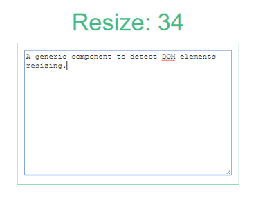
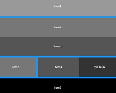
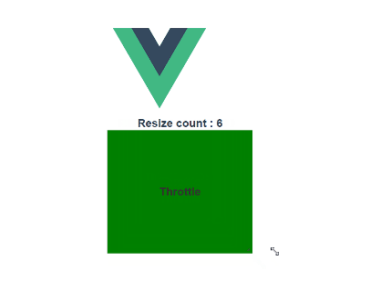
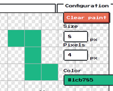
Demo
Features
- A lightweight, no-dependency
- All props are reactive
- Support touch events
- Use draggable, resizable or both
- Define sticks for resizing
- Save aspect ratio for resizable components
- Restrict size and movement to parent element
- Restrict drag to vertical or horizontal axis
Install and basic usage
$ npm i -s vue-drag-resizeRegister the component:
import Vue from 'vue' import VueDragResize from 'vue-drag-resize' Vue.component('vue-drag-resize', VueDragResize)Use the component:
<template> <div id="app"> <VueDragResize :isActive="true" :w="200" :h="200" v-on:resizing="resize" v-on:dragging="resize"> <h3>Hello World!</h3> <p>{{ top }} х {{ left }} </p> <p>{{ width }} х {{ height }}</p> </VueDragResize> </div> </template> <script> import VueDragResize from 'vue-drag-resize'; export default { name: 'app', components: { VueDragResize }, data() { return { width: 0, height: 0, top: 0, left: 0 } }, methods: { resize(newRect) { this.width = newRect.width; this.height = newRect.height; this.top = newRect.top; this.left = newRect.left; } } } </script>Props
isActive
Type: Boolean
Required: false
Default: false
Determines whether the component should be active.
<vue-drag-resize :isActive="true">preventActiveBehavior
Type: Boolean
Required: false
Default: false
Disable behavior of the component by clicking on it and clicking outside the component's area (isActive: true / false). If the prop is enabled, the component is oriented only to the specified.
<vue-drag-resize :preventActiveBehavior="true">parentW
Type: Number
Required: false
Default: 0
Define the initial width of the parent element. If not specified it calculated automatically. With this parameter, you can set the bounding area for the component, and also it is used when resizing in real time.
<vue-drag-resize :parentW="2000">parentH
Type: Number
Required: false
Default: 0
Define the initial height of the parent element. If not specified it calculated automatically. With this parameter, you can set the bounding area for the component, and also it is used when resizing in real time.
<vue-drag-resize :parentH="2000">parentScaleX
Type: Number
Required: false
Default: 1
Define the initial horizontal scale or the parent element. Same value in parent's transform: scale() css definition. The drag/resize and the sticks' sizes will computed with this value.
<vue-drag-resize :parentScaleX="0.5">parentScaleY
Type: Number
Required: false
Default: 1
Define the initial vertical scale or the parent element. Same value in parent's transform: scale() css definition. The drag/resize and the sticks' sizes will computed with this value.
<vue-drag-resize :parentScaleY="0.5">isDraggable
Type: Boolean
Required: false
Default: true
Determines whether the component should draggable.
<vue-drag-resize :isDraggable="false">isResizable
Type: Boolean
Required: false
Default: true
Determines whether the component should resize.
<vue-drag-resize :isResizable="false">parentLimitation
Type: Boolean
Required: false
Default: false
Limits the scope of the component's change to its parent size.
<vue-drag-resize :parentLimitation="true">snapToGrid
Type: Boolean
Required: false
Default: false
Determines whether the component should move and resize in predefined steps.
<vue-drag-resize :snapToGrid="true">gridX
Type: Number
Required: false
Default: 50
Define the grid step size for the horizontal axis. Both sides of the component (left and right) will snap to this step.
<vue-drag-resize :snapToGrid="true" :gridX="20">gridY
Type: Number
Required: false
Default: 50
Define the grid step size for the vertical axis. Both sides of the component (top and bottom) will snap to this step.
<vue-drag-resize :snapToGrid="true" :gridY="20">aspectRatio
Type: Boolean
Required: false
Default: false
Determines whether the component should retain its proportions.
<vue-drag-resize :aspectRatio="false">w
Type: Number
Required: false
Default: 200
Define the initial width of the component.
<vue-drag-resize :w="200">h
Type: Number
Required: false
Default: 200
Define the initial height of the component.
<vue-drag-resize :h="200">minw
Type: Number
Required: false
Default: 50
Define the minimal width of the component.
<vue-drag-resize :minw="50">minh
Type: Number
Required: false
Default: 50
Define the minimal height of the component.
<vue-drag-resize :minh="50">x
Type: Number
Required: false
Default: 0
Define the initial x position of the component.
<vue-drag-resize :x="0">y
Type: Number
Required: false
Default: 0
Define the initial y position of the component.
<vue-drag-resize :y="0">z
Type: Number|String
Required: false
Default: auto
Define the zIndex of the component.
<vue-drag-resize :z="999">sticks
Type: Array
Required: false
Default: ['tl', 'tm', 'tr', 'mr', 'br', 'bm', 'bl', 'ml']
Define the array of handles to restrict the element resizing:
tl- Top lefttm- Top middletr- Top rightmr- Middle rightbr- Bottom rightbm- Bottom middlebl- Bottom leftml- Middle left
<vue-drag-resize :sticks="['tm','bm','ml','mr']">axis
Type: String
Required: false
Default: both
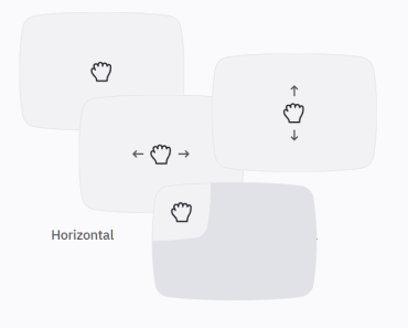
Define the axis on which the element is draggable. Available values are x, y, both or none.
<vue-drag-resize axis="x">dragHandle
Type: String
Required: false
Defines the selector that should be used to drag the component.
<vue-drag-resize dragHandle=".drag">dragCancel
Type: String
Required: false
Defines a selector that should be used to prevent drag initialization.
<vue-drag-resize dragCancel=".drag">Events
clicked
Required: false
Parameters: Original event handler
Called whenever the component gets clicked.
<vue-drag-resize @clicked="onActivated">activated
Required: false
Parameters: -
Called whenever the component gets clicked, in order to show handles.
<vue-drag-resize @activated="onActivated">deactivated
Required: false
Parameters: -
Called whenever the user clicks anywhere outside the component, in order to deactivate it.
<vue-drag-resize @deactivated="onDeactivated">resizing
Required: false
Parameters: object
{ left: Number, //the X position of the component top: Number, //the Y position of the component width: Number, //the width of the component height: Number //the height of the component }Called whenever the component gets resized.
<vue-drag-resize @resizing="onResizing">resizestop
Required: false
Parameters: object
{ left: Number, //the X position of the component top: Number, //the Y position of the component width: Number, //the width of the component height: Number //the height of the component }Called whenever the component stops getting resized.
<vue-drag-resize @resizestop="onResizstop">dragging
Required: false
Parameters: object
{ left: Number, //the X position of the component top: Number, //the Y position of the component width: Number, //the width of the component height: Number //the height of the component }Called whenever the component gets dragged.
<vue-drag-resize @dragging="onDragging">dragstop
Required: false
Parameters: object
{ left: Number, //the X position of the component top: Number, //the Y position of the component width: Number, //the width of the component height: Number //the height of the component }Called whenever the component stops getting dragged.
<vue-drag-resize @dragstop="onDragstop">Contributing
Any contribution to the code or any part of the documentation and any idea and/or suggestion are very welcome.
# serve with hot reload at localhost:8081 npm run start # distribution build npm run build 

