vue-virtual-collection


Vue component for efficiently rendering large collection data. Inspired by react-virtualize.
Usage
Install
npm i vue-virtual-collection Import
import Vue from 'vue' import VirtualCollection from 'vue-virtual-collection' Vue.use(VirtualCollection)Use it!
vue-virtual-collection offers two ways of using a VirtualCollection.
Default Usage
The standard way of using a VirtualCollection is to to pass the entire collection of items to it as a single group. This is suitable for most cases, especially if all the items in the collection are either very similar or very different from one another.
In the sample below, the collection is instantiated as an Array and passed directly to the VirtualCollection in that form.
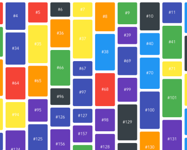
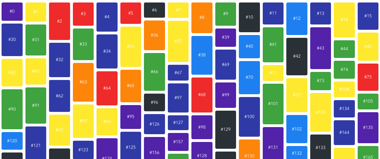
<template> <div> <VirtualCollection :cellSizeAndPositionGetter="cellSizeAndPositionGetter" :collection="items" :height="500" :width="330" > <div slot="cell" slot-scope="props">{{props.data}}</div> </VirtualCollection> </div> </template> <script> export default { data () { return { /** * This will create 1000 items like: * [ * { data: '#0' }, * { data: '#1' }, * ... * { data: '#999' } * ] */ items: new Array(1000).fill(0).map((_, index) => ({ data: '#' + index })) } }, methods: { cellSizeAndPositionGetter(item, index) { // compute size and position return { width: 100, height: 150, x: (index % 2) * 110, y: parseInt(index / 2) * 160 } } } } </script>Item Grouping
Item grouping is an optional feature that can be used to potentially improve performance, and is ideally suited to cases where the collection of items to render are logically divisable into a small number of different categories that may be updated, added or removed at different rates.
Instead of passing the entire collection as an array to the VirtualCollection, the collection is passed as an array of "groups" - objects that each contain a subset of the entire collection's items that should logically be handled the same way.
An example of where this might be appropriate is using VirtualCollection to represent a chess game. In this scenario, there might be separate items within the collection to represent the chessboard tiles and the chess pieces. Chessboard tiles and chess pieces are logically distinct categories of items, and each category would update at different rates; the collection of chessboard tiles would never change after being initially rendered, whereas the collection of pieces would change after every move.
Without grouping, changing the position of a piece (or adding/removing one) would cause everything in the collection to be re-processed and potentially re-rendered, including the chessboard tiles. However, if we pass the pieces and the tiles as separate groups, then VirtualCollection will only reprocess the collection of chess pieces after each turn, and skip reprocessing the chessboard tiles.
<template> <div> <VirtualCollection :cellSizeAndPositionGetter="cellSizeAndPositionGetter" :collection="collectionGroups" :height="500" :width="500" > <div class="grid-cell" slot="cell" slot-scope="{data}"> <ChessTile v-if="data.isTile" /> <ChessPiece v-else /> </div> </VirtualCollection> </div> </template> <script> export default { data () { return { chessTiles: [ { data: { isTile: true } }, /* ... */ ], chessPieces: [ { data: { isPiece: true } }, /* ... */ ], collectionGroups: [ { group: [] }, { group: [] } ] } }, methods: { cellSizeAndPositionGetter(item, itemIndex, groupIndex) { switch (groupIndex) { case 0: // Compute size and position for chessboard tile return { width: 0, height: 0, x: 0, y: 0 } case 1: // Compute size and position for chess piece return { width: 0, height: 0, x: 0, y: 0 } default: throw new Error("Not a tile or piece") } } }, watch: { chessTiles: function (chessTiles) { this.collectionGroups[0].group = chessTiles; }, chessPieces: function (chessPieces) { this.collectionGroups[1].group = chessPieces } } } </script>Props
cellSizeAndPositionGetter
Type: Function
(item: object, index: number) -> ({ height: number, width: number, x: number, y: number })
Required: ✓
Callback responsible for returning size and offset/position information for a given cell
function cellSizeAndPositionGetter(item, index) { return { width: item.width, height: item.height, x: item.x, y: item.y } }Alternate usage
If using the item grouping feature, the second parameter is the index of the item within the group it belongs to and a third parameter represents the index of the group within the collection of groups passed to VirtualCollection.
(item: object, itemIndex: number, groupIndex: number) -> ({ height: number, width: number, x: number, y: number })
function cellSizeAndPositionGetter(item, itemIndex, groupIndex) { return { width: item.width, height: item.height, x: item.x, y: item.y } }collection
Type: Array
Required: ✓
The data for cells to render. Each object in array must contain a data property, which will be passed into slot scope.
const collection = [ { data: { text: "#1" } }, { data: { text: "#2" } }, { data: { text: "#3" } }, // ... ]Alternate usage
If using the item grouping feature, each element of the collection should be an object with a group property representing a group of logically-related items. Each item of each group must contain a data property, which will be passed into slot scope.
const collection = [ { group: [ { data: { text: "#1" } }, { data: { text: "#2" } }, { data: { text: "#3" } }, // ... ] }, { group: [ { data: { text: "#A" } }, { data: { text: "#B" } }, { data: { text: "#C" } }, // ... ] }, // ... ]width
Type: number
Required: ✓
The width of collection
height
Type: number
Required: ✓
The height of collection
sectionSize
Type: number
Optionally override the size of the sections a Collection's cells are split into. This is an advanced option and should only be used for performance tuning purposes.
Slots
cell
<div slot="cell" slot-scope="yourOwnScope">{{yourOwnScope.data.text}}</div>The data property in items of collection will be passed into the slot scope.
const collection = [ { data: { text: "#1" } }, { data: { text: "#2" } }, { data: { text: "#3" } }, // ... ]