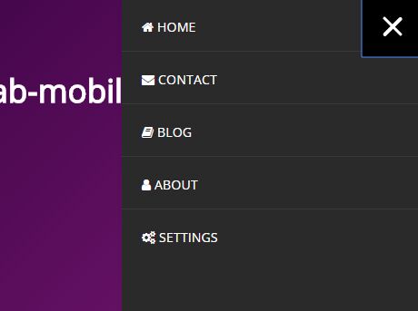
offcanvas-mobile-menu
HTML, jQuery and CSS mobile Offcanvas menu
What you need:
- jQuery (min 1.12.4)
Let´s go:
1.) Download CSS + JS
2.) Bind the CSS:
<head> [...] <link rel="stylesheet" href="css/offcanvas-mobile-menu.css" /> </head>3.) HTML structure:
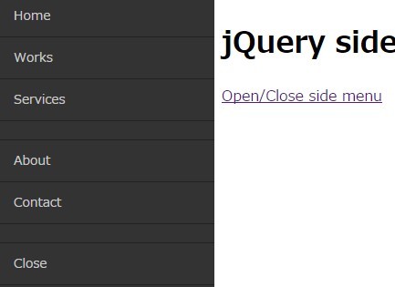
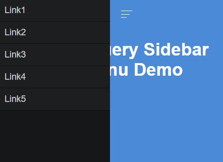
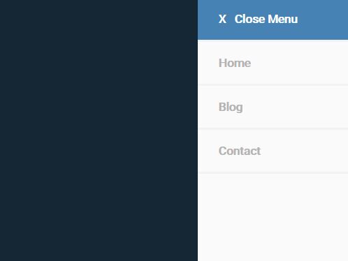
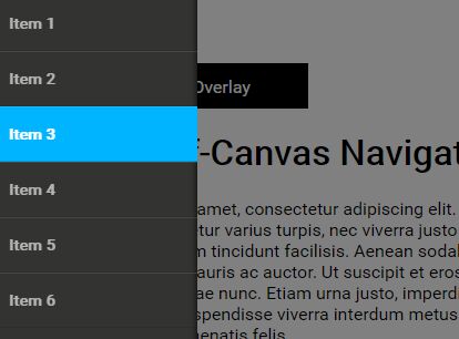
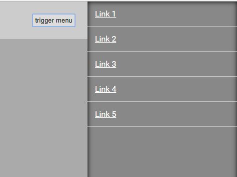
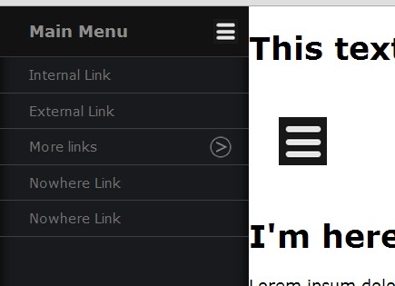
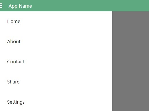
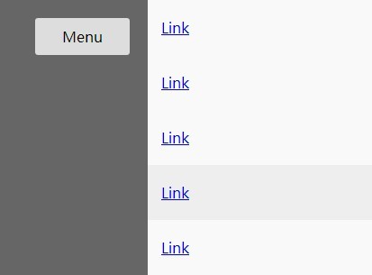
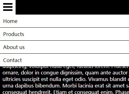
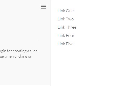
<body> <header> <button id="trigger">trigger menu</button> </header> <section id="main"></section> <section id="offcanvas"> <nav> <ul> <li><a href="#">Link 1</a></li> <li><a href="#">Link 2</a></li> <li><a href="#">Link 3</a></li> <li><a href="#">Link 4</a></li> <li><a href="#">Link 5</a></li> </ul> </nav> </section> <script src="https://code.jquery.com/jquery-1.12.4.min.js"></script> <script src="jquery.mobile-offcanvas-menu.js"></script> <script> $("#offcanvas").offcanvasmenu(); </script> </body>4.) Options:
$("#offcanvas").offcanvasmenu({ menuTrigger: "some-other-id" // With this id you trigger the action (default: trigger) position: "right", // which side the menu is coming out speed: "0.3", // animation speed (example: 0.5 = 500ms; do not write 500 etc) width: "220px" // width of the menu fixedContainer: false, fixedContainerName: "" });Further ideas are in progress:
- Close menu not only by clicking the trigger id


