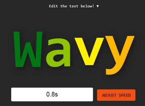
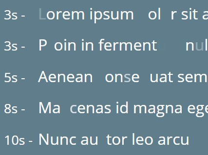
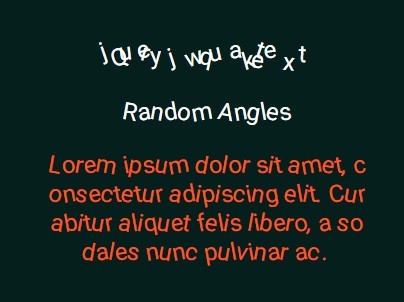
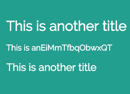
 Modern, Customizable, Clean, Fluid and Responsive. Responsive effects by default and fully compatible with Desktop, Notebook, Tablet, Smarphone, Firefox, Chrome, Opera, Safari and Internet Explorer.Image Autofit is an awesome feature that allows you to responsive your images automatically by cutting its edges and resizing its sizes, to preserve a high definition on every device and create an awesome slider for desktop and mobile.Features:Super-Fluid CSS3 Effects & Transitions on Desktop & MobileYou can select your IN/OUT/BACK Times for each elementHTML & CSS Content supported, you can add texts, images, videos, canvas, pricing tables, and all you want.Fully Support of Video Embedding as Fullscreen or BoxedYoutube & Vimeo API that stops the video if you change the slideImage Autofit that allows you to select the subject position on the imagesCinematic Effect that allows you to make an animation-movement of the imagesBlur Effect that allows you to make an automatic blur image from a normal oneFully Cross-Browser CompatibilityBootstrap 3 Integrated so you can use all the Bootstrap Elements inside the slideEasy to integrate with other FrameworksFont Awesome 4 IntegratedFully ResponsivePlay & Stop with the slide loaderAutoplay, you can active it to start your slide when the page is openedKeyboard Navigation
You May Also Like


jQuery Plugins
- 3D Slider
- AutoComplete
- Barcode
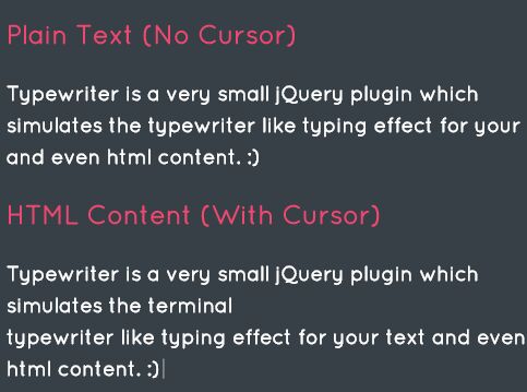
- Blur Effect
- Calculator
- Captcha
- Checkbox
- Color Picker
- Confirm Dialog
- Context Menu
- Cookies
- Countdown Timer
- Coverflow
- Currency Format
- DateTime Picker
- Dialog
- Editable
- Event Calendar
- File Upload
- Filter
- Fixed Header
- Flipbook
- Form Submit
- Form Validation
- Form Wizard
- Fullscreen
- Geolocation
- Grid
- History
- Html5 Audio Player
- HTML5 canvas
- Html5 Local Storage
- Html5 Video Player
- Image Crop
- Image Hover Effect
- Lazy Load
- Login
- Mask
- Mega Menu
- MultiSelect
- News Ticker
- Notification
- Parallax
- Placeholder
- Portfolio
- Preloader
- Progress Bar
- Range Slider
- Rating
- Rotate Image
- Scrollbar
- Scrolling Effects
- SelectBox
- Shopping Cart
- Side Menu
- Social Share
- Sorting
- Timeline
- Tooltip
- Treeview
- Video Background
- Weather
- Website Tour
- Wysiwyg Editor
- YouTube
AngularJs Plugins
- Accordion
- Animation
- Application
- Autocomplete
- Bootstrap
- Calendar
- Carousel
- Chart_Graph
- Date_Time
- Drag_Drop
- Forms
- Gallery
- Maps
- Menu_Navigation
- Modal_Popup
- Plugins
- Premium
- Slider
- Table
- Tabs
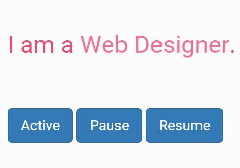
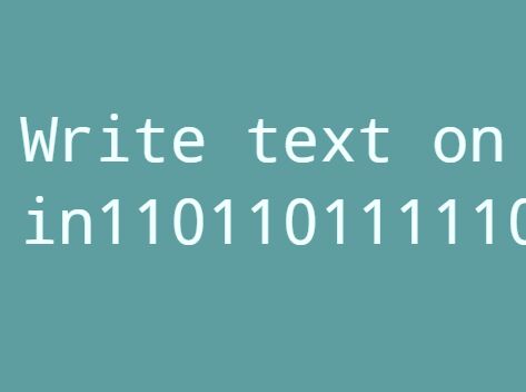
- Text Effects
- Tutorials
- Video_Audio
- Zoom