FAB
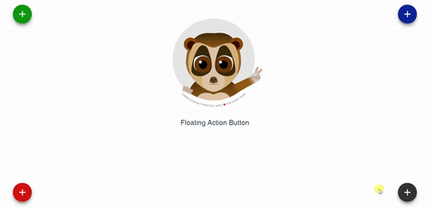
Floating Action Button for Vue.
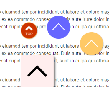
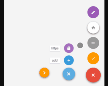
The component supports multiple action buttons so you can add as many actions as you need. It will fire an event to the parent when clicking on each one.
Installation
npm install vue-fab --save Dependencies
Include the following stylesheets on your document's head
<link rel="stylesheet" href="https://fonts.googleapis.com/icon?family=Material+Icons"> And
<link rel="stylesheet" href="https://cdnjs.cloudflare.com/ajax/libs/animate.css/3.5.2/animate.min.css"> Properties
| Properties | Type | Values |
|---|---|---|
bg-color | String | Default '#333333' Accepts all color formats: HEX, RGB & RGBA |
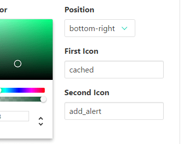
position | String | Default 'bottom-left' Options: 'bottom-left', 'bottom-right', 'top-left','top-right' |
position-type | String | Default 'fixed' Options: 'fixed' or 'absolute' |
z-index | String | Default '999' Set any value that suits your needs. |
ripple-show | Boolean | Default true Options: true or false. |
ripple-color | String | Default 'light' Options: 'light' or 'dark'. |
icon-size | String | Default 'medium' Options: 'small', 'medium' or 'large'. |
main-icon | String | Default 'add' Use icons from the material icon library. |
main-tooltip | String | Default null |
actions | Array | Details bellow |
fixed-tooltip | Boolean | Default 'false' if true, it shows the tooltip beside the actions |
enable-rotation | Boolean | Default 'true' if true, the fab will rotate to indicate that it has been opened. Will not rotate if there are no actions specified. |
start-opened | Boolean | Default 'false' if true, the fab will start opened. |
toggle-when-away | Boolean | Default 'true' if false, the fab will not be closed when clicking outside from the fab component. |
actions
| Properties | Type | Values |
|---|---|---|
name | String | Name of the event |
icon | String | Icon name (Please refer to Material icons) |
tooltip | String | If not used, tooltip won't appear. |
color | String | Default bg-color valueAccepts all color formats: HEX, RGB & RGBA |
Examples
Include the component in your .vue file, actions prop is required for the component to work. The @event has to match the name given in the actions prop.
<template> <fab :actions="fabActions" @cache="cache" @alertMe="alert" ></fab> </template> Either color and position are set by default but they can be changed.
<fab :position="position" :bg-color="bgColor" :actions="fabActions" @cache="cache" @alertMe="alert" ></fab> Match your data with your components props. The bgColor accepts either HEX, RBG or RGBA format.
Remember: Only material icons are accepted.
<script> import fab from 'vue-fab' export default { components: { fab }, data(){ return { bgColor: '#778899', position: 'top-right', fabActions: [ { name: 'cache', icon: 'cached' }, { name: 'alertMe', icon: 'add_alert' } ] } }, methods:{ cache(){ console.log('Cache Cleared'); }, alert(){ alert('Clicked on alert icon'); } } } </script> 