We don't use this package anymore in our own projects and cannot justify the time needed to maintain it anymore. That's why we have chosen to abandon it. Feel free to fork our code and maintain your own copy.
A Vue component to easily render tabs
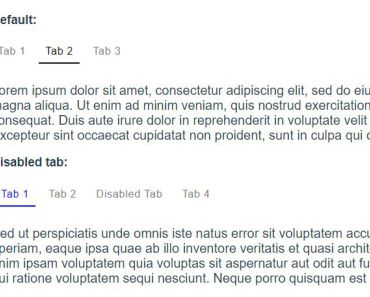
The package contains a Vue component to easily display some tabs.
This is how they can be used:
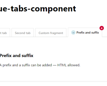
<div> <tabs :options="{ useUrlFragment: false }" @clicked="tabClicked" @changed="tabChanged"> <tab name="First tab"> This is the content of the first tab </tab> <tab name="Second tab"> This is the content of the second tab </tab> <tab name="Disabled tab" :is-disabled="true"> This content will be unavailable while :is-disabled prop set to true </tab> <tab id="oh-hi-mark" name="Custom fragment"> The fragment that is appended to the url can be customized </tab> <tab prefix="<span class='glyphicon glyphicon-star'></span> " name="Prefix and suffix" suffix=" <span class='badge'>4</span>"> A prefix and a suffix can be added </tab> </tabs> </div>When reloading the page the component will automatically display the tab that was previously opened.
The rendered output adheres to the ARIA specification.
Demo
You can see a demo here: http://vue-tabs-component.spatie.be
Installation
You can install the package via yarn:
yarn add vue-tabs-componentor npm:
npm install vue-tabs-component --saveUsage
The most common use case is to register the component globally.
//in your app.js or similar file import Vue from 'vue'; import {Tabs, Tab} from 'vue-tabs-component'; Vue.component('tabs', Tabs); Vue.component('tab', Tab);Alternatively you can do this to register the components:
import Tabs from 'vue-tabs-component'; Vue.use(Tabs);On your page you can now use html like this to render tabs:
<div> <tabs> <tab name="First tab"> First tab content </tab> <tab name="Second tab"> Second tab content </tab> <tab name="Third tab"> Third tab content </tab> </tabs> </div>By default it will show the first tab.
If you click on a tab a href representation of the name will be append to the url. For example clicking on the tab Second tab will append #second-tab to the url.
When loading a page with a fragment that matches the href of a tab, it will open up that tab. For example visiting /#third-tab will open up the tab with name Third tab.
Remembering the last opened tab
By default the component will remember which was the last open tab for 5 minutes . If you for instance click on Third tab and then visit / the third tab will be opened.
You can change the cache life time by passing the lifetime in minutes in the cache-lifetime property of the tabs component.
<tabs cache-lifetime="10"> ... </tabs>Disable modifying the url fragment
When using with other libraries that use the url fragment, you can disable modifying the url fragment by passing the useUrlFragment options. This helps using it with vue-router, or using vue-tabs-component twice in the same page.
<tabs :options="{ useUrlFragment: false }"> ... </tabs>Callbacks
Tabs has two events to which you can bind: changed and clicked
<tabs @clicked="tabClicked" @changed="tabChanged"> ... </tabs>export default { ... methods: { ... tabClicked (selectedTab) { console.log('Current tab re-clicked:' + selectedTab.tab.name); }, tabChanged (selectedTab) { console.log('Tab changed to:' + selectedTab.tab.name); }, ... } }changed is emitted when the tab changes and can be used as handle to load data on request. clicked is emitted when an active tab is re-clicked and can be used to e.g. reload the data in the current tab.
Adding a suffix and a prefix to the tab name
You can add a suffix and a prefix to the tab by using the suffix and prefix attributes.
<tab prefix="my prefix - " name="First tab" suffix=" - my suffix"> First tab content </tab>The title of the tab will now be my prefix - First tab - my suffix.
The fragment that's added to the url when clicking the tab will only be based on the name of a tab, the name-prefix and name-suffix attributes will be ignored.
Customizing fragments
When clicking on a tab it's name will be used as a fragment in the url. For example clicking on the Second tab will append #second-tab to the current url.
You can customize that fragment by using the id attribute.
<div> <tabs> <tab id="custom-fragment" name="My tab"> First tab content </tab> </tabs> </div>Clicking on My tab will then append #custom-fragment to the url.
Setting a default tab
When disabling the cache, it can be useful to specify a default tab to load which is not the first one. You can select this by passing the defaultTabHash option.
<tabs :options="{ defaultTabHash: 'second-tab' }"> <tab id="first-tab" name="First tab"> First tab content </tab> <tab id="second-tab" name="Default tab"> Second tab content </tab> </tabs>CSS
You can use the CSS from the docs as a starting point for your own styling. The output HTML has namespaced classes to target all nodes directly.
<div class="tabs-component"> <ul class="tabs-component-tabs"> <li class="tabs-component-tab"> <a class="tabs-component-tab-a">…</a> </li> </ul> <div class="tabs-component-panels"> <section class="tabs-component-panel"> … </section> </div> </div>Changelog
Please see CHANGELOG for more information what has changed recently.
Testing
$ yarn testContributing
Please see CONTRIBUTING for details.
Security
If you discover any security related issues, please contact Freek Van der Herten instead of using the issue tracker.
Postcardware
You're free to use this package, but if it makes it to your production environment we highly appreciate you sending us a postcard from your hometown, mentioning which of our package(s) you are using.
Our address is: Spatie, Samberstraat 69D, 2060 Antwerp, Belgium.
We publish all received postcards on our company website.
Credits
This package is based on the solution presented by Jeffrey Way in the practical example #3 video in the Vue series on Laracasts
Support us
Spatie is a webdesign agency based in Antwerp, Belgium. You'll find an overview of all our open source projects on our website.
Does your business depend on our contributions? Reach out and support us on Patreon. All pledges will be dedicated to allocating workforce on maintenance and new awesome stuff.
License
The MIT License (MIT). Please see License File for more information.
