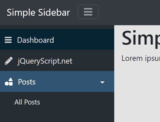
SimpleSidebar
2019-06-10
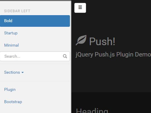
A simple sidebar widget written in jquery.
Demo: https://lingtalfi.com/simplesidebar
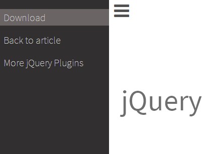
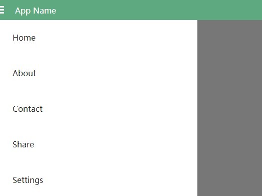
The html architecture
First, we need to create the html structure. The html structure is composed of a wrapper (called context) containing all elements pertaining to the sidebar widget.
Those elements are:
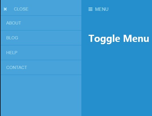
- a header (
.page-header) containing the sidebar toggler (which toggles the sidebar on/off) - a body (
.page-body) - a footer (
.page-footer)
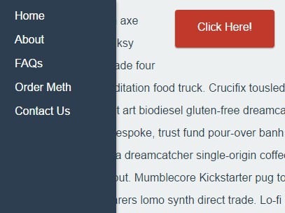
The sidebar itself is contained in the body, which contains the following elements:
- the sidebar (
.widget-sidebar) - the main content (
.page-main)
How does the sidebar behave?
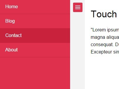
The sidebar has a default behaviour.
By default, the sidebar is responsive, and so it reacts to a break point automatically: it basically disappears on small screens, and re-appears on large screens.
However, once you've click on the sidebar toggler button (in the header), you switch to a manual mode, where the sidebar toggles only when you click that toggler button (i.e. it doesn't respond to break points anymore).
In short, you are in automatic mode until you click the toggler button, which then switches you to the manual mode until you refresh the page again.
The dynamic markup
In this section we list the important html markup which makes the sidebar alive.
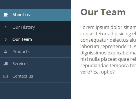
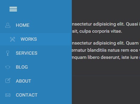
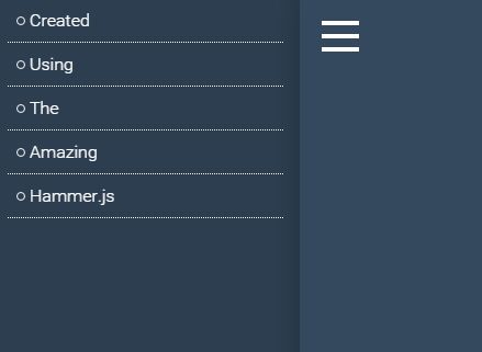
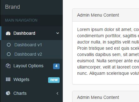
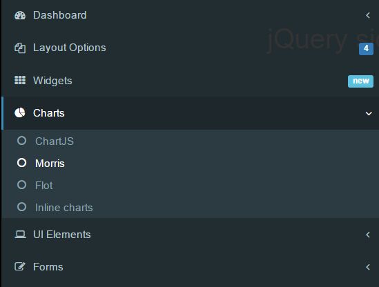
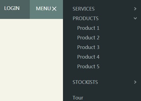
The active state
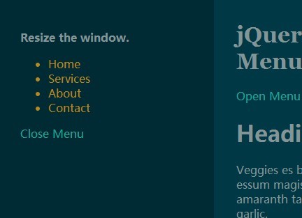
By default, all sidebar items have the same style. To emphasize that a sidebar item is active (selected), we add the .active class to it (to the li element).
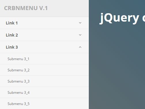
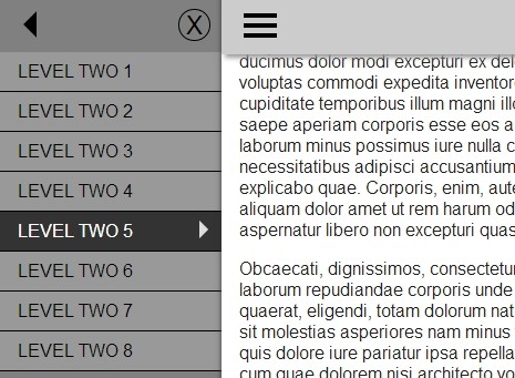
Parent/Children relationship
The sidebar items are like leaves of a tree, some of them contain children, some other don't.
To create a parent, we need to add an a tag inside the li item, and this a tag contains another ul containing the children items.
On the a tag of the parent node, we need to add the following markup:
- href: #
$target(you choose$targetarbitrarily) - data-toggle: collapse
- aria-expanded: true|false (either true or false)
- class: dropdown-toggle
And then on the ul tag of the parent element, add the following:
- class: collapse
- class: show (if you want to display the children)
- id:
$target
History Log
-
1.0.0 -- 2019-06-10
- initial commit

