vt-tabs
基于vue2 封装的 tabs组件, 提供了选项卡的基本的功能。
Install
npm i -D vt-tabs import { Tabs, TabsItem } from 'vt-tabs' // global install Vue.component('Tabs', Tabs) Vue.component('TabsItem', TabsItem) // scope install export default { components: { Tabs, TabsItem } } **备注: ** TabsItem 只能被 Tabs 包裹
Usage
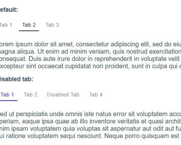
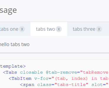
<template> <Tabs closable @tab-remove="tabRemove" @tab-add="tabAdd" @tab-click="tabClick" v-model="idx"> <TabItem v-for="(tab, index) in tabs"> <span class="tabs-title" slot="title">{{ tab.name }}</span> <p>{{ tab.content }}</p> </TabItem> </Tabs> </template> <script> import { Tabs, TabItem } from 'vt-tabs' export default { components: { Tabs, TabItem }, data(){ return { idx: 0, tabs: [ { disabled: true, name: 'tabs one', content: 'hello tabs one' }, { name: 'tabs two', content: 'hello tabs two' }, { name: 'tabs three', content: 'hello tabs three' } ] } }, mounted(){ console.log('mounted',this.tabs) }, methods: { tabRemove(index){ this.tabs.splice(index, 1) if(this.tabs.length){ this.idx = index - 1 < 0 ? this.tabs.length - 1 : index - 1 } }, tabClick(index){ this.idx = index } } } </script> Tabs interface
props: closable: type: Boolean default: false description: 按钮的类型,可选值: ``primary``,``success``,``loading``,``warning``,``info``,``danger`` value: type: Number, String default: '0' description: v-model使用,激活哪个tab slots: default: description: TabItem, 选项卡的子项 events: tab-click: description: 点击tab,参数索引 tab-remove: description: 删除的tab, 参数索引 TabItem interface
props: title: type: String, description: tab的title, 优先使用slots.title closable: type: Boolean, description: tab关闭选项,优先使用自身的closable, 否则使用 父组件的closable disabled: type: Boolean, description: 禁用tab, 禁用后不可删除,不可点击 slots: default: description: tab对应的内容 title: description: tab的标题,优先级大于props.title 