basicResponsiveMenu
This plugin gives you a responsive menu with as little hassle as possible.
The demo folder contains a demo index.html file, showing example markup. The plugin files are located in the root folder.
How To Use
Markup
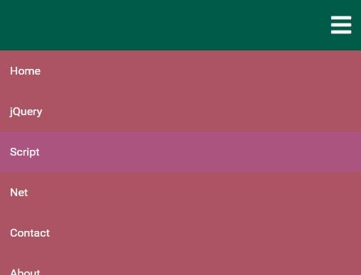
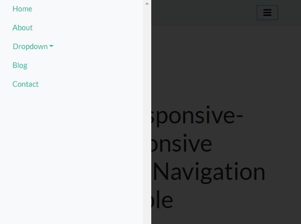
Essentially, all you need to do is to add the class response--main-navigation to the wrapper around your menu, and the class response--site-menu to the menu itself.
Example:
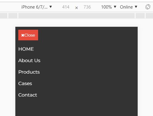
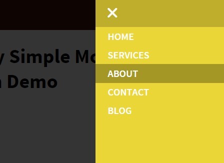
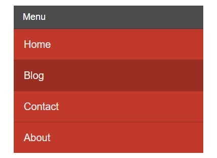
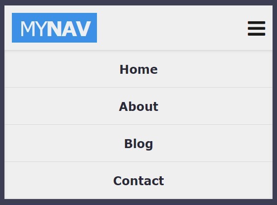
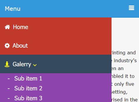
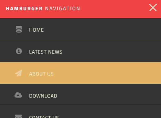
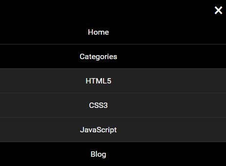
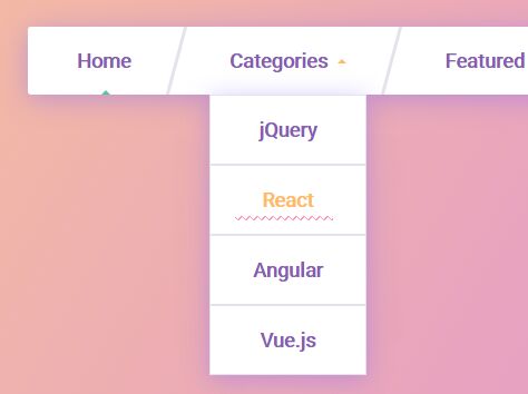
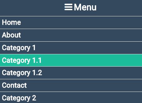
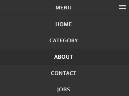
<nav class="response--main-navigation"> <ul class="response--site-menu"> <li><a href="#">HOME</a></li> <li><a href="#">About Us</a></li> <li><a href="#">Products</a></li> <li><a href="#">Cases</a></li> <li><a href="#">Contact</a></li> </ul> </nav> Setup
The plugin consists of a JS and a CSS file, and the only dependency you need to install is jQuery.
In the <head> section, include: <link rel="stylesheet" href="PATH_TO_PLUGIN_CSS/basicResponsiveMenu.css">
Either in the <head> section, or before the closing <body> tag, include: <script src="https://ajax.googleapis.com/ajax/libs/jquery/3.3.1/jquery.min.js"></script> and <script src="PATH_TO_PLUGIN_JS/basicResponsiveMenu.js"></script>
You initialize the plugin with:
<script> $(function(){ $('.response--main-navigation').basicResponsiveMenu(); }); </script> If you wish to change the default options, you can do it as follows:
$('.response--main-navigation').basicResponsiveMenu({ browserWidth:960, slideDir:'left', slideSpeed:400 }); Options
There's four different options available, listed below with their default values:
browserwidth: 768, // At which screen size do you want to transition from a horizontal to a hamburger menu? animate: true, // Do you want the menu to animate in, or simply appear? slideDir: 'right', // which direction do you want the menu to slide to? 'right' or 'left'? slideSpeed: 250 // the speed with which the menu slides in, set in ms Styling
The plugin CSS file only contains the most basic styling needed for the plugin to work. The design part is up to you, depending on what fits with your needs.
Happy coding.


