Vue-Responsive


Breaking Changes for verison 1.x:
- Tag is now
v-responsivethe oldv-responsivenessis no longer supported. - The file
Vue_Responsive.common.jsdoes no longer exist
Is a directive to use responsive breakpoints on html elements. Because sometimes it's nice to have a chance to let the view do resolution specific things.
- No further Dependencies
🔧 Chrome, Firefox, IE11+
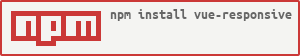
🔧 Install
npm install vue-responsive
import responsive from 'vue-responsive' Vue.use(responsive)👈 Shortest usecase
Just put the breakpoint identifiers behind the directive with dots:
<div v-responsive.lg.xl >Only visible on desktop !</div> <div v-responsive.md >Visible on tablet ☺</div> <div v-responsive.sm.xs >Only visible on smartphone!</div>👈 Small usage example
<template> <div> <h1 v-responsive="'hidden-xs'">Big Title</h1> <div v-responsive="['hidden-all','xs','sm']"> Only visible in small and extra-small windows </div> <h1 v-responsive="middleSize">Big Jumbotron</h1> </div> </template> <script> import vueResponsive from 'vue-responsive' Vue.directive('responsive', vueResponsive) ... data:{ middleSize: ['hidden-all','lg','xl'] } </script>Features
This directive adds responsive Feautures to single HTML-Elements without CSS or @Media.
The default Responsive breaks follow Bootstrap 4 Responsive Utils.
The Bootstrap 3 breakpoints are includes as well.
Do you miss a feature?
Take charge and file an issue or add your idea or vote for your favorite feature to be implemented:
Usage
In the browser just include the script and use the directive on a Html-Element inside a Vue Element
<script src="Vue-Responsive.min.js"></script> Advanced: If you do not want the directive to be globally available just add the attribute notGlobal with a not empty value in the script tag and define it the components with:
<script src="Vue-Responsive.min.js" notGlobal="true" ></script> ... directives:{ // the global variable is 'index.vueResponsive' responsive: index.vueResponsive }For Bootstrap 4 breakpoints
At default every resolution is visible, the hidden-all tag changes this to everything hidden (display:none). These tags are valid hidden-all, xs, sm, md, lg, xl, hidden-xs,...,hidden-xl.
<h1 v-responsive="'hidden-xs'">Big Title</h1> <div v-responsive="['hidden-all','md','lg']">Only visible in Middle and large Size View</div> <div v-responsive="['hidden-lg']">Only hidden at lg</div> <h1 v-responsive="middleSize">Jumbotron</h1> ... //in the vue object data:{ middleSize:['hidden-all','lg','xl'] } For Bootstrap 3 breakpoints
Just add :bs3 after the directive to use bootstrap 3 breakpoints:
<p v-responsive:bs3="['hidden-xs']"> As you can see on the big picture below.<br /><img ... /> </p> In this defintion the xl breakpoint doesn't exist.
For self defined breakpoints
First you have to declar your own breakpoints in the component/root wich wraps the html-elements with the directive. Every definition must start with responsiveMarks$$ and a following name. So you can easily create breakpoints to differentiate between desktop and smartphones for instance, as you can see in the demo.html:
<p v-responsive:twoMarks="'hidden-desktop'"> Visible on smartphone<br /> <img src="http://lorempixel.com/360/240/animals" /> </p> ... //in the vue object data:{ responsiveMarks$$twoMarks: { //set a custom breakpoint with the name "twoMarks" smartphone: { show: true, min: -1, max: 767 }, desktop: { show: true, min: 768, max: Infinity } } } You can declar as much own definitions as you wish. Every defintion should have min:-1 for its smalles breakpoint and max:Infinity for its biggest.
Planned
- Mixin to trigger methods on breakpoint change
- Add and remove classes instead of changing only the style
License
MIT