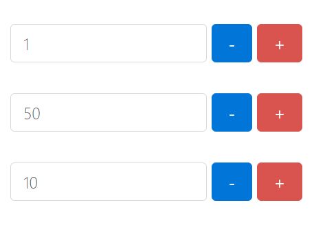
Stepper
- A jQuery widget for incrementing & decrementing values in an input with plus and minus buttons
Usage
// Options is an optional parameter, see the defaults below jQuery('.stepper-widget').stepper();Options
identifierdefault: stepper Used as the event namespace identifier and the element's data attribute nameupSelectordefault: '.js-qty-up' The selector used for the up buttondownSelectordefault: '.js-qty-down' The selector used for the down buttoninputSelectordefault: '.js-qty-input' The selector used for the input fielddisabledClassdefault: true The disabled class to apply to the elements when disable() is called on the widgetminQtydefault: true The minimum quantity the widget will count tomaxQtydefault: 999 The maximum quantity the widget will count tostepdefault: 1 The increment / decrememnt step value
Methods
enableEnables the widgetdisableDisables the widgetupdateQuantity(value)Updates the widget with the quantity set. This is validated against min / max valuesstepQuantity(value)Increment the quantity by the value specified. Use a negative number to decrement the valuegetValue()Returns the value held by the widget. Use this instead of getting the value from the widget's input as this value will have been passed through the validation routines
Callbacks
update
jQuery('.stepper-widget').on('stepperupdate', function(ev, data){ console.log(data.updateMode); });- Use the updateMode parameter to check whether the widget's current value has changed from its initial value. Possible values are same_value_entered and different_value_entered