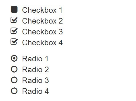
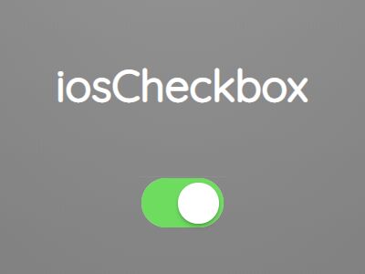
wCheck.js
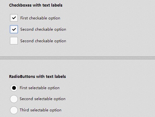
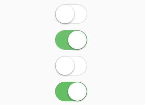
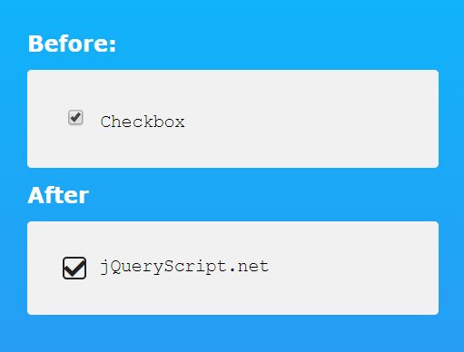
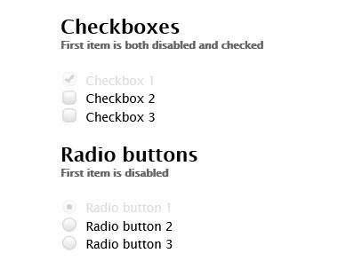
A jQuery plugin for fully customizable checkbox and radio input options. The plugin uses images for background themes and selectors to allow for compatability with more browsers. Applying this plugin will not effect any existing functionality on your radio and checkbox inputs and you should still be able to fire any existing events already created on them.
The plugin works by overlaying the original checkbox and radio on top of the image to retain any functionality that may exist on the elements such as title tags or tab indexing.
Related Plugins
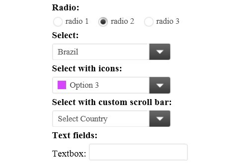
- wForm - See all the form plugins working together.
- wSelect - Custom select boxes.
- wInput - Input plugin that handles backwards compatability for placeholders.
- wChar - On the fly character counter for inputs.
Settings
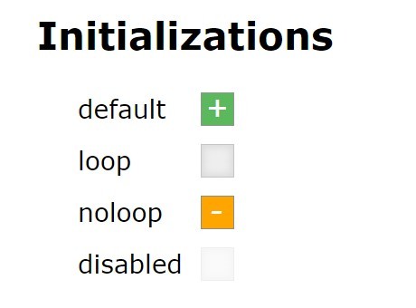
Available options with notes, the values here are the defaults.
$.fn.wCheck.defaults = { theme: 'square-classic-blue', // theme selector: 'checkmark', // selector useExistingLabel: true, // if there is a for="id" matching use it highlightLabel: false // toggle highlighting active/hover label };Note that you can set defaults for wCheck and wRadio separately.
$.fn.wRadio.defaults = { theme: 'circle-classic-blue', // theme selector: 'circle-dot-blue', // selector useExistingLabel: true, // if there is a for="id" matching use it highlightLabel: false // toggle highlighting active/hover label };Examples
To start off you will need to include the following two files:
<script type="text/javascript" src="./wCheck.js"></script> <link rel="Stylesheet" type="text/css" href="./wCheck.css" />You can then apply the plugins to any radio and checkbox like so:
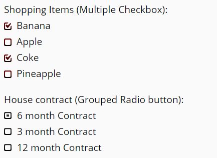
$('input:radio').wRadio(); $('input:checkbox').wCheck();themes
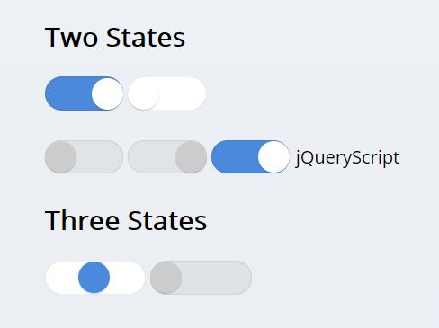
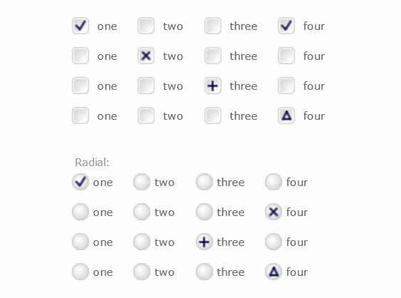
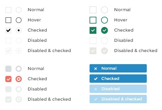
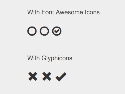
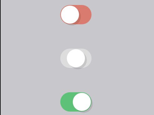
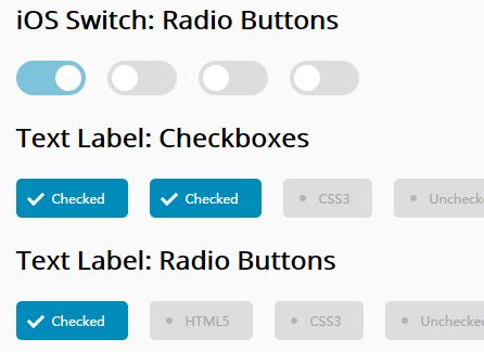
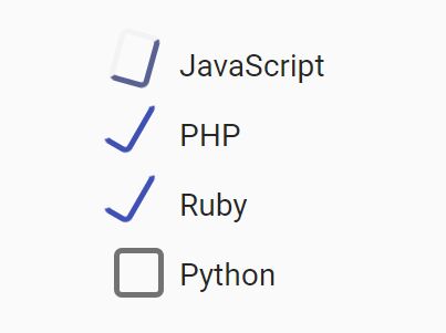
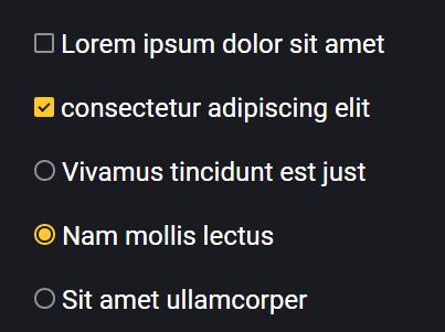
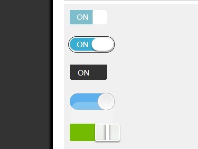
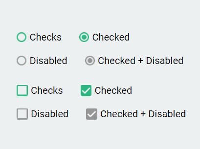
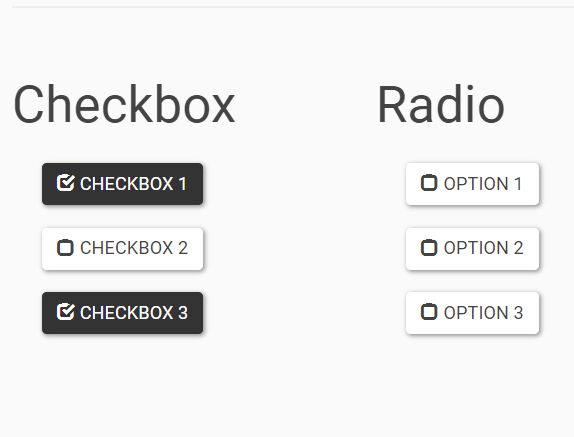
Set your own theme and selector by specifying the paths to the images. Note that the theme image is comprised of two images for off and hover state. These images should be of the same size with the hover state below the off state. Just look in the img folder of this plugin for samples. Also don't forget to set the size if using dimensions other than 16px by 16px.
$('input:radio').wRadio({ theme: 'circle-classic-green', selector: 'circle-solid' }); $('input:checkbox').wCheck({ theme: 'square-radial-yellow', selector: 'cross' });labels
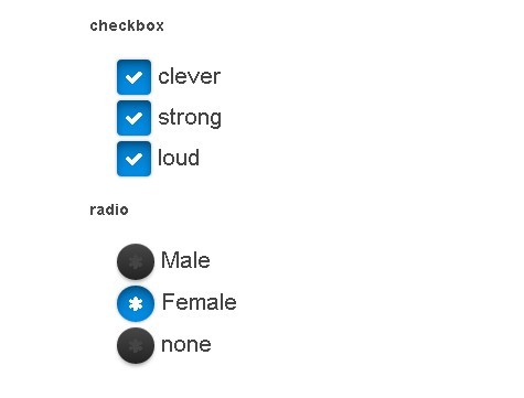
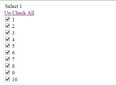
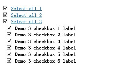
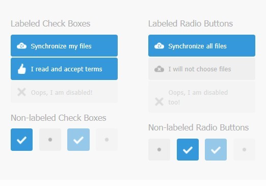
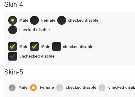
You can optionally set a label attribute for the radio and checkbox elements and the plugin will create a nicely formatted clickable label for each option. This can be done by setting the data-label attribute.
<input type="check" name="gender" value="male" data-label="Male"/> <input type="check" name="gender" value="female" data-label="Female"/>Note that you can also set your own lables and they will still work as expected. The above data-label attribute only serves as a little shortcut to avoid having to type out an id and label for radio and checkbox.
<input id="gender-male" type="check" name="gender" value="male"/><label for="gender-male">Male</label> <input id="gender-female" type="check" name="gender" value="female"/><label for="gender-female">Female</label>There is also a boolean option named useExistingLabel that can be used to set whether you want to attach the label as part of the radio plugin or just leave it as is.
$.fn.wRadio.defaults = { ... useExistingLabel: true, ... };One final option for the label is named highlightLabel that allows you to toggle whether the label will highlight when in hover or on states.
$.fn.wCheck.defaults = { ... highlightLabel: true, ... };manual control
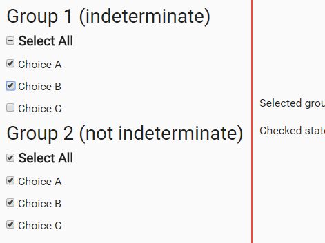
One thing that should be avoided is manually setting or removing the checked attribute as there is no way to register an event for a manual change. For this use the check method and pass in either true or false. This will automatically trigger the change event for this element if any is set.
$('#radio1').wRadio('check', true); $('#checkbox1').wCheck('check', false);If you absolutely have to do it manually on the element itself you will need to trigger a change event after your change for the plugin to register the visual change.
$('input:radio[name=radio-test1]').prop('checked', false).change(); // disable all options in group $('#radio-test1_2').prop('checked', true).change(); // enable one optionNote that to capture a change you must set the change event on all elements that are clickable. Meaning if you have for options in a group then all four must have a change event.
$('input:radio[name=radio-test1]').change(function(){ // do something });CSS labels
Global CSS labels are also available in this plugin and can be used by setting an adding the class name wLabel-left, wLabel-top or wLabel-left-top to an element.
<label class="wLabel-left">Label:</label>disabling
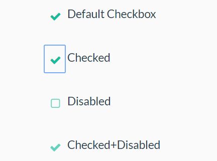
You can pre-disable an input in two ways.
- Via it's attribute
disabled="disabled". - By setting the option
disabled: true.
To disable end enable the input in real time afterwards do it manually through the plugin function.
$('#elem').wRadio('disabled', ); $('#elem').wCheck('disabled', );
Grunt.js
If you want to use Grunt you will need to install the required plugins locally using npm install in the root folder of your project. If you need to setup Grunt on your system you can follow my Setting up Grunt.js guide.
Resources
- More jQuery plugins by Websanova
- Websanova JavaScript Extensions Project
- jQuery Plugin Development Boilerplate
- The Ultimate Guide to Writing jQuery Plugins
License
MIT licensed
Copyright (C) 2011-2013 Websanova http://www.websanova.com
