#react-photostory
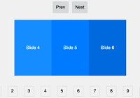
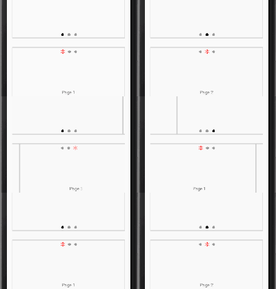
A lightweight carousel made in React and optimized for mobile.
Demo is available here. Make sure devtools is open and mobile emulation is selected as this library currently only supports touch events.
##Features
- lazy-loading by default
- AutoPlay
- Drag and swipe
Installation
This library works with react-lazy-card (don't worry. they are very light even when used together . react-lazy-card may serve other purposes in the app so we separated it).
npm install --save react-photostory react-lazy-card Basic Usage
JSX:
import Swipe from 'react-photostory'; import LazyCard from 'react-lazy-card'; <Swipe className="photostory"> <LazyCard image="a.jpg" defaultImage="default1.jpg">Text 1</LazyCard> <LazyCard image="b.jpg" defaultimage="default2.jpg">Text 2</LazyCard> </Swipe>CSS
@import "react-photostory/dist/swipe"Options
<Swipe/> Component
| prop | default | description |
|---|---|---|
| className | '' | Custom classname |
| initialIndex | 0 | initially visible slide index |
| autoPlay | false | whether to display slide show or not |
| overScan | 0 | Number of Slide offsets to load excluding the current slide.If its 1 it will load current, current+-1 |
| onSwipe | ({initialIndex, currentIndex}) | function executed whenever the current slide changes |
| onClick | {index} | function executed when a slide is clicked |
| prev | <button>PREV</button> | React element to replace the PREV button |
| next | <button>NEXT</button> | React element to replace the NEXT button |
| threshold | 0.5 | Ratio of carousel width one should drag to make successful swipe |
| responsive | false | whether or not to listen to window resize event |
| renderFirst | true | don't lazy load the initial slide |
| height | 300 | height of the carousel |
.gotoSlide(i)
To manually go to a particular slide you can use gotoSlide(i) method
const x = ( <Swipe className="photostory"> <LazyCard image="a.jpg" defaultImage="default1.jpg">Text 1</LazyCard> <LazyCard image="b.jpg" defaultimage="default2.jpg">Text 2</LazyCard> <LazyCard image="c.jpg" defaultimage="default3.jpg">Text 2</LazyCard> </Swipe> ) x.gotoSlide(2) // will go to the 3rd slide<Story/>
<Story height={300} > {({handleClick, handleSwipe}) => { return ( <Swipe overScan={number('overScan', 0)} autoPlay={boolean('autoPlay', false)} autoPlayInterval={number('Autoplay Interval', 4000)} onSwipe={handleSwipe} responsive={true} onClick={handleClick} > <LazyCard defaultImage={defaultImage} title={'Image 1'} subTitle={'title 1'} image='https://is1-2.housingcdn.com/afe3f526/1264f1fbf64cb1d23dfaa3beb33ff0ef/v2/medium.jpg'/> <LazyCard title={'Image 2'} subTitle={'title 2'} defaultImage={defaultImage} image='https://is1-3.housingcdn.com/afe3f526/13b186eece020d2d4ad85cea21cdb991/v4/medium.jpg'/> <LazyCard title={'Image 3'} subTitle={'title 3'} defaultImage={defaultImage} image='https://is1-3.housingcdn.com/afe3f526/7114b67ecce8e089fa750d76372d4636/v3/medium.jpg'/> </Swipe>) }} </Story>Development
git clone https://github.com/housinghq/react-photostory cd react-photostory npm install npm run storybook Make sure you develop in emulation mode (open devtools and select mobile emulation). Currently this only supports touch events.
Open an issue before opening a PR. This package is optimised for mobile so its hard to include all the features.
###License MIT @ Loconsolutions


