nuka-carousel
A Pure ReactJS Carousel Component
Maintained by Sarah Meyer

Install
To add nuka-carousel to your project run the following command in your project folder.
$ yarn add nuka-carouselExample
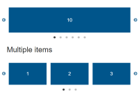
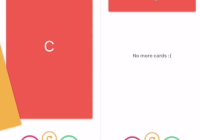
import React from 'react'; import Carousel from 'nuka-carousel'; export default class extends React.Component { render() { return ( <Carousel> <img src="https://via.placeholder.com/400/ffffff/c0392b/&text=slide1" /> <img src="https://via.placeholder.com/400/ffffff/c0392b/&text=slide2" /> <img src="https://via.placeholder.com/400/ffffff/c0392b/&text=slide3" /> <img src="https://via.placeholder.com/400/ffffff/c0392b/&text=slide4" /> <img src="https://via.placeholder.com/400/ffffff/c0392b/&text=slide5" /> <img src="https://via.placeholder.com/400/ffffff/c0392b/&text=slide6" /> </Carousel> ); } }Running demo locally
The demo can be launched on your local machine via webpack-dev-server. Make sure you are running node version 9.11 or earlier. Once you have cloned this repo locally, run the following:
yarn yarn build yarn startYou can access the application on your localhost at the following url: Local Demo
Or on CodeSandBox at the following url: CodeSandBox Demo
Keyboard Controls
| Key Combination | Function |
|---|---|
| Right/Up Arrow or D/W key | Next slide |
| Left/Down Arrow or A/S key | Previous slide |
| Q key | First slide |
| E key | Last slide |
| SpaceBar | When autoplay={true} pauses and unpauses carousel |
- Keyboard shortcuts are disabled as a default. To enable them set
enableKeyboardControlsprop totrue.
Props
| Name | PropType | Description | Default |
|---|---|---|---|
| afterSlide | React.PropTypes.func | Hook to be called after a slide is changed. | |
| animation | React.PropTypes.oneOf(['zoom']) | Adds a zoom effect on the currently visible slide. A transform: scale(0.85) is set as default, however, the scale can be customized using zoomScale prop. Property is applied on all slides except the current 1. Use cellAlign to align the slide with zoom effect where you'd like. | |
| autoGenerateStyleTag | React.PropTypes.bool | When set to true, it will generate a style tag to help ensure images are displayed properly. Set to false if you don't want or need the style tag generated. | true |
| autoplay | React.PropTypes.bool | Autoplay mode active. | false |
| autoplayInterval | React.PropTypes.number | Interval for autoplay iteration. | 3000 milliseconds |
| autoplayReverse | React.PropTypes.bool | Only meaningful when autoplay is already true. When autoplayReverse is also true, autorotation cycles through slides indexes from high to low. | false |
| beforeSlide | React.PropTypes.func | Hook to be called before a slide is changed | |
| cellAlign | React.PropTypes.oneOf(['left', 'center', 'right']) | When displaying more than one slide, sets which position to anchor the current slide to. When cellAlign='center' or cellAlign='right', keep slidesToScroll prop set to default.Is overridden to left when transitionMode="fade" | |
| cellSpacing | React.PropTypes.number | Space between slides, as an integer, but reflected as px | |
| enableKeyboardControls | React.PropTypes.bool | When set to true will enable keyboard controls. | |
| disableAnimation | React.PropTypes.bool | When set to true, will disable animation. | false |
| disableEdgeSwiping | React.PropTypes.bool | When set to true, will disable swiping before first slide and after last slide. | false |
| dragging | React.PropTypes.bool | Enable mouse swipe/dragging. | true |
| easing | React.PropTypes.string | Animation easing function. See valid easings here: D3 Easing Functions | |
| edgeEasing | React.PropTypes.string | Animation easing function when swipe exceeds edge. See valid easings here: D3 Easing Functions | |
| frameOverflow | React.PropTypes.string | Used to set overflow style property on slider frame. | hidden |
| framePadding | React.PropTypes.string | Used to set the margin of the slider frame. Accepts any string dimension value such as "0px 20px" or "500px" | |
| heightMode | React.PropTypes.oneOf(['first', 'current', 'max']) | Change the height of the slides based either on the first slide, the current slide, or the maximum height of all slides. Overrides height set by initialSlideHeight | |
| initialSlideHeight | React.PropTypes.number | Initial height of the slides in pixels. | 100 |
| initialSlideWidth | React.PropTypes.number | Initial width of the slides in pixels | |
| pauseOnHover | React.PropTypes.bool | Pause autoPlay when mouse is over carousel. | true |
| renderAnnounceSlideMessage | React.PropTypes.func | Renders message in the ARIA live region that is announcing the current slide on slide change | Render function that returns "Slide {currentSlide + 1} of {slideCount}" |
| slideIndex | React.PropTypes.number | Manually set the index of the slide to be shown | |
| slideOffset | React.PropTypes.number | While using prop animation = "zoom", you can configure space around current slide with slideOffset. | 25 |
| slidesToScroll | React.PropTypes.oneOfType([ React.PropTypes.number, React.PropTypes.oneOf(['auto'])]) | Slides to scroll at once. Set to "auto" to always scroll the current number of visible slides. Is overridden to slidesToShow when transitionMode="fade" | |
| slidesToShow | React.PropTypes.number | Number of slides to show at once. Will be cast to an integer when transitionMode="fade" | |
| slideWidth | React.PropTypes.oneOfType([React.PropTypes.string, React.PropTypes.number]) | Manually set slideWidth. If you want hard pixel widths, use a string like slideWidth="20px", and if you prefer a percentage of the container, use a decimal integer like slideWidth={0.8} | |
| speed | React.PropTypes.number | Animation duration/Transition speed in milliseconds | |
| swiping | React.PropTypes.bool | Enable touch swipe/dragging | true |
| transitionMode | React.PropTypes.oneOf(['scroll', 'fade', 'scroll3d']) | Set the way slides transition from one to the next. | scroll |
| vertical | React.PropTypes.bool | Enable the slides to transition vertically | |
| width | React.PropTypes.string | Used to hardcode the slider width. Accepts any string dimension value such as "80%" or "500px" | |
| withoutControls | React.PropTypes.bool | Used to remove all controls at once. Overwrites the render[Top, Right, Bottom, Left]CenterControls(). | false |
| wrapAround | React.PropTypes.bool | Sets infinite wrapAround mode. | false |
| zoomScale | React.PropTypes.number | Adds a number value to set the scale of zoom when animation === "zoom". The number value should be set in a range of (0,1). The default value is set to zoomScale: 0.85 | |
| opacityScale | React.PropTypes.number | Adds a number value to set the scale of the opacity for the 'scroll3d' transition mode. The number value should be set in a range of (0,1). The default value is set to opacityScale: 0.65 |
render*Controls
React.PropTypes.func
A set of eight render props for rendering controls in different positions around the carousel.
-
Valid render props for the eight positions are
renderTopLeftControls,renderTopCenterControls,renderTopRightControls,renderCenterLeftControls,renderCenterCenterControls,renderCenterRightControls,renderBottomLeftControls,renderBottomCenterControls, andrenderBottomRightControls. -
The default props are set as
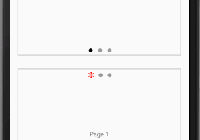
renderCenterLeftControlsforPreviousbutton,renderCenterRightControlsfor theNextbutton andrenderBottomCenterControlsfor the "Paging dots". To change the position or remove "Paging dots", the default positions need to be disabled by setting them to null.
<Carousel renderTopCenterControls={({ currentSlide }) => ( <div>Slide: {currentSlide}</div> )} renderCenterLeftControls={({ previousSlide }) => ( <button onClick={previousSlide}>Previous</button> )} renderCenterRightControls={({ nextSlide }) => ( <button onClick={nextSlide}>Next</button> )} > {/* Carousel Content */} </Carousel>-
The function returns the props for
goToSlide,nextSlideandpreviousSlidefunctions in addition toslideCountandcurrentSlidevalues. Can also remove all render controls usingwithoutControls. -
NOTE: The className
slide-visibleis added to the currently visible slide.
renderAnnounceSlideMessage
React.PropTypes.func
renderAnnounceSlideMessage render prop is a special case of the render*Controls props. It's responsibility is to render ARIA live announcement message to improve accessibility. The prop will announce the message you pass in every time the slide changes with VoiceOver enabled on your machine. The function returns only slideCount and currentSlide values.
<Carousel renderAnnounceSlideMessage={({ currentSlide, slideCount }) => `Slide ${currentSlide + 1} of ${slideCount}` } > {/* Carousel Content */} </Carousel>External Control of Carousel State
You can control the state of the carousel from your parent component as shown below:
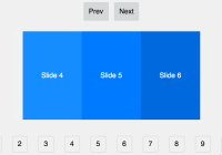
import React from 'react'; import Carousel from 'nuka-carousel'; export default class extends React.Component { state = { slideIndex: 0 }; render() { return ( <Carousel slideIndex={this.state.slideIndex} afterSlide={slideIndex => this.setState({ slideIndex })} > <img src="https://via.placeholder.com/400/ffffff/c0392b/&text=slide1" /> <img src="https://via.placeholder.com/400/ffffff/c0392b/&text=slide2" /> <img src="https://via.placeholder.com/400/ffffff/c0392b/&text=slide3" /> <img src="https://via.placeholder.com/400/ffffff/c0392b/&text=slide4" /> <img src="https://via.placeholder.com/400/ffffff/c0392b/&text=slide5" /> <img src="https://via.placeholder.com/400/ffffff/c0392b/&text=slide6" /> </Carousel> ); } }TypeScript
TypeScript type definitions are now shipped with nuka-carousel. You can use them directly from the library.
Resizing Height Issue
When using dynamic content in a slide such as text, you may see an issue with resizing the height of the component when loading in an iframe, or forcing the component to load synchronously after another component such as a loading screen, or interstitial.
How resizing works
In componentDidMount, the initial dimensions are assigned to each slide:
- Width:
initialSlidewidth||slideWidth|| (slidesToShow/ width of container) - Height:
initialSlideHeight
Once the component has completed mounting with the accurate width, it waits for the readyStateChange event to fire before measuring the desired height of the content (current, first, max). That measurement then replaces initialSlideHeight with the measured height in pixels.
If the readyStateChange event fires before the component completes mounting, the height of the component is not measured until a resize event or a change in slide is triggered.
Contributing
See the Contribution Docs.
Maintenance Status
Active: Formidable is actively working on this project, and we expect to continue for work for the foreseeable future. Bug reports, feature requests and pull requests are welcome.