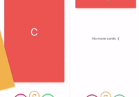
react-native-coverflow
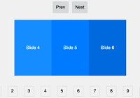
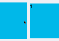
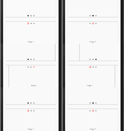
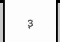
A Coverflow component for react-native.
Installation
$ npm install --save react-native-coverflow
or
$ yarn add react-native-coverflow
Usage
import React, { Component } from 'react'; import { View, Text } from 'react-native'; import Coverflow from 'react-native-coverflow'; class YourComponent extends Component { render() { return ( <Coverflow onChange={(index) => console.log('Current item', index)}> <View><Text>First Card</Text></View> <View><Text>Second Card</Text></View> <View><Text>Third Card</Text></View> </Coverflow> ); } }Checkout the demo project
https://github.com/Bhoos/coverflow-demo
$ git clone [email protected]:Bhoos/coverflow-demo.git
$ cd coverflow-demo
$ npm install
Run demo on iOS or Android
$ react-native run-ios
$ react-native run-android
Props
onChange :callback(index)
A callback invoked whenever the selection changes.
onPress :callback(index)
A callback invoked when the central card is pressed.
initialSelection :number default 0
The card that needs to be centered initially.
spacing :number default 100
The number of pixels between the center card and the its adjacent card.
wingSpan :number default 80
The number of pixels between the adjacent card and its next card.
rotation :number default 50
The angle in degrees at which the non centered cards needs to be rotated.
midRotation :number default 50
The angle at which the center card needs to rotate to during transition. Use this value to make sure that during the central card transition, the cards do not overlap.
perspective :number default 800
The perspective value for 3D projection. A lower value means viewing from a short distance.
scaleDown :number default 0.8
A scale factor for the card adjacent to the center.
scaleFurther :number default 0.75
A diminising scale factor for the card next to the adjacent card.


