React Native Swipeable Parallax Carousel
Android & iOS // React Native v0.46+
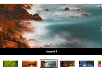
Carousel with parallax effect, overlay and dots navigation
Carousel without parallax effect, without overlay and with bars navigation
Get started
Installation
Run: $ npm install react-native-swipeable-parallax-carousel --save
Usage
import SwipeableParallaxCarousel from 'react-native-swipeable-parallax-carousel'; const datacarousel = [ { "id": 339964, "title": "Valerian and the City of a Thousand Planets", "imagePath": "https://image.tmdb.org/t/p/w780/o6OhxtsgMurL4h68Uqei0aSPMNr.jpg", }, { "id": 315635, "imagePath": "https://image.tmdb.org/t/p/w780/fn4n6uOYcB6Uh89nbNPoU2w80RV.jpg", }, ... { "id": 339403, "title": "Baby Driver", "subtitle": "More than just a trend", "imagePath": "https://image.tmdb.org/t/p/w780/xWPXlLKSLGUNYzPqxDyhfij7bBi.jpg", }, ]; <SwipeableParallaxCarousel data={datacarousel} />Properties
| Prop | Description | Default | Required |
|---|---|---|---|
data | An array with all your items. Read bellow about Data array structure. | None | Yes |
align | Title alignment. Could be left, right or center. | left | No |
titleColor | Color title. | #ffffff | No |
navigation | Display a navigation bar or not. Boolean true or false. | true | No |
navigationColor | Color of the current item in the navigation bar. | #ffffff | No |
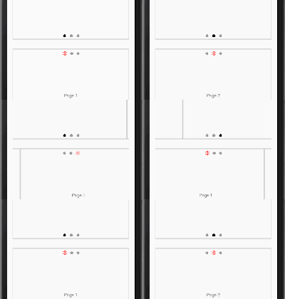
navigationType | Navigation bar type. 3 types available: dots, bars or squares. See navigationType examples for illustrations. | dots | No |
height | Carousel height. | 200 | No |
parallax | Parallax effect while scrolling. Boolean true or false. | true | No |
overlayPath | Image ressource to overlay item image. For example: {require('../assets/images/itemGradient.png')} | None | No |
onPress | A function called when an item is pressed | None | No |
parentScrollViewRef | Reference of the parent ScrollView. Read bellow about Make your carousel ScrollView friendly | None | No |
Data array structure
Your data array must be an array of objects with at least an id and an imagePath key.
| Prop | Description | Required |
|---|---|---|
id | Item ID. | Yes |
title | Item title. Omit this prop if you don't want a title. | No |
subtitle | Item subtitle. Omit this prop if you don't want a subtitle. | No |
imagePath | Item image path. | Yes |
const datacarousel = [ { "id": 339964, "title": "Valerian and the City of a Thousand Planets", "imagePath": "https://image.tmdb.org/t/p/w780/o6OhxtsgMurL4h68Uqei0aSPMNr.jpg", }, { "id": 315635, "imagePath": "https://image.tmdb.org/t/p/w780/fn4n6uOYcB6Uh89nbNPoU2w80RV.jpg", }, { "id": 339403, "title": "Baby Driver", "subtitle": "More than just a trend", "imagePath": "https://image.tmdb.org/t/p/w780/xWPXlLKSLGUNYzPqxDyhfij7bBi.jpg", }, ];navigationType examples
You can easily customize your navigation bar with navigationType: use dots, barsor squares to give a different look at your navigation items. Remember you can also use navigationColor to change the color of the current item in your navigation bar.
Dots, bars and squares navigation
Make your carousel ScrollView friendly
In order to use your carousel component inside a ScrollView and avoid any conflicts while scrolling, you need to use parentScrollViewRef prop.
<ScrollView ref={(c) => { this.parentScrollView = c; }} > ... <SwipeableCarousel data={datacarousel} parentScrollViewRef={this.parentScrollView} /> ... </ScrollView>Demo
- Check the demo with Expo on your phone (See on Expo)

Questions or suggestions?
Feel free to contact me on Twitter or create an issue.
License
This project is licenced under the MIT License.


