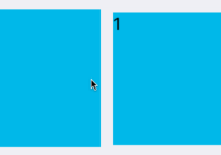
React Alice Carousel

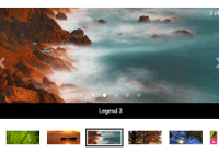
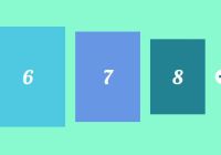
React Alice Carousel is a React component for building content galleries, content rotators and any React carousels.


Features of react-alice-carousel
- Infinite loop
- FadeOut animation
- AutoPlay mode
- Mobile friendly
- Responsive design
- Stage padding
- Swipe to slide
- Start index
- Slide to index
- RTL
- Auto Height
- Keyboard navigation
- Touch and Drag support
- Custom rendered slides
- Custom animation duration
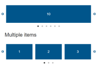
- Multiple items in the slide
- Show / hide anything (indicators, arrows, slides indexes)
- TypeScript type definitions
How to use
npm install react-alice-carousel --save-dev Style import
# SCSS @import "react-alice-carousel/lib/scss/alice-carousel.scss"; # CSS @import "react-alice-carousel/lib/alice-carousel.css"; # Webpack import "react-alice-carousel/lib/alice-carousel.css"; Quick start
import React from 'react'; import AliceCarousel from 'react-alice-carousel'; import "react-alice-carousel/lib/alice-carousel.css"; const Gallery = () => { const handleOnDragStart = e => e.preventDefault() return ( <AliceCarousel mouseDragEnabled > <img src="/img1" onDragStart={handleOnDragStart} className="yours-custom-class" /> <img src="/img2" onDragStart={handleOnDragStart} className="yours-custom-class" /> <img src="/img3" onDragStart={handleOnDragStart} className="yours-custom-class" /> <img src="/img4" onDragStart={handleOnDragStart} className="yours-custom-class" /> <img src="/img5" onDragStart={handleOnDragStart} className="yours-custom-class" /> </AliceCarousel> ) }Advanced configuration
Props
-
items: Array, default[]- gallery items, preferable to use this property instead ofchildren -
duration: Number, default250- Duration of slides transition (milliseconds) -
responsive: Object, default{}- Number of items in the slide{ 0: { items: 1 }, 1024: { items: 3 } } -
stagePadding: Object, default{}- Padding left and right on the stage{ paddingLeft: 0, // in pixels paddingRight: 0 } -
buttonsDisabled: Boolean,false- Disable buttons control -
dotsDisabled: Boolean,false- Disable dots navigation -
startIndex: Number,0- The starting index of the carousel -
slideToIndex: Number,0- Sets the carousel at the specified position -
swipeDisabled: Boolean, defaultfalse- Disable swipe handlers -
mouseDragEnabled: Boolean, defaultfalse- Enable mouse drag animationTo Avoid unexpected behavior you should handle
dragevent independently, something like in an example -
infinite: Boolean, defaulttrue- Disable infinite mode -
fadeOutAnimation: Boolean,false- Enable fadeout animation. Fired when 1 item is in the slide -
keysControlDisabled: Boolean, defaultfalse- Disable keys controls (left, right, space) -
playButtonEnabled: Boolean, defaultfalse- Disable play/pause button -
autoPlay: Boolean, defaultfalse- Set auto play mode -
autoHeight: Boolean, defaultfalse- Set auto height mode -
autoPlayInterval: Number, default250- Interval of auto play animation (milliseconds). If specified, a larger value will be taken from comparing this property and thedurationone -
autoPlayDirection: String, defaultltr- To run auto play in the left direction specifyrtlvalue -
disableAutoPlayOnAction: Boolean, defaultfalse- If this property is identified astrueauto play animation will be stopped after clicking user on any gallery button -
stopAutoPlayOnHover: Boolean, defaulttrue- If this property is identified asfalseauto play animation won't stopped on hover -
showSlideInfo: Boolean, defaultfalse- Show slide info -
preventEventOnTouchMove: Boolean, defaultfalse- Prevent the browser's touchmove event when carousel is swiping -
onSlideChange: Function - Fired when the event object is changing / returns event object -
onSlideChanged: Function - Fired when the event object was changed / returns event object -
onInitialized: Function - Fired when the gallery was initialized / returns event object -
onResized: Function - Fired when the gallery was resized / returns event objectEvent object example
{ item: index, // index of the current item`s position slide: index, // index of the current slide`s position itemsInSlide: number // number of elements in the slide } -
shouldHandleResizeEvent: Function - Fired during resize event to determine whether the event handler should be called / returns boolean
Methods
-
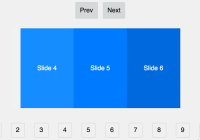
slideTo(index: number): Go to the specified slide -
slidePrev(): Go to the prev slide -
slideNext(): Go to the next slide
Examples
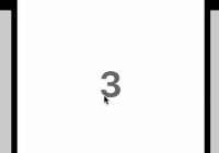
import React from 'react' import AliceCarousel from 'react-alice-carousel' import "react-alice-carousel/lib/alice-carousel.css" class Gallery extends React.Component { state = { galleryItems: [1, 2, 3].map((i) => (<h2 key={i}>{i}</h2>)), } responsive = { 0: { items: 1 }, 1024: { items: 2 }, } onSlideChange(e) { console.debug('Item`s position during a change: ', e.item) console.debug('Slide`s position during a change: ', e.slide) } onSlideChanged(e) { console.debug('Item`s position after changes: ', e.item) console.debug('Slide`s position after changes: ', e.slide) } render() { return ( <AliceCarousel items={this.state.galleryItems} responsive={this.responsive} autoPlayInterval={2000} autoPlayDirection="rtl" autoPlay={true} fadeOutAnimation={true} mouseDragEnabled={true} playButtonEnabled={true} disableAutoPlayOnAction={true} onSlideChange={this.onSlideChange} onSlideChanged={this.onSlideChanged} /> ) } }Custom Prev / Next buttons, dots / thumbs navigation:
- Using - refs.
import React from 'react' import AliceCarousel from 'react-alice-carousel' import "react-alice-carousel/lib/alice-carousel.css" class Gallery extends React.Component { items = [1, 2, 3, 4, 5] state = { galleryItems: this.items.map((i) => (<h2 key={i}>{i}</h2>)) } thumbItem = (item, i) => ( <span key={item} onClick={() => this.Carousel.slideTo(i)}>* </span> ) render() { return ( <div> <AliceCarousel dotsDisabled={true} buttonsDisabled={true} items={this.state.galleryItems} ref={(el) => (this.Carousel = el)} /> <nav>{this.items.map(this.thumbItem)}</nav> <button onClick={() => this.Carousel.slidePrev()}>Prev button</button> <button onClick={() => this.Carousel.slideNext()}>Next button</button> </div> ) } }- Using props
import React from 'react' import AliceCarousel from 'react-alice-carousel' import "react-alice-carousel/lib/alice-carousel.css" class Gallery extends React.Component { items = [1, 2, 3, 4, 5] state = { currentIndex: 0, responsive: { 1024: { items: 3 } }, galleryItems: this.galleryItems(), } slideTo = (i) => this.setState({ currentIndex: i }) onSlideChanged = (e) => this.setState({ currentIndex: e.item }) slideNext = () => this.setState({ currentIndex: this.state.currentIndex + 1 }) slidePrev = () => this.setState({ currentIndex: this.state.currentIndex - 1 }) thumbItem = (item, i) => <span onClick={() => this.slideTo(i)}>* </span> galleryItems() { return this.items.map((i) => <h2 key={i}> {i}</h2>) } render() { const { galleryItems, responsive, currentIndex } = this.state return ( <div> <AliceCarousel dotsDisabled={true} buttonsDisabled={true} items={galleryItems} responsive={responsive} slideToIndex={currentIndex} onSlideChanged={this.onSlideChanged} /> <ul>{this.items.map(this.thumbItem)}</ul> <button onClick={() => this.slidePrev()}>Prev button</button> <button onClick={() => this.slideNext()}>Next button</button> </div> ) } }Example for slidePrev/slideNext page
import React from 'react' import AliceCarousel from 'react-alice-carousel' import 'react-alice-carousel/lib/alice-carousel.css' class Gallery extends React.Component { state = { currentIndex: 0, itemsInSlide: 1, responsive: { 0: { items: 3 }}, galleryItems: this.galleryItems(), } galleryItems() { return ( Array(7).fill().map((item, i) => <h2 className="item">{i + 1}</h2>) ) } slidePrevPage = () => { const currentIndex = this.state.currentIndex - this.state.itemsInSlide this.setState({ currentIndex }) } slideNextPage = () => { const { itemsInSlide, galleryItems: { length }} = this.state let currentIndex = this.state.currentIndex + itemsInSlide if (currentIndex > length) currentIndex = length this.setState({ currentIndex }) } handleOnSlideChange = (event) => { const { itemsInSlide, item } = event this.setState({ itemsInSlide, currentIndex: item }) } render() { const { currentIndex, galleryItems, responsive } = this.state return ( <div> <AliceCarousel items={galleryItems} slideToIndex={currentIndex} responsive={responsive} onInitialized={this.handleOnSlideChange} onSlideChanged={this.handleOnSlideChange} onResized={this.handleOnSlideChange} /> <button onClick={this.slidePrevPage}>Prev Page</button> <button onClick={this.slideNextPage}>Next Page</button> </div> ) } }Build the project locally
Clone
git clone https://github.com/maxmarinich/react-alice-carousel cd react-alice-carousel Run
npm i npm start Test
npm test License
MIT