react-native-slideshow
A quick and easy slideshow for react native. (Android & iOS)


Installation
npm install react-native-slideshow --saveUsage
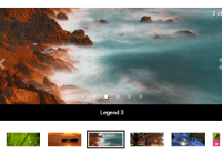
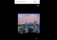
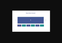
import Slideshow from 'react-native-slideshow'; // ... render() { return ( <Slideshow dataSource={[ { url:'http://placeimg.com/640/480/any' }, { url:'http://placeimg.com/640/480/any' }, { url:'http://placeimg.com/640/480/any' } ]}/> ); }Autoplay Example
export default class SlideshowTest extends Component { constructor(props) { super(props); this.state = { position: 1, interval: null, dataSource: [ { title: 'Title 1', caption: 'Caption 1', url: 'http://placeimg.com/640/480/any', }, { title: 'Title 2', caption: 'Caption 2', url: 'http://placeimg.com/640/480/any', }, { title: 'Title 3', caption: 'Caption 3', url: 'http://placeimg.com/640/480/any', }, ], }; } componentWillMount() { this.setState({ interval: setInterval(() => { this.setState({ position: this.state.position === this.state.dataSource.length ? 0 : this.state.position + 1 }); }, 2000) }); } componentWillUnmount() { clearInterval(this.state.interval); } render() { return ( <Slideshow dataSource={this.state.dataSource} position={this.state.position} onPositionChanged={position => this.setState({ position })} /> ); } }Props
| Property | Type | isRequired? | Default | Description |
|---|---|---|---|---|
dataSource | bool | required | - | slideshow data |
height | number | optional | 200 | container height |
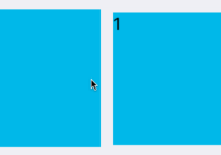
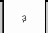
position | number | optional | - | set position slideshow |
scrollEnabled | bool | optional | true | enable / disable scrolling |
overlay | bool | optional | false | background overlay |
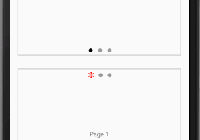
indicatorSize | number | optional | 16 | indicator size |
indicatorColor | string | optional | #CCCCCC | indicator color |
indicatorSelectedColor | string | optional | #FFFFFF | indicator selected color |
arrowSize | number | optional | 16 | arrow size |
arrowLeft | object | optional | - | component arrow left |
arrowRight | object | optional | - | component arrow right |
onPress | func | optional | - | returns an object image and index of image pressed |
onPositionChanged | func | optional | - | called when the current position is changed |
containerStyle | object | optional | - | custom styles for container |
Data Structure
// example data structure dataSource: [ { title: 'title 1', caption: 'caption 1', url: 'url 1', }, { title: 'title 1', caption: 'caption 1', url: 'url 2', }, ]| Property | Type | Description |
|---|---|---|
title | string | title |
caption | string | caption |
url | string / number | image (URL or a local file resource) |
Credits
License
MIT