jQuery Accordion
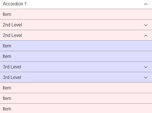
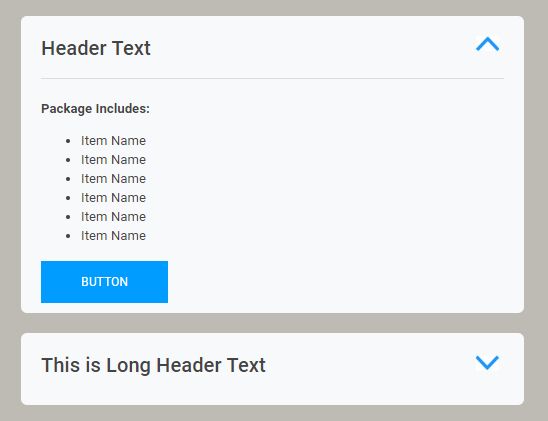
Responsive, CSS powered, jQuery accordion plugin.
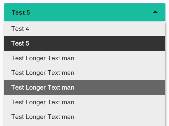
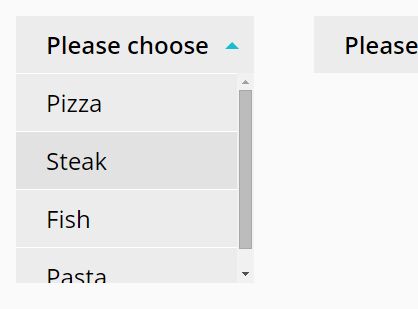
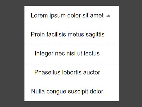
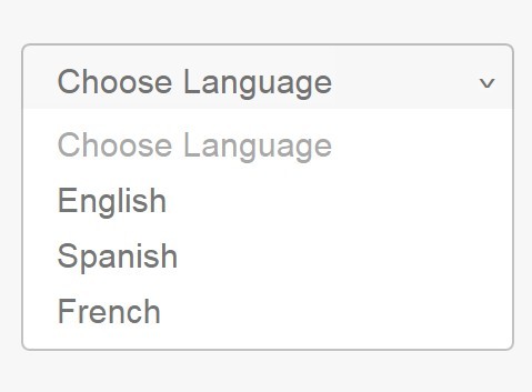
Jquery Accordion uses CSS transitions to animate opening/closing with a fallback to jQuery's animate when CSS transitions are not supported. It takes little configuration or code to use it on your project. Try out the demo.
Supports IE9+ and modern browsers.
Developed by @vctrfrnndz. Licensed under the MIT License.
Usage
$('.accordion').accordion({ "transitionSpeed": 400 });Options
| Name | Default | Type | Description |
|---|---|---|---|
| transitionSpeed | 300 | int | Transition speed on miliseconds. |
| transitionEasing | 'ease' | string | CSS value for easing. |
| controlElement | '[data-control]' | string | CSS selector for the element acting as a button. |
| contentElement | '[data-content]' | string | CSS selector for the element containing hide/show content. |
| groupElement | '[data-accordion-group]' | string | CSS selector for a parent element containing a group. |
| singleOpen | true | boolean | Opens a single accordion a time. |
Events
accordion.open fires when any accordion opens
accordion.close fires when any accordion closes
accordion.toggle toggles accordion open/close when triggered on a controlElement. This will not be triggered if it affects more than one accordion while singleOpenis enabled.
accordion.refresh manually refreshes the height of an accordion. Useful when adding elements to the accordion dynamically.
Sample Structure
For a simple accordion/dropdown, use the following structure/data-attributes:
<div data-accordion> <div data-control>Control</div> <div data-content> <div>Row</div> <div>Row</div> <div>Row</div> </div> </div>For a group of accordions, you can use the data-accordion-group attribute on a parent, this will allow you to activate/deactivate the single open behavior by setting singleOpen to true/false.
<div data-accordion-group> <div class="accordion" data-accordion> <div data-control>Control</div> <div data-content> <div>Row</div> <div>Row</div> <div>Row</div> </div> </div> <div class="accordion" data-accordion> <div data-control>Control</div> <div data-content> <div>Row</div> <div>Row</div> <div>Row</div> </div> </div> </div>Starting with opened state
To initialize the accordion with an open state just add the class .open to your accordion element.
<div data-accordion-group> <div class="accordion open" data-accordion> <div data-control>Control</div> <div data-content> <div>Row</div> <div>Row</div> <div>Row</div> </div> </div> </div>