react-native-swiper-animated
Tinder like animations swiper for React Native
ATTENTION! THIS PACKAGE IS CURRENTLY UNMAINTAINED!!
I am currently working on the v2, it's based on react-native-gesture-handler instead of RN's PanResponder. I will be more performant, cleaner and tested.
Installation
$ npm i react-native-swiper-animated --saveShots
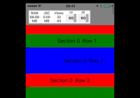
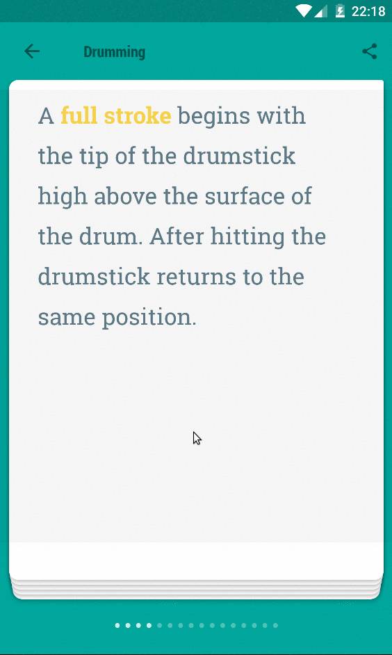
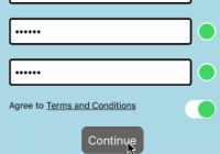
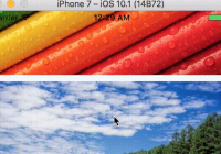
| Basic | Stack | Extended |
|---|---|---|
 |  |  |
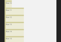
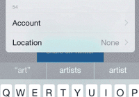
In Action
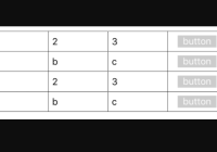
| Basic | Stack | Stack with default navigation |
|---|---|---|
 |  |  |
Basic Usage
import React from 'react'; import { Text, View, } from 'react-native'; import Swiper from 'react-native-swiper-animated'; const styles = { wrapper: { backgroundColor: '#009688', }, slide1: { flex: 1, justifyContent: 'center', alignItems: 'center', backgroundColor: '#e91e63', }, slide2: { flex: 1, justifyContent: 'center', alignItems: 'center', backgroundColor: '#673ab7', }, slide3: { flex: 1, justifyContent: 'center', alignItems: 'center', backgroundColor: '#3f51b5', }, text: { color: '#fff', fontSize: 30, fontWeight: 'bold', }, }; export default () => <Swiper style={styles.wrapper} smoothTransition loop > <View style={styles.slide1}> <Text style={styles.text}>Hello Swiper</Text> </View> <View style={styles.slide2}> <Text style={styles.text}>Beautiful</Text> </View> <View style={styles.slide3}> <Text style={styles.text}>And simple</Text> </View> </Swiper>; Examples
$ cd examples $ npm i $ react-native run-androidQuick start with examples.
Properties
Basic
| Prop | Default | Type | Description |
|---|---|---|---|
| smoothTransition | false | bool | If true, Swiper will only transit with minimal animations |
| loop | true | bool | Set to false to disable continuous loop mode. |
| index | 0 | number | Index number of initial slide. |
| stack | false | bool | Set to true to stack views |
| swiper | true | bool | Set to false to disable swiper (used when navigating using methods only) |
| swipeDirection | right | string | Set to left to move to next card on left swipe |
Custom
| Prop | Default | Type | Description |
|---|---|---|---|
| style | {...} | style | See default style in source. |
| swiperThreshold | 120 | number | Used to set swiper distance before transition |
| backPressToBack | true | bool | Set to false to disable previous card nagivation on back press |
| stackOffsetY | 3 | number | Set vertical offset |
| stackDepth | 5 | number | Set number of cards to display in card stack |
| scaleOthers | true | bool | Set to false to disable scaling of cards below the top card |
Pagination
| Prop | Default | Type | Description |
|---|---|---|---|
| showPagination | true | bool | Set to false to disable pagination |
| paginationDotColor | #C5C5C5 | string | In active pagination bullet color |
| paginationActiveDotColor | #4D4D4E | string | Active pagination bullet color |
| showPaginationBelow | false | bool | Set to true to render pagination below content |
| hidePaginationOnLast | false | bool | Set to true to hide pagination on last card |
| renderPagination | null | func | render custom pagination - calls func with (total, currentIndex) |
Toolbar
| Prop | Default | Type | Description |
|---|---|---|---|
| renderHeader | () => {} | func | called with the current index |
| react-native-material-ui was removed in version 1.5.0, you will have to call renderHeader to render a custom header |
Methods
forceLeftSwipe()
Swiper to left
forceRightSwipe()
Swiper to right
jumpToIndex(index: number)
Jump to a particular index
Development
$ cd examples $ npm i $ npm run watch $ react-native run-androidContribution
- @chitezh The main author.
Questions
Feel free to contact me or create an issue
Inspired by leecade/Swiper and Tinder swiper by @brentvatne


