react-native-multi-slider
Note: Anyone using RN <=0.18 should use version 0.2.5
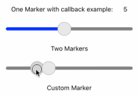
Pure JS react native slider component with one or two markers. Options to customise track, touch area and provide customer markers and callbacks for touch events and value changes.
Examples
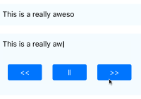
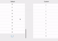
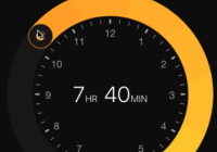
Open iOS/Slider.xcodeproj with Xcode, then press Cmd + R; you may edit index.ios.js to try building your own custom sliders. Feel free to make a PR if you are particularly proud of your slider and want it to feature. (Shortcut npm run open:xcode)
index.ios.js
Getting Started
Installation
$ npm i react-native-multi-slider --saveProperties
Basic Setup & Values
| Prop | Default | Type | Description |
|---|---|---|---|
| values | [0] | array | An array containing one or two values (determines one or two markers respectively) that are the initial marker values. Note these must be possible values from your set up. |
| min | 0 | number | Slider min value corresponding to far left |
| max | 10 | number | Slider max value corresponding to far right |
| step | 1 | number | The step size between values. Make sure min max range is divisible by this to get expected results |
| optionsArray | - | array | Array of values corresponding to the slider's position (left to right on slider index 0 to end respectively). Values of any type can be inserted and the slider will simply give them back in the callbacks |
Event Callbacks
| Prop | Default | Type | Description |
|---|---|---|---|
| onValuesChangeStart | console.log... | function() | Function to be called at beginning of press |
| onValuesChange | console.log... | function(valuesArray) | Function called after every change in value, with current values passed in as an array. |
| onValuesChangeFinish | console.log... | function(valuesArray) | Function called on end of press with final values passed in as an array |
Slider Boundaries
| Prop | Default | Type | Description |
|---|---|---|---|
| sliderLength | 280 | number | Width of track |
| touchDimensions | { height: 30, width: 30, borderRadius: 15, slipDisplacement: 30 }, | object | Area to be touched, should enclose the whole marker. Will be automatically centered and contain the marker. Slip displacement If finger leaves the marker measures distance before responder cuts out and changes are no longer registered, if not given marker will be active until pressed released. |
| sliderOrientation | horizontal | horizontal or vertical | TODO |
Custom Style
| Prop | Default | Type | Description |
|---|---|---|---|
| containerStyle | {height:30} | object | Style of sliders container, note be careful in applying styles that may affect the children's (i.e. the slider's) positioning |
| trackStyle | { borderRadius: 7, height: 3.5 } | object | Customise the track |
| selectedStyle | {backgroundColor: 'blue'} | object | Style for the track up to a single marker or between double markers |
| unselectedStyle | {backgroundColor: 'grey'} | object | Style for remaining track |
| markerStyle | { height:30, width: 30, borderRadius: 15, backgroundColor:'#E8E8E8', borderWidth: 0.5, borderColor: 'grey'} | object | Customise the marker's style |
| pressedMarkerStyle | {backgroundColor:'#D3D3D3'} | object | Style to be given to marker when pressed |
Questions & Suggestions
Feel free to create an issue x
