react-native-ezswiper


source is simple, easy to use card swiper for React Native on iOS&android.
Installation
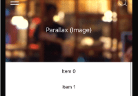
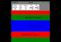
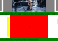
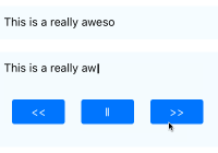
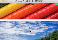
$ npm install react-native-ezswiper --save Preview


Usage
import library:
import EZSwiper from 'react-native-ezswiper';simple swiper
<EZSwiper style={{width: width,height: 150,backgroundColor: 'white'}} dataSource={['0', '1' ,'2','3']} width={ width } height={150 } renderRow={this.renderRow} onPress={this.onPressRow} />card swiper
<EZSwiper style={{width: width,height: 150,backgroundColor: 'white'}} dataSource={images} width={ width } height={150 } renderRow={this.renderImageRow} onPress={this.onPressRow} ratio={0.867} />advanced
<EZSwiper style={{width: width,height: 150,backgroundColor: 'white'}} dataSource={['0', '1' ,'2','3']} width={ width } height={150 } renderRow={this.renderRow} onPress={this.onPressRow} index={2} cardParams={{cardSide:width*0.867, cardSmallSide:150*0.867,cardSpace:width*(1-0.867)/2*0.2}} />vertical swiper
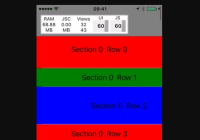
<EZSwiper style={{width: width,height: 200,backgroundColor: 'white'}} dataSource={['0', '1' ,'2','3']} width={ width } height={200 } renderRow={this.renderRow} onPress={this.onPressRow} ratio={0.867} horizontal={false} />API
Props
| key | type | default | description |
|---|---|---|---|
| width | PropTypes.number.isRequired | swiper width | |
| height | PropTypes.number.isRequired | swiper height | |
| index | PropTypes.number | 0 | initial index |
| offset | PropTypes.number | 0 | initial left and right or up and down offsets |
| horizontal | PropTypes.bool | true | swiper derection is horizontal |
| loop | PropTypes.bool | true | swiper is loop |
| autoplayTimeout | PropTypes.number | 5 | auto play mode (in second) |
| autoplayDirection | PropTypes.bool | true | cycle direction control |
| ratio | PropTypes.number | 1 | scaling ratio |
| cardParams | PropTypes.object | {} | swiper card advanced object |
| renderRow | PropTypes.func.isRequired | render card view | |
| onPress | PropTypes.func | card is clicked action | |
| onWillChange | PropTypes.func | next card will show | |
| onDidChange | PropTypes.func | next card showed |
cardParams is object:{cardSide,cardSmallSide,cardSpace}

Function
| function | description |
|---|---|
| scrollTo(index, animated = true) | scroll to position |
License
MIT License. © Zhu Yangjun 2017


