


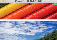
Demo

Installation
This package has a dependency of React Native Elements. Install RNE first with:
yarn add react-native-elements (make sure the version is 0.19.1)
Finally install this package using yarn or npm:
yarn add react-native-parallax-scrollview
Usage
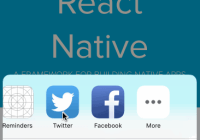
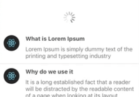
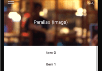
Default Profile Component
import ParallaxScrollView from 'react-native-parallax-scrollview'; <ParallaxScrollView />Default header view with custom User
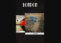
<ParallaxScrollView windowHeight={SCREEN_HEIGHT * 0.4} backgroundSource='http://i.imgur.com/UyjQBkJ.png' navBarTitle='John Oliver' userName='John Oliver' userTitle='Comedian' userImage='http://i.imgur.com/RQ1iLOs.jpg' leftIcon={{name: 'rocket', color: 'rgba(131, 175, 41, 1)', size: 30, type: 'font-awesome'}} rightIcon={{name: 'user', color: 'rgba(193, 193, 193, 1)', size: 30, type: 'font-awesome'}} />Default Header view & Custom ScrollView content
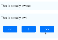
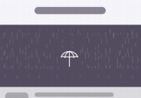
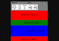
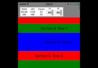
<ParallaxScrollView windowHeight={SCREEN_HEIGHT * 0.4} backgroundSource='http://i.imgur.com/UyjQBkJ.png' navBarTitle='John Oliver' userName='John Oliver' userTitle='Comedian' userImage='http://i.imgur.com/RQ1iLOs.jpg' leftIcon={{name: 'rocket', color: 'rgba(193, 193, 193, 1)', size: 30, type: 'font-awesome'}} rightIcon={{name: 'user', color: 'rgba(193, 193, 193, 1)', size: 30, type: 'font-awesome'}} > <ScrollView style={{flex: 1, backgroundColor: 'rgba(228, 117, 125, 1)'}}> <View style={{height: 300, justifyContent: 'center', alignItems: 'center'}}> <Text style={{fontSize: 32, color: 'white'}}>Custom view</Text> </View> <View style={{height: 300, justifyContent: 'center', alignItems: 'center'}}> <Text style={{fontSize: 32, color: 'white'}}>keep going.</Text> </View> <View style={{height: 300, justifyContent: 'center', alignItems: 'center'}}> <Text style={{fontSize: 32, color: 'white'}}>keep going..</Text> </View> <View style={{height: 300, justifyContent: 'center', alignItems: 'center'}}> <Text style={{fontSize: 32, color: 'white'}}>keep going...</Text> </View> <View style={{height: 300, justifyContent: 'center', alignItems: 'center'}}> <Text style={{fontSize: 32, color: 'white'}}>the end! :)</Text> </View> </ScrollView> </ParallaxScrollView>Custom Header view & ScrollView content
<ParallaxScrollView windowHeight={SCREEN_HEIGHT} backgroundSource='http://i.imgur.com/s4JEY9E.jpg' navBarTitle='Custom Title' navBarTitleColor='black' navBarColor='white' headerView={( <View style={styles.headerView}> <View style={styles.headerTextView}> <Text style={styles.headerTextViewTitle}>My App</Text> <Text style={styles.headerTextViewSubtitle}> Custom Header View </Text> </View> </View> )} leftIcon={{name: 'rocket', color: 'rgba(228, 117, 125, 1)', size: 30, type: 'font-awesome'}} leftIconOnPress={() => this.setState({index: (this.state.index + 1 ) % 3})} rightIcon={{name: 'user', color: 'rgba(228, 117, 125, 1)', size: 30, type: 'font-awesome'}} rightIconOnPress={() => this.setState({index: (this.state.index + 1 ) % 3})} > <ScrollView style={{flex: 1, backgroundColor: 'rgba(228, 117, 125, 1)'}}> <View style={{height: 300, justifyContent: 'center', alignItems: 'center'}}> <Text style={{fontSize: 32, color: 'white'}}>Custom view</Text> </View> <View style={{height: 300, justifyContent: 'center', alignItems: 'center'}}> <Text style={{fontSize: 32, color: 'white'}}>keep going.</Text> </View> <View style={{height: 300, justifyContent: 'center', alignItems: 'center'}}> <Text style={{fontSize: 32, color: 'white'}}>keep going..</Text> </View> <View style={{height: 300, justifyContent: 'center', alignItems: 'center'}}> <Text style={{fontSize: 32, color: 'white'}}>keep going...</Text> </View> <View style={{height: 300, justifyContent: 'center', alignItems: 'center'}}> <Text style={{fontSize: 32, color: 'white'}}>the end! :)</Text> </View> </ScrollView> </ParallaxScrollView>API
| prop | default | type | description |
|---|---|---|---|
| backgroundSource | {uri:http://i.imgur.com/6Iej2c3.png} | ImageSourcePropType | The background image for the header. The image source is (either a remote URL or a local file resource) backgroundSource={{uri:http://i.imgur.com/6Iej2c3.png}} or backgroundSource={require('./image.png')} |
| onBackgroundLoadEnd | none | callback | Callback function when the background finishes loading (either with success or failure) |
| onBackgroundLoadError | none | callback | Callback function when the background loading fails (an object is received with the error details) |
| windowHeight | SCREEN_HEIGHT * 0.5 | number | The height of the header window |
| navBarTitle | Katy Friedson | string | The title to be display on the NavBar header |
| navBarTitleColor | 'white' | string | Color of the navBar title when displayed |
| navBarColor | 'rgba(0, 0, 0, 1.0)' | string | Color of the navbar when shown |
| navBarHeight | 65 | number | Height of the navBar when displayed |
| navBarView | Left/Right Icons View | custom object | Pass in a custom object to override the default navigation bar view |
| userName | Katy Friedson | string | The user name displayed in the collapsable header view |
| userImage | http://i.imgur.com/uma9OfG.jpg | string | The user image displayed in the collapsable header view |
| userTitle | Engineering Manager | string | The user title displayed in the collapsable header view |
| headerView | Profile View | custom object | Pass in a custom object to override the default header view |
| leftIcon | none | object | Pass in the left icon name and type as an object. leftIcon={{name: 'rocket', color: 'red', size: 30, type: 'font-awesome'}} |
| leftIconOnPress | none | callback | Callback function when the left icon is pressed |
| leftIconUnderlayColor | 'transparent' | string | Underlay color for the left icon. |
| rightIcon | none | object | Pass in the right icon name and type etc as an object. rightIcon={{name: 'user', color: 'blue', size: 30, type: 'font-awesome'}} |
| rightIconOnPress | none | callback | Callback function when the right icon is pressed |
| rightIconUnderlayColor | 'transparent' | string | Underlay color for the right icon. |
| children | List View | React Components | Render any react views/components as children and these will be rendered below the headerView |
Try it out
You can try it out with Exponent here
Example
Look at the example folder to run the expo app locally.
Motivation
Currently there are a couple packages that provide a similar parallax Scrollview component (here and here) although both of them are not maintained and wasn't exactly what I was looking for.
So I challenged myself to create a Parallax ScrollView component (using react-native-parallax-view as a base) with
- Sticky NavBar Header
🎉 - An awesome default profile component that just works out of the box (
<ParallaxScrollView />) - Flexible and comprehensive API to use the ScrollView component for any use case.
aka it's a (Parallax) ScrollView component for React Native that we truly deserve
Feedback
This repo is being actively manitained. Feel free to open a new Issue with a Feature Request or submit a PR with an Enhancement.


