react-native-app-intro-slider
Easy-to-use yet very configurable app introduction slider/swiper based on FlatList
npm i react-native-app-intro-slider --save |  |
Table of contents
Usage
Basic example
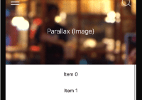
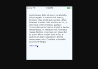
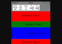
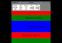
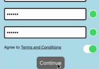
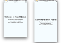
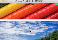
| No configuration | showSkipButton | bottomButton and showSkipButton |
|---|---|---|
 |  |  |
The component is based on FlatList so usage is very similar. Pass a data-array to AppIntroSlider along with a renderItem-function (or you can use the default basic layout).
import React from 'react'; import { StyleSheet } from 'react-native'; import AppIntroSlider from 'react-native-app-intro-slider'; const slides = [ { key: 'somethun', title: 'Title 1', text: 'Description.\nSay something cool', image: require('./assets/1.jpg'), backgroundColor: '#59b2ab', }, { key: 'somethun-dos', title: 'Title 2', text: 'Other cool stuff', image: require('./assets/2.jpg'), backgroundColor: '#febe29', }, { key: 'somethun1', title: 'Rocket guy', text: 'I\'m already out of descriptions\n\nLorem ipsum bla bla bla', image: require('./assets/3.jpg'), backgroundColor: '#22bcb5', } ]; export default class App extends React.Component { this.state = { showRealApp: false } _renderItem = (item) => { return ( <View style={styles.slide}> <Text style={styles.title}>{item.title}</Text> <Image source={item.image} /> <Text style={styles.text}>{item.text}</Text> </View> ); } _onDone = () => { // User finished the introduction. Show real app through // navigation or simply by controlling state this.setState({ showRealApp: true }); } render() { if (this.state.showRealApp) { return <App />; } else { return <AppIntroSlider renderItem={this._renderItem} slides={slides} onDone={this._onDone}/>; } } }Configuring buttons
import React from 'react'; import { Ionicons } from '@expo/vector-icons'; import { StyleSheet, View } from 'react-native'; import AppIntroSlider from 'react-native-app-intro-slider'; const styles = StyleSheet.create({ buttonCircle: { width: 40, height: 40, backgroundColor: 'rgba(0, 0, 0, .2)', borderRadius: 20, justifyContent: 'center', alignItems: 'center', }, image: { width: 320, height: 320, }, }); // slides = [...] export default class App extends React.Component { _renderNextButton = () => { return ( <View style={styles.buttonCircle}> <Ionicons name="md-arrow-round-forward" color="rgba(255, 255, 255, .9)" size={24} style={{ backgroundColor: 'transparent' }} /> </View> ); }; _renderDoneButton = () => { return ( <View style={styles.buttonCircle}> <Ionicons name="md-checkmark" color="rgba(255, 255, 255, .9)" size={24} style={{ backgroundColor: 'transparent' }} /> </View> ); }; render() { return ( <AppIntroSlider slides={slides} renderDoneButton={this._renderDoneButton} renderNextButton={this._renderNextButton} /> ); } }Custom slide layout
import React from 'react'; import { Ionicons } from '@expo/vector-icons'; import { StyleSheet, View, Text, Image } from 'react-native'; import { LinearGradient } from 'expo'; import AppIntroSlider from 'react-native-app-intro-slider'; const styles = StyleSheet.create({ mainContent: { flex: 1, alignItems: 'center', justifyContent: 'space-around', }, image: { width: 320, height: 320, }, text: { color: 'rgba(255, 255, 255, 0.8)', backgroundColor: 'transparent', textAlign: 'center', paddingHorizontal: 16, }, title: { fontSize: 22, color: 'white', backgroundColor: 'transparent', textAlign: 'center', marginBottom: 16, }, }); const slides = [ { key: 'somethun', title: 'Quick setup, good defaults', text: 'React-native-app-intro-slider is easy to setup with a small footprint and no dependencies. And it comes with good default layouts!', icon: 'ios-images-outline', colors: ['#63E2FF', '#B066FE'], }, { key: 'somethun1', title: 'Super customizable', text: 'The component is also super customizable, so you can adapt it to cover your needs and wants.', icon: 'ios-options-outline', colors: ['#A3A1FF', '#3A3897'], }, { key: 'somethun2', title: 'No need to buy me beer', text: 'Usage is all free', icon: 'ios-beer-outline', colors: ['#29ABE2', '#4F00BC'], }, ]; export default class App extends React.Component { _renderItem = props => ( <LinearGradient style={[ styles.mainContent, { width: props.width, height: props.height, }, ]} colors={props.colors} start={{ x: 0, y: 0.1 }} end={{ x: 0.1, y: 1 }} > <Ionicons style={{ backgroundColor: 'transparent' }} name={props.icon} size={200} color="white" /> <View> <Text style={styles.title}>{props.title}</Text> <Text style={styles.text}>{props.text}</Text> </View> </LinearGradient> ); render() { return <AppIntroSlider slides={slides} renderItem={this._renderItem} bottomButton />; } }Here a custom renderItem is supplied and the bottomButton-props has been set to true. Notice how the setup of slides has been configured to support icons and gradient backgrounds.
Props and options
The component extends FlatList so all FlatList-props are valid.
Configure looks
| Name | Type | Default | Description |
|---|---|---|---|
| skipLabel | string | Skip | Custom label for Skip button |
| doneLabel | string | Done | Custom label for Done button |
| nextLabel | string | Next | Custom label for Next button |
| prevLabel | string | Back | Custom label for Prev button |
| bottomButton | boolean | false | Enable to show a full-width button under pagination |
| buttonStyle | style | null | Styling of outer button component |
| buttonTextStyle | style | null | Styling of button text component |
| dotStyle | style | {backgroundColor: 'rgba(0, 0, 0, .2)'} | Style of inactive pagination dots |
| activeDotStyle | style | {backgroundColor: 'rgba(255, 255, 255, .9)'} | Style of active pagination dot |
| paginationStyle | style | null | Styling of the pagination dots |
| hidePagination | boolean | false | Enable to hide the pagination |
| renderNextButton | function | renders a Text-component | Use to supply your own next button |
| renderPrevButton | function | renders a Text-component | Use to supply your own prev button |
| renderDoneButton | function | renders a Text-component | Use to supply your own done button |
| renderSkipButton | function | renders a Text-component | Use to supply your own skip button |
| renderItem | function | renders DefaultSlide | (FlatList's renderItem)[https://facebook.github.io/react-native/docs/flatlist.html#renderitem]. Receives {item, index, dimensions} where dimensions contains height and width of the slides. |
Configure behavior
| Name | Type | Default | Description |
|---|---|---|---|
| slides | object | No default, required | An array of objects (they should either contain a unique key-prop or you should pass a keyExtractor-function to the component) |
| showSkipButton | boolean | false | Enable to show a skip button to the left of pagination dots. When bottomButton == true the skip button is a small text under the full-width next button |
| showPrevButton | boolean | false | Enable to show a previous button. If showSkipButton is true, the skip button will be displayed on the first page and prev button on subsequent one |
| showNextButton | boolean | true | Disable to hide the next button |
| showDoneButton | boolean | true | Disable to hide the done button |
| onSlideChange | function | void | Called when user goes changes slide (by swiping or pressing next/prev). Function called with arguments index: number, lastIndex: number |
| onDone | function | void | Called when user ends the introduction by pressing the done button |
| onSkip | function | Scroll the list to the end | Called when user presses the skip button |
Slide object
If you want to use the default slide layout, your slides can contain the following information:
| Name | Type | Note |
|---|---|---|
| title | string | The title |
| titleStyle | Style-prop | Styling for the title (e.g color, fontSize) |
| text | string | Main text of slide |
| textStyle | Style-prop | Styling for the text (e.g color, fontSize) |
| image | Image-source prop | Slide image |
| imageStyle | Style-prop | Styling for the image (e.g. size) |
| backgroundColor | string | Slide background color |
Methods
| Method Name | Arguments | Description |
|---|---|---|
| goToSlide | number | Change to slide with specified index |
| getListRef | none | Returns the Flat List ref |
Example
You can run the example Expo-app by cloning the repo:
git clone https://github.com/Jacse/react-native-app-intro-slider.git cd react-native-app-intro-slider/Example yarn yarn start


