----- NO LONGER MAINTAINED -----
Minimit Anima
Css3 transitions and transforms with jQuery with fallback for older browsers
It's built to have fast animation execution, and it has an api similar to jquery animate, with animations queueing.
By default the anima method do automatic fallback animations on browsers without transitions or transform3d, and instant animations on browsers without transform.
It also does scale, rotate and skew animations on browsers without transitions thanks to jquery.transform.js included in the plugin.
Browser support
IE8+, Firefox 3.5+, Safari 3+, Chrome, Ios, Android.
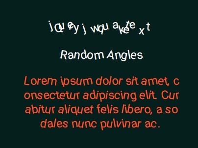
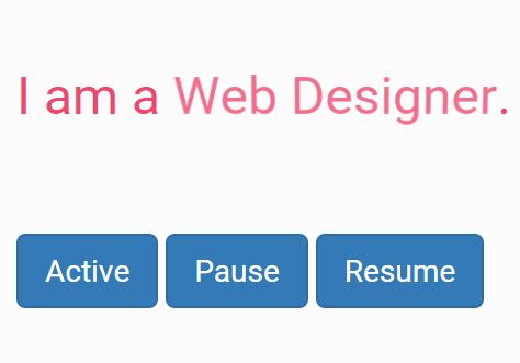
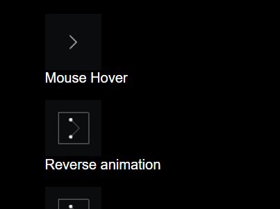
Demo
My website minimit.com and my twitter.
Install
Install with Bower bower install minimit-anima or download manually.
Api
Include minimit-anima after jQuery (v1.6.4+):
<script src='jquery.js'></script> <script src='minimit-anima.min.js'></script>Use the anima method to have automatic fallback:
anima(properties:object, duration:number, easing:string, options:object);Combine the anima3d method to execute animations only on browser with transitions and transform3d, with the anima2d method to execute animations on fallback browsers:
anima3d(properties:object, duration:number, easing:string, options:object); anima2d(properties:object, duration:number, easing:string, options:object);Use the stopAnima method to stop current running animations:
stopAnima(clearQueue:boolean, jumpToEnd:boolean);Use the delayAnima method to delay the animations queue:
delayAnima(time:number);Use the clearAnima method to clear the queued animations:
clearAnima();Parameters
Instant animations are default:
$(this).anima({x:20, y:20});You can specify a duration, default easing is "easeOut":
$(this).anima({x:20, y:20}, 400);You can specify a custom easing or a preset easing:
$(this).anima({x:20, y:20}, 400, ".19,1,.22,1"); $(this).anima({x:0, y:0}, 400, "linear");You can set a function to execute on animation complete:
$(this).anima({x:20, y:20}, 400, ".19,1,.22,1", {complete:function(){$(this).anima({x:-20, y:-20}, 400, "linear");}});You can skip instant animations on browser with no transforms support:
$(this).anima({x:20, y:20}, 400, ".19,1,.22,1", {skipInstant:true});The properties you can animate can be:
- any css, use string if it has a hypen like {"margin-top":20}
- any transform, like x, y, z, skew, skewX, skewY, scale, scaleX, scaleY, scaleZ, rotate, rotateX, rotateY, rotateZ, perspective
The easing property can be:
- a custom bezier, you can make your own at cubic-bezier.com.
- a preset, like linear, ease, easeIn, easeOut, easeInOut, easeInQuad, easeInCubic, easeInQuart, easeInQuint, easeInSine, easeInExpo, easeInCirc, easeInBack, easeOutQuad, easeOutCubic, easeOutQuart, easeOutQuint, easeOutSine, easeOutExpo, easeOutCirc, easeOutBack, easeInOutQuad, easeInOutCubic, easeInOutQuart, easeInOutQuint, easeInOutSine, easeInOutExpo, easeInOutCirc, easeInOutBack
Properties
####Css
You can animate any css (still have to test all) listed here:
$(this).anima({"padding-right":"20px", opacity:0.6}, 400);####Translate
Use translateX , translateY, or translateZ:
$(this).anima({translateX:20, translateY:20}, 400); // px is default unit $(this).anima({translateX:"0%", translateY:"0%"}, 400);Alternatively use the short syntax x , y, or z:
$(this).anima({x:20, y:20}, 400); // px is default unit $(this).anima({x:"0%", y:"0%"}, 400);####Scale
You can use scale, scaleX, scaleY or scaleZ:
$(this).anima({scaleX:0.6, scaleY:0.6}, 400); $(this).anima({scale:"1, 1"}, 400);####Rotate
You can use rotate, rotateX, rotateY or rotateZ:
$(this).anima({rotate:45}, 400); // deg is default unit $(this).anima({rotateX:"0deg"}, 400);####Skew
You can use skew, skewX or skewY:
$(this).anima({skewX:20, skewY:20}, 400); // deg is default unit $(this).anima({skew:"0deg, 0deg"}, 400);Utils
####Stop
Stop the current running animation:
$(this).anima({x:20}, 400); // this get stopped $(this).delayAnima(400).anima({y:20}, 400); $(this).stopAnima();Stop the current running animations and clear all delayed animations:
$(this).anima({x:20}, 400); // this get stopped $(this).delayAnima(400).anima({y:20}, 400); // this get cleared $(this).stopAnima(true);Stop the current running animations and jump to end:
$(this).anima({x:20}, 400); // this get stopped and jumped to end $(this).delayAnima(400).anima({y:20}, 400); $(this).stopAnima(false, true);####Delay
Delay the animations queue:
$(this).anima({x:20, y:0}, 400); $(this).delayAnima(400).anima({x:20, y:20}, 400); // this get delayed $(this).delayAnima(400).anima({x:0, y:20}, 400); // this get delayed####Clear
Clear all delayed animations that have not yet been run:
$(this).anima({x:20}, 400); $(this).delayAnima(400).anima({y:20}, 400); // this get cleared $(this).clearAnima();Advanced usage
####Fix chrome and safari flicker
Fix chrome 1 pixel shift and safari flicker:
$(this).css("backface-visibility", "hidden").css("perspective", "1000");####Hardware acceleration
Trigger hardware accelerated animations by adding the z and the perspective properties:
$(this).anima({x:200, z:0, perspective:1000}, 800);####Transform origin
You can set transform-origin on the element that you animate:
$(this).css("transform-origin","0% 0%"); $(this).anima({rotate:"45deg"}, 400);####3D and 2D
Do different animations based on browser support of transition and transform3d:
$(this).anima3d({rotateX:"100deg", rotateY:"100deg", rotateZ:"100deg"}, 400).anima2d({scale:0.6}, 400); $(this).anima3d({rotateX:"0deg", rotateY:"0deg", rotateZ:"0deg"}, 400).anima2d({scale:1}, 400);####Transform values retain
Since transform animations haven't persistent values, you have to include them in every anima if you want to retain the values:
$(this).anima({x:20, y:20}); $(this).anima({x:20, y:20, rotate:"40deg"}, 400);Or it will transform to the default value like this:
$(this).anima({x:20, y:20}); $(this).anima({rotate:"40deg"}, 400);####Perspective
Because browsers inconsistencies, use this syntax to avoid browser bugs:
- put the perspective css the animated elements and on parent elements
- put the perspective anima in all the animate (chrome and ie fix)
$(this).css("perspective", "100px"); $(this).parent().css("perspective", "100px"); $(this).anima({perspective:"100px", rotateX:"0deg", rotateY:"0deg"}); $(this).anima({perspective:"100px", rotateX:"180deg", rotateY:"0deg"}, 400); $(this).anima({perspective:"100px", rotateX:"180deg", rotateY:"180deg"}, 400);####Perspective origin
Because browsers inconsistencies, use this syntax to avoid browser bugs:
- put the perspective-origin css the animated elements and on parent elements
$(this).css("perspective-origin", "-20px 20px").css("perspective", "100px"); $(this).parent().css("perspective-origin", "-20px 20px").css("perspective", "100px"); $(this).anima({perspective:"100px", rotateX:"0deg", rotateY:"0deg"}); $(this).anima({perspective:"100px", rotateX:"180deg", rotateY:"0deg"}, 400); $(this).anima({perspective:"100px", rotateX:"180deg", rotateY:"180deg"}, 400);Acknowledgements
Copyright © 2013 Riccardo Caroli. Licensed under MIT license.
This plugin uses some open source code:
- Modernizr http://modernizr.com
- Bez http://github.com/rdallasgray/bez
- Transform http://github.com/louisremi/jquery.transform.js


