Ladda
Buttons with built-in loading indicators, effectively bridging the gap between action and feedback.
Installation
npm install ladda
Usage
CSS
You will need to include ONE of the two style sheets in the /dist directory. If you want the button styles used in the Ladda example page, use the ladda.min.css file. If you want to have the functional buttons without the visual style (colors, padding, etc.), use the ladda-themeless.min.css file.
HTML
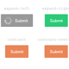
Ladda buttons must be given the class ladda-button and the button label needs to have the ladda-label class. The ladda-label will be automatically created if it does not exist in the DOM. Below is an example of a button which will use the expand-right animation style.
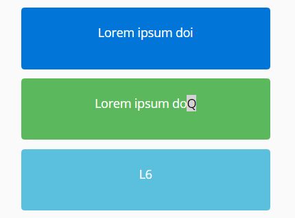
<button class="ladda-button" data-style="expand-right"><span class="ladda-label">Submit</span></button>Buttons accept the following attributes:
- data-style: one of the button styles, full list in demo [required]
- data-color: green/red/blue/purple/mint
- data-size: xs/s/l/xl, defaults to medium
- data-spinner-size: pixel dimensions of spinner, defaults to dynamic size based on the button height
- data-spinner-color: a hex code or any named CSS color
- data-spinner-lines: the number of lines the for the spinner, defaults to 12
JavaScript
Start by importing the Ladda module:
import * as Ladda from 'ladda';The following approach is recommended for JavaScript control over your buttons:
// Create a new instance of ladda for the specified button var l = Ladda.create( document.querySelector( '.my-button' ) ); // Start loading l.start(); // Will display a progress bar for 50% of the button width l.setProgress( 0.5 ); // Stop loading l.stop(); // Toggle between loading/not loading states l.toggle(); // Check the current state l.isLoading(); // Delete the button's ladda instance l.remove();To show the loading animation for a form that is submitted to the server (always resulting in a page reload) the bind() method can be used:
// Automatically trigger the loading animation on click Ladda.bind( 'button[type=submit]' ); // Same as the above but automatically stops after two seconds Ladda.bind( 'button[type=submit]', { timeout: 2000 } );Note: when using the bind() method on buttons that are inside a form, loading indicators will not be shown until the form is valid.
All loading animations on the page can be stopped by using:
Ladda.stopAll();Browser support
Ladda has been tested in Chrome, Firefox, Edge, and Internet Explorer 11. It also Should Work™ in Safari and Internet Explorer 10.
Note: Ladda 2.x is distributed as an ES6 module, but not all browsers support importing native ES6 modules. For full browser compatibility, use a module bundler such as Webpack or Rollup to create a production-ready code bundle.
Changelog
https://github.com/hakimel/Ladda/releases
License
MIT


