

html5tooltips.js
Tooltips, written in pure JavaScript, with smooth 3D animation implemented in CSS. No framework required. http://ytiurin.github.io/html5tooltipsjs
Install
npm install html5tooltipsjs or
bower install html5tooltipsjs Simple usage
The simplest way to tie a tooltip to a specific UI element is to add a data-* attribute to an element's HTML code.
<span data-tooltip="Refresh"></span>Add extra attributes to customize a tooltip.
<span data-tooltip="Refresh" data-tooltip-stickto="right" data-tooltip-color="bamboo" data-tooltip-animate-function="foldin"></span>Customization inheritance
To customize multiple tooltips with less of code, add a data-* attribute to their shared parent element (or document body).
<body data-tooltip-animate-function="foldin"> <div data-tooltip-color="bamboo"> <span data-tooltip="Build"></span> <span data-tooltip="Refresh"></span> <span data-tooltip="Delete"></span> </div> </body>Advanced usage
You may use a JavaScript constructor to abstract from your view layer.
html5tooltips({ animateFunction: "spin", color: "bamboo", contentText: "Refresh", stickTo: "right", targetSelector: "#refresh" });There is an extra feature in html5tooltips.js that allows to show extended text in the tooltip, when user focuses on input field and editable element. You can use plain text or HTML formatting.
html5tooltips({ contentText: "Not less then 8 symbols", contentMore: "Use lower and UPPER case letters, num<span style='color:red'>6</span>ers and spec<span style='color:red'>!</span>al symbols to make password safe and secure.", maxWidth: "180px", targetSelector: "#password" });Define multiple tooltips by passing an array of tooltip objects to the Javascript constructor.
html5tooltips([ { animateFunction: "spin", color: "#FF0000", contentText: "Refresh", stickTo: "right", targetSelector: "#refresh" }, { contentText: "Simple to remember", contentMore: "Check that your login name is not used by anyone else.", stickTo: "left", maxWidth: "180px", targetSelector: "#username" } ]);Styling
To modify tooltip presentation, simply apply styling to it's root element .html5tooltip-box. Properties background-color, color, border-radius, box-shadow, font-family and font-size will propogate to the tooltip text container and pointer.
.html5tooltip-box { background-color: #2A2A2A; border-radius: 2px; box-shadow: 0 0 0 1px rgba(255,255,255,.15), 0 0 10px rgba(255,255,255,.15); color: #F7F7F7; font-family: arial,sans-serif; font-size: 11px; font-weight: bold; }For Single Page Applications
Refresh tooltips when you update declarative announcement of tooltips or when DOM change, affecting tooltips target elements.
html5tooltips.refresh();HTML5Tooltip UI Component
var tooltip = new HTML5TooltipUIComponent; var target = document.getElementById("refresh"); tooltip.set({ animateFunction: "spin", color: "bamboo", contentText: "Refresh", stickTo: "right", target: target }); target.addEventListener('mouseenter',function(){ tooltip.show(); }); target.addEventListener('mouseleave',function(){ tooltip.hide(); }); tooltip.mount();Get a tooltip by the target element
var tooltip = html5tooltips.getTooltipByTarget(document.getElementById('myElement')); tooltip.destroy();List of possible parameters
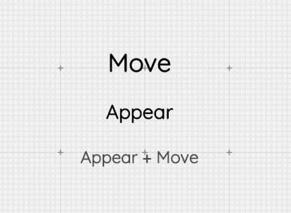
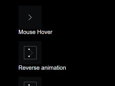
- animateFunction - Choose one of the available animate functions:
fadein,foldin,foldout,roll,scalein,slidein,spin. Default valuefadein. - color - Any CSS color or one of the predefined colors:
daffodil,daisy,mustard,citrus-zest,pumpkin,tangerine,salmon,persimmon,rouge,scarlet,hot-pink,princess,petal,lilac,lavender,violet,cloud,dream,gulf,turquoise,indigo,navy,sea-foam,teal,peacock,ceadon,olive,bamboo,grass,kelly,forrest,chocolate,terra-cotta,camel,linen,stone,smoke,steel,slate,charcoal,black,white,metalic-silver,metalic-gold,metalic-copper. - contentText - Text for a tooltip; HTML may be applied.
- contentMore - Text for the expanded version of a tooltip which shows up when focused on a target element; HTML may be applied.
- delay - Delay the tooltip show up in milliseconds. Default value is
500. - hideDelay - Delay the tooltip hide in milliseconds, if the tooltip is persistent. Default value is
300. - disableAnimation - Disable the animation:
trueorfalse. Default value isfalse. - maxWidth - The maximum width of the expanded version of the tooltip.
- persistent - If set to true, the tooltip will wait for
hideDelaynumber of milliseconds before hide. Default value isfalse. - stickTo - Choose one of the available stick values:
bottom,left,right,top. Default value isbottom. - stickDistance - The
numberof pixels that represent the distance between the tooltip and a target element. - targetSelector - A CSS selector which is used to catch a target element in the document.
List of possible data-* attributes
- data-tooltip - Value for the
contentTextparameter. - data-tooltip-animate-function - Value for the
animateFunctionparameter. - data-tooltip-disable-animation - Value for the
disableAnimationparameter. - data-tooltip-color - Value for the
colorparameter. - data-tooltip-delay - Value for the
delayparameter. - data-tooltip-hide-delay - Value for the
hideDelayparameter. - data-tooltip-maxwidth - Value for the
maxWidthparameter. - data-tooltip-more - Value for the
contentMoreparameter. - data-tooltip-persistent - Value for the
persistentparameter. - data-tooltip-stickto - Value for the
stickToparameter.
Browser compatibility
Tooltips are compatible with old browsers including IE7. Animation works in Chrome 1.0, Firefox 2.0, Internet Explorer 10, Opera 10.5, Safari 3.2.


