jQuery.slidizle (1.3.23)
This plugin allows you to create fully customizable slider. Slidizle is focused on managing your slider by just applying some classes on each of your html elements so you can have the full control over your slider look.
Install
You can download or clone the repo, or just use bower like this
bower install jquery.slidizle Demo
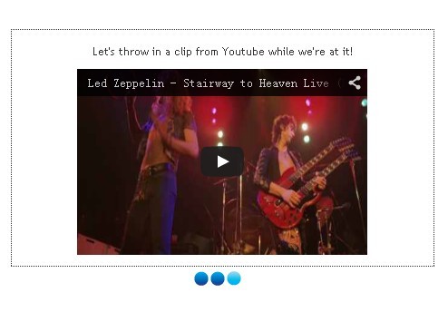
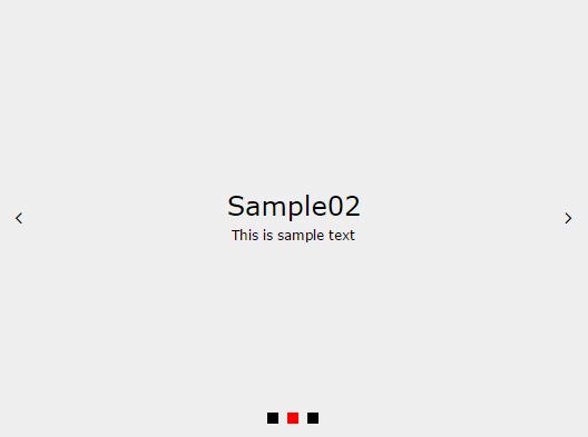
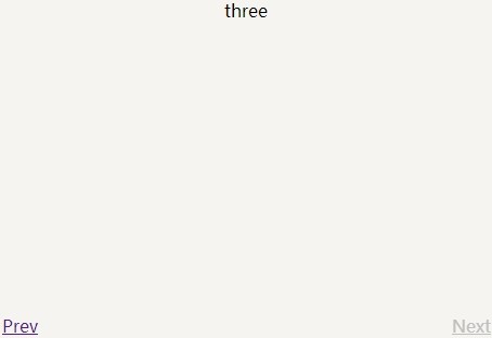
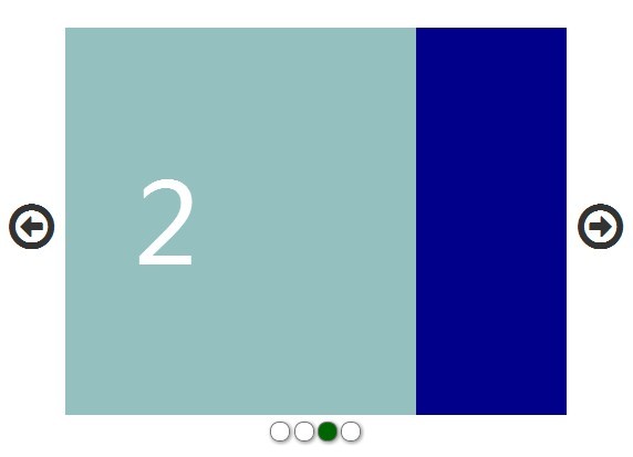
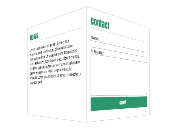
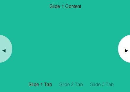
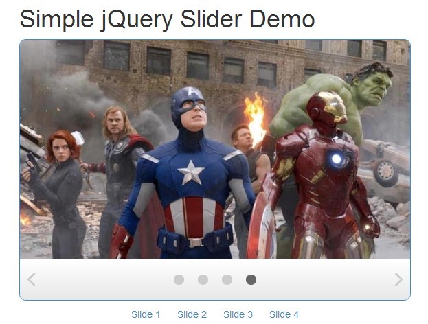
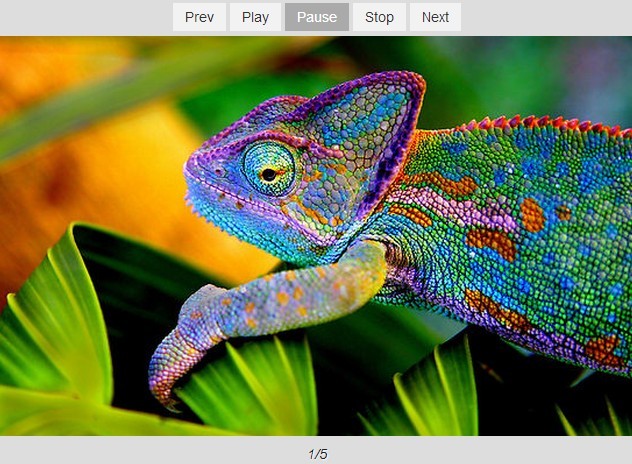
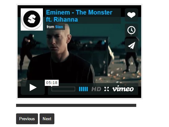
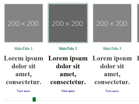
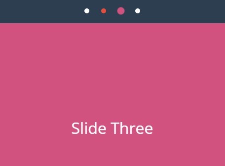
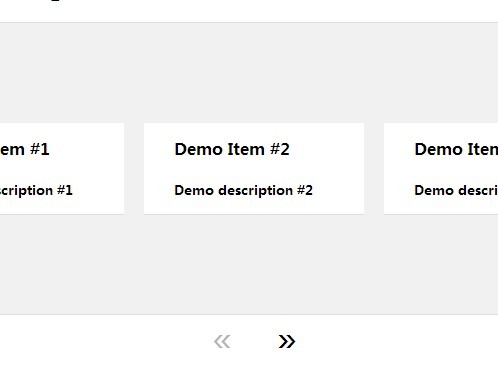
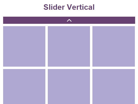
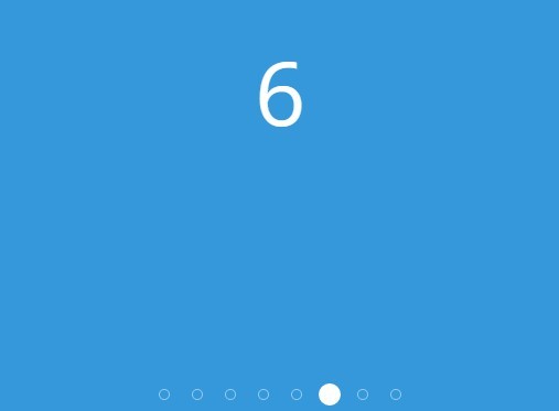
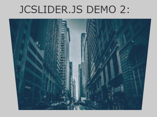
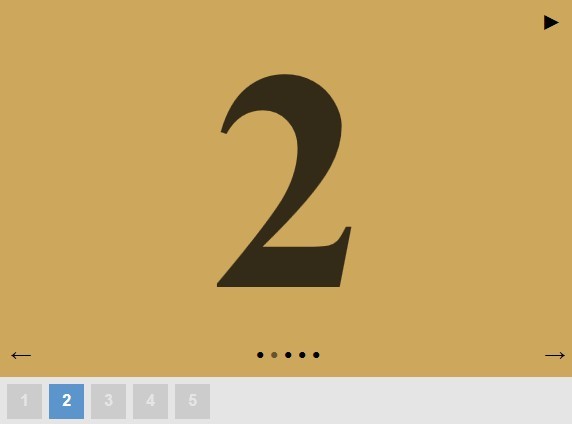
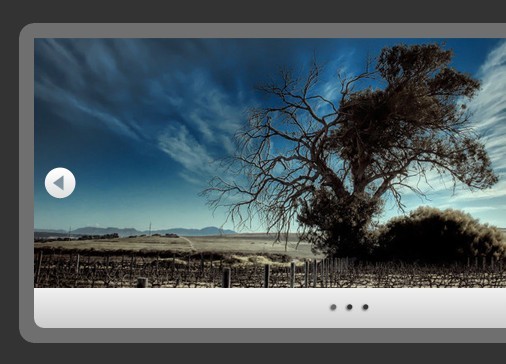
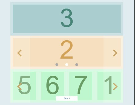
You can find some demos here : http://olivierbossel.github.io/slidizle/
Get Started
First, you need to include the scripts and css in your page
<script src="jquery.js"></script> <script src="jquery.slidizle.js"></script>The html part
You will need some html to describe your slider. This can be fully changed. You will just need the different slidizle attributes...
<div class="my-cool-slider" data-slidizle> <ul class="my-cool-slider-content" data-slidizle-content> <li class="my-cool-slide"> Hello world </li> <li class="my-cool-slide"> Hello world </li> <li class="my-cool-slide"> Hello world </li> </ul> <ul class="my-cool-navigation" data-slidizle-navigation> <!-- automagically filled with some li for your navigation --> <!-- can be custom too (cf. sample index.html) --> </ul> <button class="my-cool-next-button" data-slidizle-next>Next</button> <button class="my-cool-previous-button" data-slidizle-next>Previous</button> </div>The javascript part
Then, you have multiple options to use slidizle :
Use as a normal jQuery plugin
This is of course a jQuery plugin, so you can use it as it
jQuery(function($) { // init slidizle on all data-overlizle elements var $sliders = $('[data-slidizle]').slidizle(); // you can pass options directly at instanciation like this var $sliders = $('[data-slidizle]').slidizle({ pauseOnHover : true, timeout : 5000 // etc... }); // use the api through jquery element $sliders.filter(':first').slidizle('next'); // get the api from element and use it : var api = $sliders.filter(':first').data('slidizle_api'); api.next();Use as an object
You can also use slidizle as a "Class" directly in your javascript code. The dependence to jQuery remain of course...
// instanciate slidizle : var mySlider = new Slidizle($('#mySlider'), { timeout : 5000 // etc... }); // using the api : mySlider.goto(2); // go to slide with index 2 (mean third slide) // etc...The CSS part
This is totally under your control. You just need to know that slidizle will apply the classes described bellow on each elements of your slider.
Classes
There are the different classes that are applied on your html
Base classes
- slidizle : applied on the container
- slidizle-content : applied on the content container
- slidizle-slide : applied on each of your slides
- slidizle-next : applied on the next button
- slidizle-previous : applied on the previous button
- slidizle-navigation : applied on the navigation container
These classes are applied at the initialisation
States classes
There classes describe the state of your slider
- active : applied on the active slide
- loading : applied on the container and the slide that is currently loading
- forward : applied on the container when go forward
- backward : applied on the container when go backward
- disabled : applied on the next and previous element when need to be disabled
- played : applied on the container when the slider is in play mode
- paused : applied on the container when the slider is in pause mode
- stoped : applied on the container when the slider is in stop mode
- slide-{index} : applied on the container (slide-0, slide-1, etc...)
- loaded-slide-{index} : same as slide-{index} but applied only when the slide is loaded
- first : applied on the first slide
- last : applied on the last slide
- previous : applied on the previous slide
- next : applied on the next slide
- before-active : applied on all the slides that are before the active one
- after-active : opposite of before-active
Options
Here's the list of all the available options :
classes : { // class applied on content wrrapper content : 'slidizle-content', // class applied on next navigation element next : 'slidizle-next', // class applied on previous navigation element previous : 'slidizle-previous', // class applied on all slides that are before the active one beforeActive : 'before-active', // class applied on all slides that are after the active one afterActive : 'after-active', // class applied on the next active slide nextActive : 'next', // class applied on the previous active slide previousActive : 'previous', // class applied on container when the slider is in forward mode forward : 'forward', // class applied on container when the slider is in backward mode backward : 'backward', // class applied on navigation element navigation : 'slidizle-navigation', // class applied on timer element timer : 'slidizle-timer', // not documented // class applied on each slide slide : 'slidizle-slide', // class applied on the next and previous navigation, or the all slider when disabled disabled : 'disabled', // the class applied on container when the slider is at his first slide first : 'first', // the class applied on container when the slider is at his last slide last : 'last', // the play class applied on the container play : 'played', // the pause class applied on the container pause : 'paused', // the stop class applied on the container stop : 'stoped', // an class to access the slider slider : 'slidizle', // the className to add to active navigation, slides, etc... active : 'active', // the className to add to the slider and slides when it is in loading mode loading : 'loading' }, // the slider interval time between each medias timeout : null, // set if the slider has to make pause on mouse hover pauseOnHover : false, // set if the slider has to go next on mouse click nextOnClick : false, // set if the slider has to go first item when next on last loop : false, // set if the slider has to play directly or not if a timeout is specified autoPlay : true, // activate or not the keyboard keyboardEnabled : true, // activate or not the touch navigation for mobile (swipe) touchEnabled : true, // specify if need to load the next content before the transition loadBeforeTransition : true, // specify if the slider is disabled or not (can be a function that return true or false) disabled : false, // callback when the slider is inited onInit : null, // callback when a slide is clicked onClick : null, // callback before the slider change from one media to another beforeChange : null, // callback when the slider change from one media to another onChange : null, // callback after the slider change from one media to another afterChange : null, // callback before the slider begin to load the slide beforeLoading : null, // callback during the loading progress onLoading : null, // callback after the slider has loaded the next slide (before the actual change) afterLoading : null, // callback when the slider change for the next slide onNext : null, // callback when the slider change for the previous slide onPrevious : null, // callback when the slider change his state to play onPlay : null, // callback when the slider change his state to pause onPause : null, // callback when the slider resume after a pause onResume : null All the options can be set directly on the DOM element using the pattern : data-overlizle-{option-separated-with-dash}="{value}"
<div data-slidizle data-slidizle-pause-on-hover="true" data-slidizle-classes-loading="myLoadingClass"> <!-- slider content here... --> </div>
## Attributes
Slidizle provide some attributes that you need to apply on your different html elements in order to describe it. Here's the list
- data-slidizle-content : has to be applied on the element that contains your slides (slides need to be direct childs)
- data-slidizle-navigation : applied on the element where you need (or have) your navigation
- data-slidizle-next : make the marked element a trigger to go to the next slide
- data-slidizle-previous : make the marked element a trigger to go to the previous slide
- data-slidizle-slide-id="..." : link a slide with a navigation element (cf the doc bellow)
- data-slidizle-timeout="..." : has to be applied on a slide to specify a custom timeout (milisecond)
Events
Slidizle trigger some events that you can catch to make what you want at certain point of the code execution
- slidizle.init : when ready
- slidizle.beforeChange : before the change happens
- slidizle.change : when change to another slide
- slidizle.afterChange : after the change has been done
- sliditle.beforeLoading : before the loading of next slide is launched (if loadBeforeTransition is at true)
- sliditle.onLoading : during the loading of next slide (if loadBeforeTransition is at true)
- sliditle.afterLoading : after the loading of next slide is launched (if loadBeforeTransition is at true)
- slidizle.next : when go to the next slide
- slidizle.previous : when go to the previous slide
- slidizle.play : when pass in play mode
- slidizle.pause : when pass in pause mode
- slidizle.resume : when the slider get out of pause
- slidizle.stop : when pass in stop mode
- slidizle.click : when clicked on a slide
API
Slidizle expose a simple but powerful api :
next()
Go to next slide
previous()
Go to previous slide
goto( id )
id : can be an index of slide, an id (#myCoolSlide) or an slide-id (cf doc)
Go to a certain slide.
gotoAndPlay( id )
Same as goto but launch a play after
gotoAndStop( id )
Same as goto but launch a stop after
play()
This method is used to play the slider. This wotks only if a timeout is specified in settings
pause()
Pause the slider
stop()
Stop the slider
togglePlayPause()
Switch between play and pause state
getCurrentSlide()
Return the current slide
getNextSlide()
Return the next slide
getPreviousSlide()
Return the previous slide
getPreviousActiveSlide()
Return the previous active slide
getAllSlides()
Return all the slides
getLoadingProgress()
Return the loading progress of the next slide (will return 0 is the loadBeforeTransition setting is at false)
getRemainingTimeout()
Return the remaining timeout until the next slide change (only if a timeout is specified in settings)
getCurrentTimeout()
Return the current timeout in ms since the slide is active (only if a timeout is specified in settings)
getTotalTimeout()
Return the time that the active slide has to be displayed (only if a timeout is specified in settings)
isLast()
Return true if is the last slide active
isFirst()
Return true if is the first slide active
isLoop()
Return if the slider has to loop or not
isPlay()
Return if the slider is in play state
isDisabled()
Return if the slider is disabled or not
isPause()
Return if the slider is in pause state
isStop()
Return is the slider is in stop state
isHover()
Return if the mouse if hover the slider
getSettings
Return the settings of the slider
Advanced usage
These are some useful advanced usage of slidizle
Custom navigation
By default, slidizle will populate your data-slidizle-navigation with the corresponding child on witch the attribute is applied. But if this element is not empty, slidizle will take your elements as navigation.
<div class="my-cool-slider" data-slidizle> <ul class="my-cool-slider-content" data-slidizle-content> <li class="my-cool-slide"> Hello world </li> <li class="my-cool-slide"> Hello world </li> <li class="my-cool-slide"> Hello world </li> </ul> <ul class="my-cool-navigation" data-slidizle-navigation> <li>Navigation item 1</li> <li>Navigation item 2</li> <li>Navigation item 3</li> </ul> </div>By default, the element at index 0 will twigger the slide at index 0, etc... You can change that by using the data-slidizle-slide-id attribute like this
<div class="my-cool-slider" data-slidizle> <ul class="my-cool-slider-content" data-slidizle-content> <li class="my-cool-slide" data-slidizle-slide-id="my-first-slide"> Hello world </li> <li class="my-cool-slide" data-slidizle-slide-id="my-second-slide"> Hello world </li> <li class="my-cool-slide" data-slidizle-slide-id="my-third-slide"> Hello world </li> </ul> <ul class="my-cool-navigation" data-slidizle-navigation> <li data-slidizle-slide-id="my-second-slide">Navigation item 1 that trigger slide 2</li> <li data-slidizle-slide-id="my-first-slide">Navigation item 2 that trigger slide 1</li> <li data-slidizle-slide-id="my-third-slide">Navigation item 3 that trigger slide 3</li> </ul> </div>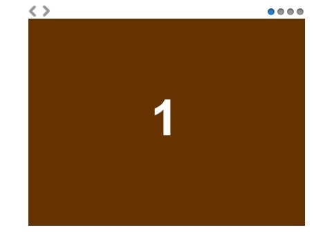


