gaBasicSlider
A vanilla JavaScript slider plug-in that's made to be styleable.
If you want to design your own slider and can build it in html and css, gaBasicSlider can animate it and give you API controls into your own design. See working example.
Contents
Noteworthy features:
- 1.8KB gzipped
- Touch support
- Parallax animation
- Move parts around to fit your design
- Infinite looping navigation
How it works
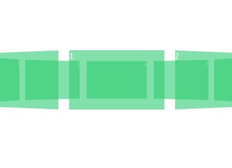
gaBasicSlider takes in markup that have a parent child relationship and animates them with a simple parallax effect. You can optionally pass in nodes for next and previous buttons. gaBasicSlider also takes in a node where it can either generate indicators or use your existing markup as indicators.
The slider markup
First let's look at the markup for the slider itself.
<!-- div --> <div id="slider" class="your-slider-styles"> <div>...</div> <div>...</div> <div>...</div> </div> <!-- or ul --> <ul id="slider" class="your-slider-styles"> <li>...</li> <li>...</li> <li>...</li> </ul>gaBasicSlider adds the minimum amount of CSS to position the slides on top of each other and to animate between them.
At this point we can turn the slider on with the following JavaScript.
<script> var params = { slider: document.getElementById('slider'), }; mySlider = new gaBasicSlider(params); </script>Next and previous buttons
I leave the position and look of these buttons entirely up to you, all gaBasicSlider does is add click handlers.
<div class="your-slider-wrapper"> <!-- buttons --> <button id="sliderPrevious" class="your-btn-styles">←</button> <button id="sliderNext" class="your-btn-styles">→</button> <!-- slider --> <ul id="slider" class="your-slider-styles"> <li>...</li> <li>...</li> <li>...</li> </ul> </div> <script> var params = { slider: document.getElementById('slider'), btnNext: document.getElementById('sliderNext'), // Next btnPrevious: document.getElementById('sliderPrevious'), // Previous }; mySlider = new gaBasicSlider(params); </script>Indicators
You can pass in an empty element where you want gaBasicSlider to genereate indicators.
<div id="sliderIndicators" class="your-indicator-styles"></div> <script> var params = { slider: document.getElementById('slider'), indicators: document.getElementById('sliderIndicators') // Indicators }; mySlider = new gaBasicSlider(params); </script>This is what the generated html will look like for a slider with three slides.
<div id="sliderIndicators" class="your-indicator-styles"> <span class="gabs-indicator gabs-active">•</span> <span class="gabs-indicator">•</span> <span class="gabs-indicator">•</span> </div>The class gabs-active is added to the active indicator.
Custom Indicators
All you need to do to use custom indicators is just create the markup for it inside your indicator element. When gaBasicSlider sees you've created markup for the indicators it will only attach click handlers. Note when using custom indicators your responsible for making sure the number of indicators match the number of slides.
<div id="slider-indicators" class="your-styles"> <!-- gaBasicSlider will use your indicators instead of creating it's own --> <span class="gabs-active">Custom Indicator 1</span> <span>Custom Indicator 2</span> <span>Custom Indicator 3</span> </div>The class gabs-active will be added to your custome indicators as well.
Simple API
Animation can be turned on and off using this simple API.
mySlider = new gaBasicSlider(params); mySlider.stop() // turn animation off mySlider.start() // turn animation onParameters
This table shows each gaBasicSlider parameter as well as the variable type of each parameter and what it's value will default to if omitted.
| Parameter | Type | Default |
|---|---|---|
| slider | Node | null |
| indicators | Node | null |
| btnNext | Node | null |
| btnPrevious | Node | null |
| animate | Boolean | true |
| animationDelay | Number (milliseconds) | 6000 |
| animationDuration | Number (milliseconds) | 300 |
Here is what it looks like when we set the options in JavaScript.
var params = { slider: document.getElementById('slider'), btnNext: document.getElementById('sliderNext'), btnPrevious: document.getElementById('sliderPrevious'), indicators: document.getElementById('sliderIndicators') }; mySlider = new gaBasicSlider(params);