KOslider
KOslider is a jQuery slider/carousel plugin that uses CSS3 transitions for its animation. It is named KOslider because it was initially used on a project with my Kickoff framework and uses the same [CSS class naming scheme](http://tmwagency.github.io/kickoff/learn/css.html#sts=CSS Naming scheme).
Getting the Library
Direct downloads
- Minified (2.36 kB gzipped)
- Unminified (11.19 kB gzipped)
Bower
bower install trak
NPM
npm install koslider --save
Usage
Include KOslider in your JavaScript bundle or add it to your HTML page like this:
<script type='application/javascript' src='/path/to/KOslider.js'></script>Usage
Include KOslider in your JavaScript bundle or add it to your HTML page like this:
<script type='application/javascript' src='/path/to/jquery-KOslider.js'></script>There are two ways to use KOslider: the data-koslider attribute or with the traditional jQuery plugin call $('.element').KOslider().
Example usage on an HTML element:
All options are defined using JSON. Please note that the initial opening quote on the data-koslider attr has a single quote. This means we can use double quotes within the options object.
<div data-koslider='{"dots":"true","arrows":"true","keys":"true","uiPosition":"above","debug":"true"}'> <ul class="KOslider unstyled clearfix"> <li class="KOslider-slide"> <h4>1This is the title</h4> <p>Lorem ipsum dolor sit amet, consectetur adipisicing elit. Id, eveniet, enim assumenda cum recusandae qui nemo facilis laboriosam numquam corrupti unde eligendi laudantium itaque. Est, fugit corrupti possimus itaque eligendi.</p> </li> <li class="KOslider-slide"> <h4>2This is the title</h4> <p>Lorem ipsum dolor sit amet, consectetur adipisicing elit. Id, eveniet, enim assumenda cum recusandae qui nemo facilis laboriosam numquam corrupti unde eligendi laudantium itaque. Est, fugit corrupti possimus itaque eligendi.</p> </li> </ul> </div>KOslider can also be called using standard jQuery syntax:
// Doc ready $(function(){ $('.slider').KOslider({ keys : true, uiPosition : "below", customPrevClass : "icon-arrow-previous", customNextClass : "icon-arrow-next", debug : true, itemWidth : "200px" }); });Default options:
"keys" : false, [boolean] keyboard shortcuts (boolean) "dots" : true, [boolean] display ••••o• pagination (boolean) "dotsClick" : false [boolean] enable clickable dots "arrows" : true, [boolean] display prev/next arrows (boolean) "sliderEl" : ".KOslider", [string] slides container selector "slide" : ".KOslider-slide", [string] slidable items selector "uiPosition" : "after", [string] Options: 'before', 'after' or 'over' "customPrevBtnClass" : undefined [string] Classname for prev button icon "customNextBtnClass" : undefined [string] Classname for next button icon "setHeight" : "auto" [string] "auto" = Change height of slides according to content; "equal" = equalise height of all slides; "none" = don't adjust height at all "equaliseEl" : undefined [string] Selector used to calculate equalised heights "debug" : false [boolean] Show debug info "autoplay" : false [boolean] autoplay the slider "autoplayInterval" : 4000 [integer] Change the autoplay speed "swipe" : false [boolean] enable swipe for touch "itemWidth" : undefined [string] define an element width instead of calculating it "inactiveClass" : "KOslider--inactive" [string] "activeClass" : "KOslider--active" [string] "callbacks" : undefined [object] Add custom callbacks Markup
Wrap your existing markup with an element. Add the data-koslider attribute if you want to use that implementation or just add a class so that you can select the element using jQuery.
<!-- Uses data-koslider with options --> <div data-koslider='{"dots":"true","arrows":"true","keys":"true","uiPosition":"above","debug":"true"}'> <ul class="slider clearfix"> <li class="slide"></li> <li class="slide"></li> <li class="slide"></li> </ul> </div> <!-- or --> <!-- Use traditional jQuery way to call plugin, see above --> <div class="KOsliderContainer"> <ul class="slider clearfix"> <li class="slide"></li> <li class="slide"></li> <li class="slide"></li> </ul> </div>Debugging
KOslider has debugging built-in. To use it, just set debug: true in the options and it will show various debug messages in your javascript console.
On-change callback
You can define an callback when the slides change. Add a callback method to the callbacks object in your options like below:
$('.slider').KOslider({ keys : true, callbacks: { onChange : function() { console.log('slider changed'); } } });Styling
KOslider does not try to style everything for you; there are no themes. Only the bare minimum is styled so that you can apply your own styles. Please see the source file for what to style.
/** * Next / previous buttons */ .KOslider-UI-btn { /* Styling for both buttons */ } .KOslider-UI-btn:hover { } .KOslider-UI-btn[disabled] { } .KOslider-UI-btn[disabled]:hover { } .KOslider-UI-btn--previous { } .KOslider-UI-btn--next { }Assumptions
This plugin assumes a few things so that it works properly:
- That you use some js to modify classes on the
<html>element to tell if js is available. It uses the Modernizr.no-js/.jsexample. This is done so that the slider can be styled well when js is unavailable. See our demo for an example of this without using Modernizr. - That you want resize events debounced. Included is a small script that allows resize events to be made more effecient.
Demo
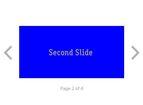
View the demo at http://codepen.io/mrmartineau/full/qEKNxN/


