#Ice Slider
###Multi-purpose highly customizable slider implementation of jquery.hammer.js
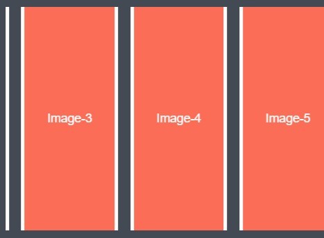
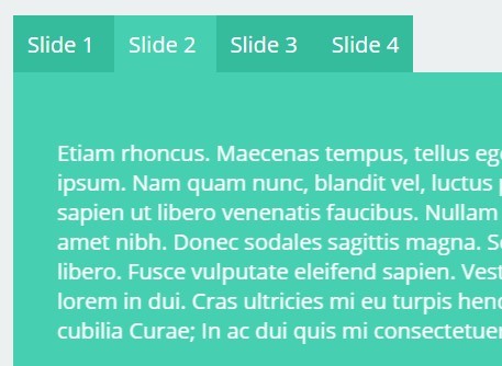
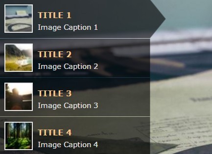
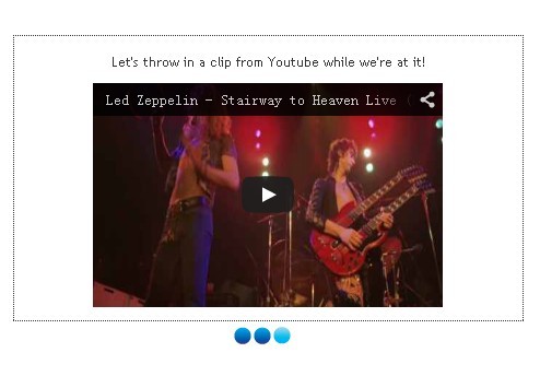
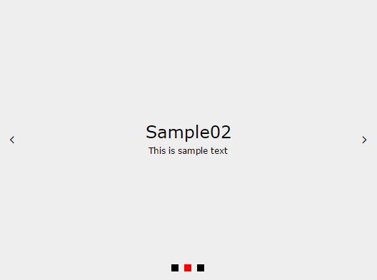
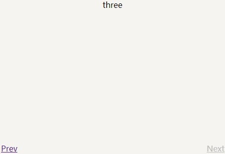
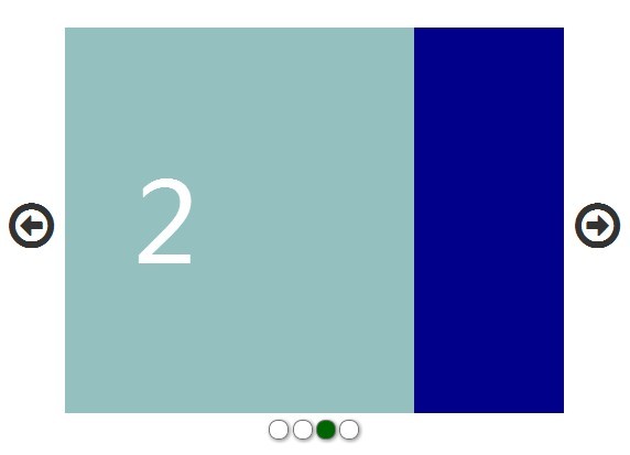
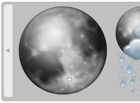
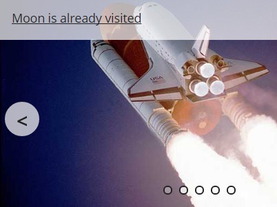
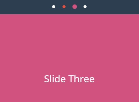
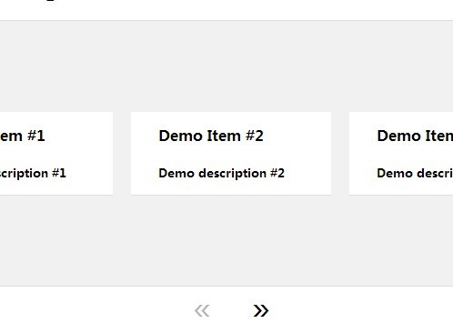
See the slider sample page at http://mv2sa.github.io/iceSlider keep scrolling for documentation
###Features:
- Touch events
- Mouse events
- Arrows
- Custom Classes for CSS
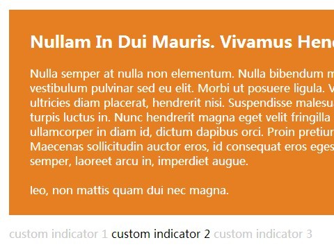
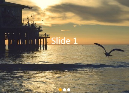
- Navigation Dots
- Bouncing
- CSS3 animation with js fallback
- Timed auto-slide with customizable options
- Disable slider in desktop sizes (nice for responsive design)
- More than 20 configurable settings, every setting is defaulted to optimal user experience, but very easy to change
- requireJS friendly, just need to add the define function
###The sample implementation is using HTML5 Boilerplate, with some tweaks
###Requirements for iceSlider:
- Jquery (http://jquery.com)
- modernizr (https://github.com/Modernizr/Modernizr)
- jquery.hammer.js (https://github.com/EightMedia/jquery.hammer.js)
###What is part of the iceSlider:
- js/iceSlider.js
- css/iceSlider.css
###Where can I see the javascript for this implementation:
- js/main.js
- or keep going down for the complete documentation
###Where can I see the HTML for this implementation:
- index.html
###Where can I see the CSS for this implementation:
- css/main.css
##Documentation
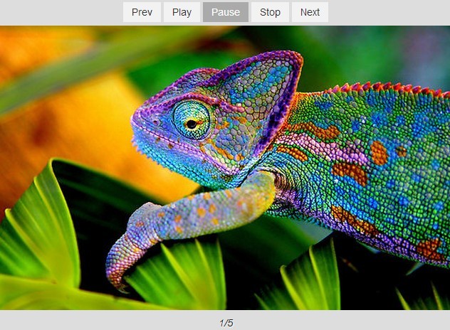
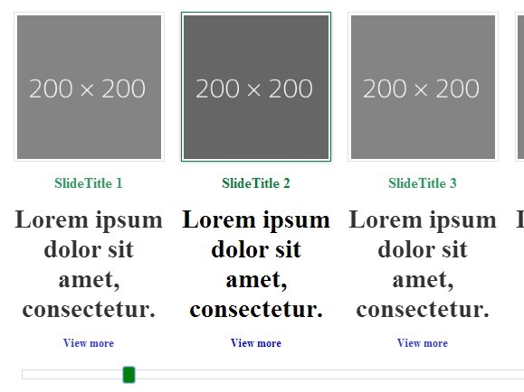
/* sample 1 */ slider = new iceSlider.hammerSlider({ /* Required */ wrapper : '#slider1Wrapper', container : '#slider1Container', item : '.slider1Item', /* optionals */ itemActiveClass : 'active', leftArrow : '#slider1ArrowL', rightArrow : '#slider1ArrowR', arrowInactiveClass : 'inactive', dots : '#slider1Dots', dotActiveClass : 'slider1-currentDot', autoSlide : true, setTime : 5000 }); slider.init(); /* sample 2 */ slider2 = new iceSlider.hammerSlider({ /* Required */ wrapper : '#slider2Wrapper', container : '#slider2Container', item : '.slider2Item', /* optionals */ itemSize : 85, desktop : false, centerItem : true }); slider2.init();###Comprehensive description of properties
-
wrapper
- Required
- accepts only an ID, jQuery style (#id)
- this should be the element that will define the size of the view and display on the active slide
- class hammer-set will be added to this element
-
container
- Required
- accepts only an ID, jQuery style (#id)
- this should be the element that will hold all items from the slider, and this is what will actually slide
-
item
- Required
- accepts only classes, jQuery style (.class).
- this should be applied for all items in the slider
-
itemActiveClass
- Optional
- Accepts only classes, non-jQuery style (class)
- Default value is hammer-currentItem
-
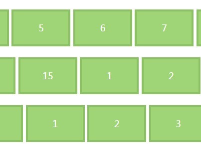
itemSize
- Optional
- Default value is 100
- Accepts a number, from 0 to 100
- This defines the size of each item in the slider in relation to the wrapper, 100 will be 100% of the wrapper, 80 will be 80%, and so on.
-
centerItem
- Optional
- Default value is false
- Accepts true or false
- In case that you defined an itemSize, this will determine if the items should be centralized (true) or to the left (false)
-
touchEvents
- Optional
- Default value is true
- Accepts true or false
- If set to false, touch events will be disabled, slider will still work with automatic transitions (autoSlide) or through the iceSlider methods (see methods next, prev and showPane in the methods section bellow)
-
desktop
- Optional
- Default value is true
- Accepts true or false
- If set to false, the slider will deactivate on desktop (768px). Touch events will turn off, values will be stored (for reference in case you go back to mobile) and removed, autoSlide will also be disabled, and through css, you can achieve a non-slider look and feel
-
dots
- Optional
- Default value is false
- Accepts false or an ID, jQuery style (#id)
- If an ID is defined, dots will be generated and used to navigate to different slides, works together with any other type of navigation already active
-
dotActiveClass
- Optional
- Default value is hammer-currentDot
- Accepts only classes, non-jQuery style (class)
- The dot representing the active slider will have this class applied to it, can be used for a visual reference of the active slide
-
oneItemDotHide
- Optional
- Default value is true
- Accepts true or false
- This will hide the dots in case of having a single slide, can be useful if your slider is dynamically generated
-
leftArrow
- Optional
- Default value is false
- Accepts false or an ID, jQuery style (#id)
- If set, this will create event listener to go to the previous slide
-
rightArrow
- Optional
- Default value is false
- Accepts false or an ID, jQuery style (#id)
- If set, this will create event listener to go to the next slide
-
arrowInactiveClass
- Optional
- Default value is arrowInactiveClass
- Accepts only classes, non-jQuery style (class)
- Will add the class to the arrows, in case that it is the first, last, or there is only a single slide, useful to indicate that no action will be performed in the arrow at the time
-
autoSlide
- Optional
- Default value is false
- Accepts true or false
- If true, the slider will automatically move to the next slide in a time interval (see setTime property)
-
setTime
- Optional
- Default value is 8000 (8 seconds)
- Accepts a number representing milliseconds
- This defines the time interval for the autoSlide
-
autoSlideInterruption
- Optional
- Default value is true
- Accepts true or false
- If true, the autoSlide will pause if user hovers over it, or will deactivate if the user interacts in any way (touch events, arrows or dots), creates a less frustrating UX
-
animation
- Optional
- Default value is auto
- Accepts auto, js or CSS
- This will define the type of animation that the slider will use, CSS will use either translate or translate3d depending on browser support, is recommended to keep it at auto
-
animationClass
- Optional
- Default value is hammer-animate
- Accepts only classes, non-jQuery style (class)
- This will define the CSS animation specifics, easing and timing
-
onInitCallback
- Optional
- Default value is false
- Accepts a function (doSomething)
- The callback will run as soon as the slider is ready
-
onUpdateCallback
- Optional
- Default value is false
- Accepts a function (doSomething)
- The callback will run when the slider finishes updating (see the update method in the methods section bellow)
-
onResizeCallback
- Optional
- Default value is false
- Accepts a function (doSomething)
- The callback will run when the slider finishes readjusting it size, happens everytime there is window resize event
###Comprehensive description of methods
- init
- Start the slider after defining it properties
- Sample:
slider = new iceSlider.hammerSlider({ ... }); slider.init();- prev
- Goes to the previous slide
- Sample:
slider.prev();- next
- Goes to the next slide
- Sample:
slider.next();- showPane
- Goes to a specific slide
- Starts at 0, so slider 1 will be 0, 2 will be 1, and so on
- Sample:
slider.showPane(2);- update
- After removing or adding slides, this method will update iceSlider internal values and calculations, to take in account the new quantity of items
- Sample:
$('#sliderContainer').append('<article class="sliderItem">...</article>'); slider.update();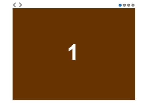


