TootleTips v0.1
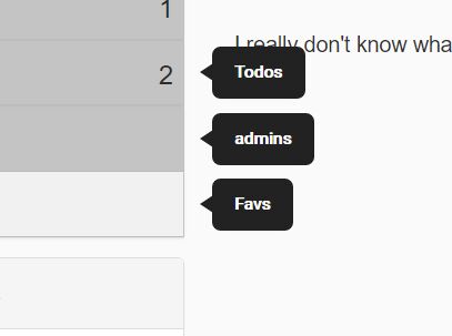
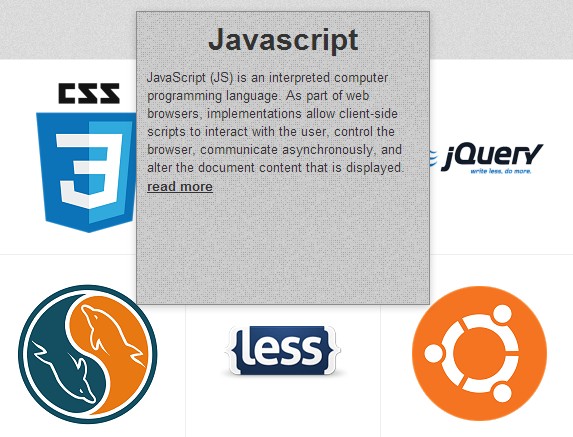
This is a small jquery plugin that helps you add functionality for tooltips in your web sites or applications. It's really flexible as it uses CSS3 transitions and falls back to in-built jQuery animation for non-supporting browsers. It renders really well and quickly too!
Download TootleTips Zip Archive
Details
- Release Version: 0.1
- Browser Support: IE6-11, FF3.6-36, CRM3-32, SAF3-5, Opera7-*
- Known Issues: None that i know of
- Change Log: ehhm... this is the first version so no change logs yet
How to use
Install the jquery script into your page using the script tag or script loaders like (curl.js, require.js, script.js) and then include the tootletips plugin script into the page.
<head> <!-- asumming a production environment here --> ... <script type="text/javascript" src="/path/to/library/jquery.1.10.1.min.js"></script> <script type="text/javascript" src="/path/to/plugin/tootletips.min.js"></script> ... </head> To activate the script, include the following code within the page ready event callback for jQuery
<script> $(document).ready(function(){ $("[title]").tootletip({ showTip:true, preferedPosition:"left", resetPosition:true }) }); </script> Option Settings for Tootletips
There are a couple of option settings which you can pass to TootleTips while activating it and they are as listed below
- showTip (Type: Boolean | DefaultValue:
false) - resetPosition (Type: Boolean | DefaultValue:
false) - eventsTriggerIn (Type: String | DefaultValue:
"") - eventsTriggerOut (Type: String | DefaultValue:
"") - preferedPosition (Type: Mixed | DefaultValue:
"bottom") - attributes (Type: Array | DefaultValue:
["title"]) - tipEvents (Type: Object | DefaultValue:
{onFinishIn:function(){}, onFinishOut:function(){}}) - delay (Type: Number | DefaultValue:
0)
| showTip
The arrow on the tooltip doesn't show up by default. So, you'll have to activate it by setting this option to true.
| resetPosition
The default behaviuor of TootleTips is to ignore window resizes and viewport edge restrictions and element offset modifications due to scrolling. You can modify this behaviour by setting this option to true.
| eventsTriggerIn
This option is used to specify which DOM events are necessary to trigger the tooltip to show up on the screen. Apart from being one single event, it can also be a series of different events delimeted by a single space. e.g "mouseenter keypress"
| eventsTriggerOut
This option is jsut the opposite of eventsTriggerIn which determines what DOM events will trigger the tooltip to disappear from the screen. e.g "blur"
| preferedPosition
This option is used to indicate which side of the target element you prefer the tooltip to appear on. In other words, the 'prefered' position. You can either set this option to a string or to an object literal. there are only four possible values for this option as a string ("left", "right", "top", "bottom"). As an object literal, all keys of the object literal should be set to a valid DOM element selector string for the elements you wish to target and all values (for each key) should be set to either of the four values ("left", "right", "top", "bottom").
| attributes
This option makes it easy enough to use other attributes as content holders for the tooltips' content. Apart from the default 'title' attribute being used, you could choose to use your own custom attribute(s) whereever needed. Setting this option to an empty array does you no good though ;)
| tipEvents
This option creates a way for you to bind callbacks to the transitions of the tooltip.
| delay
This option is used to indicate the number of milliseconds to wait before showing the tooltip and hiding it.
