bootstrap-progressbar - 0.9.0
bootstrap-progressbar is a jQuery plugin which extends the basic twitter-bootstrap progressbar. It provides the ability to animate the progressbar by adding Javascript in combination with the preexisting css transitions. Additionally you can display the current progress information in the bar or get the value via callback.
What's new in v0.9.0?
- Fix #49 runtime option override support
- Fix #48 extend bower.json
Note: this version replaces the not official supported
aria-valuetransitionsgoalwithdata-transitionsgoalwhich may affect (or brick) your progressbars.
Note: Bootstrap's low percentage styles (introduced in 3.2.0) causes flickering under some circumstances (e.g. slow transitions). To preserve correct progressbar functionality + appearance this bs feature is reverted in v0.8.3. (and reverted by bootstrap in 3.3.0)
Note: Stacked progressbars are not supported by now.
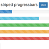
Demo
Installation
- Download the latest release: v0.9.0
- Clone the repository:
git clone [email protected]:minddust/bootstrap-progressbar.git - Install with Bower:
bower install bootstrap-progressbar
Usage
-
include
bootstrap-progressbar.js<script type="text/javascript" src="bootstrap-progressbar.js"></script>
-
activate
bootstrap-progressbarfunctionality on progressbars of your choice:$('.progress .bar').progressbar(); // bootstrap 2 $('.progress .progress-bar').progressbar(); // bootstrap 3
-
set the
ariaattribute and remove thewidthstyle attribute (alternatively you can set it to 0)-
data-transitiongoal<div class="progress"> <div class="progress-bar" data-transitiongoal="75"></div> </div>
-
aria-valuemin(default: 0) andaria-valuemax(default: 100)<div class="progress"> <div class="progress-bar" data-transitiongoal="75" aria-valuemin="-1337" aria-valuemax="9000"></div> </div>
-
Usage Extended
-
Do I need the additional style file?
-
for the horizontal bar with no or filled text: NO
-
for any vertical bars or the horizontal bar with centered text or right aligned bar: YES
less:
<link rel="stylesheet/less" type="text/css" href="bootstrap-progressbar.less"> <script src="less.js" type="text/javascript"></script>
or precompile it yourself. (see: 3rd party compilers)
scss:
- need to precompile it yourself (see: libsass)
css:
<link rel="stylesheet" type="text/css" href="bootstrap-progressbar.css">
you can find your needed css, less or scss files inside the specific subdirectories.
-
-
Multiple trigger
You can trigger progressbar as much as you want. Just change your attribute(s) and trigger
.progressbar()again. All settings made before will be kept.
Settings
default values
Progressbar.defaults = { transition_delay: 300, refresh_speed: 50, display_text: 'none', use_percentage: true, percent_format: function(percent) { return percent + '%'; }, amount_format: function(amount_part, amount_total) { return amount_part + ' / ' + amount_total; }, update: $.noop, done: $.noop, fail: $.noop };transition_delay
Is the time in milliseconds until the animation starts.
This could be useful to delay the start on the initial page load like:
$(document).ready(function() { $('.progress .progress-bar').progressbar({ transition_delay: 1500 }); });refresh_speed
Is the time in milliseconds which will elapse between every text refresh, aria-valuenow attribute update and update callback call.
display_text
Determines if and where to display text on the progressbar. Possible options:
noneno textfilltext on filled barcentertext on center (this mode changes css / html due to styling requirements)
use_percentage
If text will be displayed - this option determines whether to show the percentage value or the amount.
So if use_percentage is false and aria-valuemin and aria-valuemax are not set (or to 0 and 100) the value will be the same but amount_format will be used to format the result.
Example:
<div class="progress-bar" data-transitiongoal="75">
with use_percentage: true is the final text: 75%
with use_percentage: false is the final text: 75 / 100
percent_format
Is a function which returns the text format for progressbar with use_percentage: true.
It takes 1 argument which is the current percent value.
amount_format
Is a function which returns the text format for progressbar with use_percentage: false.
It takes 3 argument which are the current-, the max- and the min-amount.
update
Is a callback function which will be called while the progressbar is transitioning ;)
Depends on refresh_speed.
It takes 2 argument which is the current percent value and a reference to the attached progressbar element.
done
Is a callback function which will be called when the transition process is done.
It takes 1 argument which is a reference to the attached progressbar element.
fail
Is a callback function which will be called when an error occurs.
It takes 1 argument which is the error message.
Customisation
alignment
-
to use a horizontal progressbar which is align to the right you have to add
rightto theprogresselement.<div class="progress right">
-
to use a vertical progressbar you have to add
verticalto theprogresselement.<div class="progress vertical">
-
to use a vertical progressbar which is align to the bottom you have to add
verticalandbottomto theprogresselement.<div class="progress vertical bottom">
animation
to change the animation itself you have to overwrite either less or css
-
horizontal
-
less
.progress .bar { .transition(width 2s ease-in-out); }
-
scss
.progress.vertical .progress-bar { @include transition(width 2s ease-in-out); }
-
css
.progress .bar { -webkit-transition: width 2s ease-in-out; -moz-transition: width 2s ease-in-out; -ms-transition: width 2s ease-in-out; -o-transition: width 2s ease-in-out; transition: width 2s ease-in-out; }
-
-
vertical
-
less
.progress.vertical .bar { .transition(height 2s ease-in-out); }
-
scss
.progress.vertical .bar { @include transition(height 2s ease-in-out); }
-
css
.progress.vertical .bar { -webkit-transition: height 2s ease-in-out; -moz-transition: height 2s ease-in-out; -ms-transition: height 2s ease-in-out; -o-transition: height 2s ease-in-out; transition: height 2s ease-in-out; }
-
Known Problems
- Looks like iOS Safari is flooring the width of the transition. So if you want to display text with a correct value you have to use a full bar width greater or equal 100px.
Copyright and license
Copyright 2013-2015 Stephan Groß, under MIT license.
Want to appreciate my work? minddust at Gittip
