#Tip Cards by Pete R. Create an animated card layout that let your viewer flip through it like you see on Google Tips Page.
Created by Pete R., Founder of BucketListly

Demo
Compatibility
Modern browsers such as Chrome, Firefox, and Safari on desktop have been tested. I have not tested this on IE.
Basic Usage
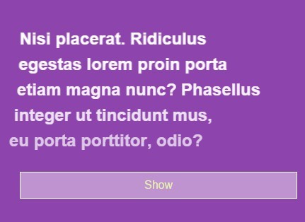
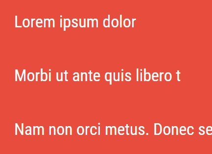
Tip Cards plugin let you create a layout of cards with a card-like interaction that you see on Google Tips Page. I've also added several new animation options so that you can personalize it to your own liking.
To add this to your website, all you have to do is include the latest jQuery library together with jquery.tip_cards.js and tip_cards.css into your document's <head>, and follow the HTML markup as shown below:
2 Sides Flippable HTML Markup
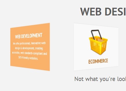
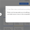
This is the default markup if you are looking to replicate the effect you see on Google Tips Page.
<body> .. <ul class="tips"> <li> <div class="tc_front"> <a href="#tip1">...</a> </div> <div class="tc_back">...</div> <div id="tip1" class="tip"> <div class="tc_front">...</div> <div class="tc_back">...</div> </div> </li> .. </body>Note: If you would like the card to be flippable, the html markup above will work perfectly. The content inside tc_front will be the front side of the card and the content inside tc_back will be the back side of the card.
Normal HTML Markup
If you DO NOT want it to be flippable then take out all the tc_front and tc_back as shown below and your card will no longer be flippable.
<body> .. <ul class="tips"> <li> <a href="#tip1">...</a> <div id="tip1" class="tip"> ... </div> </li> .. </body>Once that is done, simply call the function like below and the plugin will automatically detect whether to make the card flippable or not from the markup you provided:
$(".tips").tip_cards({ entrance: "bottom", // This option let you determine the direction of the fly in entrance animation when all the cards appears. Available options are "bottom", "left", "right", and "top". The default value is "bottom". column: 4, // The plugin also let you define how the card will be displayed and aligned. You can set the column of cards here. The default value is 4. margin: "1%", // You can define the margins between each cards here. Percentage is currently support at this point. The default is "1%". selector: "> li", // You can define a custom selector if you do not want to use ul and li tags. This option accepts the normal CSS selector. The default value is "> li" hoverTilt: "right", // Define the tilt direction when cards are hovered here. Available options are "right", "left", "up", and "down". The default value is "right". triggerSelector: "> li a", // You can also define a custom selector for the trigger button here. The default value is "> li a" which will use the link inside a list as a trigger to activate the card. cardFlyDirection: "all", // You can define the card fly animation when the modal appears here. Available options are "all", "top", "bottom", "left", and "right". The default value is "all" which will have the cards fly in from all direction and stack up under the opened modal closeButton: "X", // You can define the content of the close button here. Change this to false to prevent the plugin from automatically generating the close button. The default string is "X". flipButton: "Flip", // You can define the content of the flip button here. Change this to false to prevent the plugin from automatically generating the flip button. The default string is "Flip". navigation: true, // Set this to true to allow users to navigate from one card to another when modal is opened. Change it to false to disable it. The default value is true. beforeOpen: null, // A callback function that will be executed before the modal opens. afterOpen: null // A callback function that will be executed after the modal opens. });Callbacks
You can use callbacks to perform actions before or after the modal opens.
beforeOpen()
This callback will be called called before the modal opens after cards are clicked.
$(".tips").tip_cards({ beforeOpen: function () { ... } });afterOpen()
This callback will be called called after the modal opens.
$(".tips").tip_cards({ afterOpen: function () { ... } });Now, what you will have on your website is a gallery of cards that will let users interact in a way that is familiar and rich in experience like you see on Google Tips Page. Thank you for dropping by and if you want to see more of my plugins, visit The Pete Design, or follow me on Twitter and Github.
Other Resources
- Tutorial (Coming Soon)


