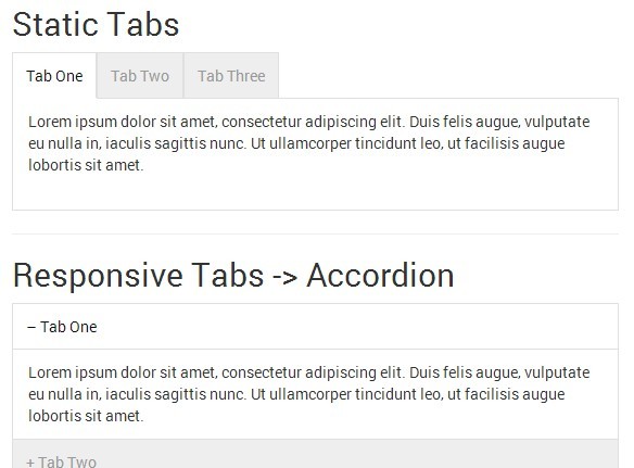
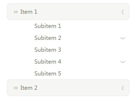
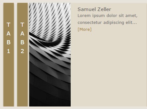
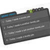
jQuery Responsive Tabs
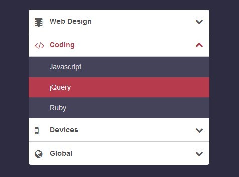
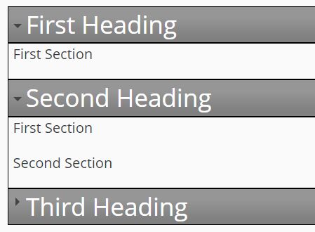
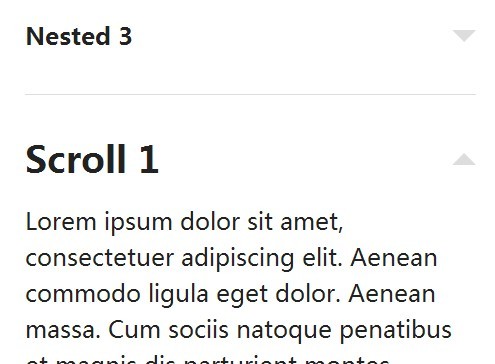
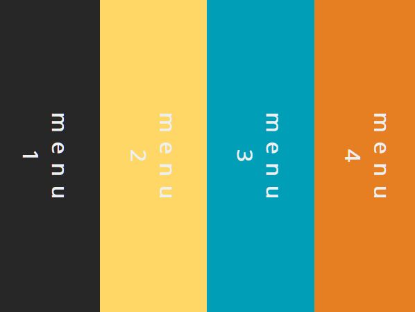
This jQuery plugin provides responsive tab functionality. The tabs transform to an accordion when it reaches a CSS breakpoint. Check out a demo at http://jellekralt.github.io/Responsive-Tabs/
Features
- Tabs transform to accordion based on breakpoint
- Uses javascript / jQuery for the technical tab switching (class based)
- Uses CSS for the desktop/tablet/mobile view
- Has callback events for the tab events
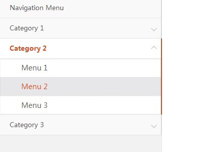
- Tabs can be opened with URL hashes
- Tabs can auto rotate
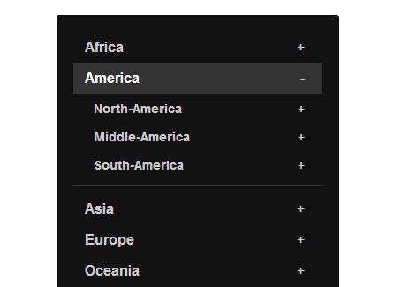
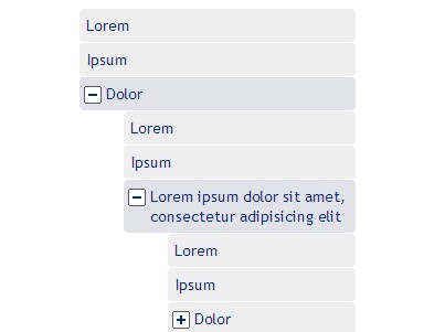
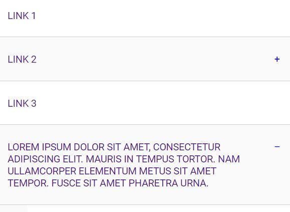
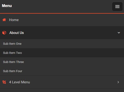
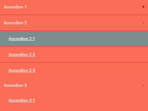
- Tabs can be collapsed (optional)
- Tabs can start collapsed based on the view (optional)
- Tabs can be disabled
- The tabs are controllable with API methods
- Cross browser compatibility (IE7+, Chrome, Firefox, Safari and Opera)
- Multiple device support (Web, Tablet, Mobile, etc)
How to use
- Requires jQuery (minimaly jQuery 1.7.0)
- Include jquery.responsiveTabs.js
<script src="js/jquery.responsiveTabs.js"></script>- Include responsive-tabs.css for the basic Tabs to Accordion switching
<link type="text/css" rel="stylesheet" href="css/responsive-tabs.css" />- Include style.css for a basic tab/accordion theme
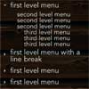
<link type="text/css" rel="stylesheet" href="css/style.css" />- Use this HTML markup:
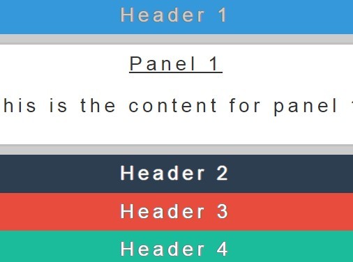
<div id="responsiveTabsDemo"> <ul> <li><a href="#tab-1"> .... </a></li> <li><a href="#tab-2"> .... </a></li> <li><a href="#tab-3"> .... </a></li> </ul> <div id="tab-1"> ....... </div> <div id="tab-2"> ....... </div> <div id="tab-3"> ....... </div> </div>- Use this jQuery function to enable responsive tabs on the selected element:
$('#responsiveTabsDemo').responsiveTabs({ startCollapsed: 'accordion' });Get
Bower
bower install responsive-tabs NPM
npm install responsive-tabs CDN
Responsive Tabs is available on jsDelivr
http://www.jsdelivr.com/#!jquery.responsive-tabs API
The following options are available:
Collapsible
If set to 'true' the panels are collapsible. The values 'tabs' and 'accordion' can be used to make the panels collapsible in a specific view/state. If a tab is active and you select it again, the panel will collapse.
collapsible: false // The panels are not collapsible collapsible: true // The panels are collapsible collapsible: 'tabs' // The panels are only collapsible if the view is currently tab based collapsible: 'accordion' // The panels are only collapsible if the view is currently accordion basedStart collapsed
This option defines if the first panel on load starts collapsed or not. With the values 'tabs' and 'accordion' you can specify in which view the tabs are supposed to start collapsed.
startCollapsed: false // Do not collapse on start startCollapsed: true // Start with the panels collapsed startCollapsed: 'tabs' // Start with the panels collapsed if the view is currently tab based startCollapsed: 'accordion' // Start with the panels collapsed if the view is currently accordion basedDisabled tabs
An array with zero based integers that define the tabs that should be disabled
disabled: [0,2] // Disables the first and third tabActive tab
An 0 based integer that defines the initial opened tab on load.
active: 1 // Opens the second tab on loadAccordion Tab HTML element
A single HTML element template in which the accordion tab will be wrapped.
accordionTabElement: '<div></div>'Set hash
A boolean that can be used to enable and disable the setting of a reference to the selected tab in the URL hash. If set to 'true', the selecting of a new tab will set the reference to that tab in the URL hash.
setHash: trueRotate
This option can be used to auto rotate the tabs. The tabs will stop rotating when a tab is selected.
rotate: false, // The tabs won't auto rotate rotate: true, // The tabs will auto rotate from the startEvent
This option can be used to specify the event that activates a tab. For instance: 'mouseover'. Defaults to 'click'
event: 'click' // (default) The tabs will activate on click event: 'mouseover' // The tabs will activate on mouseover etc...Animation
This option enables the animation of the panels. By default the panels will just show and hide, this option can be used to make the panels slide up and down and fade in and out.
animation: 'fade', // The panels will fade in and out animation: 'slide', // The panels will slide up and downYou can enable / disable the queueing of the animation by setting the animationQueue option.
animationQueue: false, // (default) disables the queueing of the animations. With this option on, all animations happen at the same time animationQueue: true, // enables the queueing of the animations. With this option on, animations wait for each other animationQueue: 'tabs', // enables the queueing of the animations for the tabs state only animationQueue: 'accordion', // enables the queueing of the animations for the accordion state onlyYou can set the speed of the animation by setting the duration option.
duration: 500, // (default) Sets the animation duration to 500Scroll to Accordion panel
This options can be used to enable automatic scrolling to the accordion panel that has been opened
scrollToAccordion: false, // (default) disables the auto scrolling to the accordion panel scrollToAccordion: true, // enables the auto scrolling to the accordion panelScroll to Accordion panel on load
This option can be used to disabling the scrolling to an accordion panel on load
scrollToAccordionOnLoad: true, // (default) enables scrolling to accordion on load scrollToAccordionOnLoad: false, // disables scrolling to accordion on loadYou can define an offset in pixels for the scroll to accordion panel by setting the scrollToAccordionOffset option.
scrollToAccordionOffset: false, // (default) disables the auto scrolling to the accordion panel scrollToAccordionOffset: true, // enables the auto scrolling to the accordion panelNavigation container
This option can be used to select a different container element for the navigation <ul>.
navigationContainer: '.some-css-selector'<div class="some-css-selector"> <ul> <li>Tab</li> ... </ul> </div>Callbacks
Click
This callback is called after a tab is clicked, regardless of whether it's disabled
Arguments
- event: Clicked event
- tab: Clicked tab object
click: function(event, tab){},Activate
This callback is called after a tab is selected
Arguments
- event: Activate event
- tab: Activated tab object
activate: function(event, tab){},Deactivate
This callback is called after a tab is deactivated
Arguments
- event: Deactivate event
- tab: Deactivated tab object
deactivate: function(event, tab){},Load
This callback is called after the plugin has been loaded
Arguments
- event: Load event
- tab: First tab object
load: function(event, firstTab){},Activate State
This callback is called after the plugin switches from state (Tab view / Accordion view)
activateState: function(){}Methods
The following methods are available:
Activate
This method activates/opens a tab by using a zero based tab reference
$('#responsiveTabsDemo').responsiveTabs('activate', 1); // This would open the second tabDeactivate
This method deactivates/closes a tab by using a zero based tab reference
$('#responsiveTabsDemo').responsiveTabs('deactivate', 1); // This would close the second tabEnable
This method enables a tab by using a zero based tab reference
$('#responsiveTabsDemo').responsiveTabs('enable', 1); // This would enable the second tabDisable
This method deactivates/closes a tab by using a zero based tab reference
$('#responsiveTabsDemo').responsiveTabs('disable', 1); // This would disable the second tabstartRotation
This method start the rotation of the tabs. You can use the first argument to define the speed.
$('#responsiveTabsDemo').responsiveTabs('startRotation', 1000); // This would open the second tabEvents
The following events are emitted on the element the tabs are initialised on (the container):
tabs-load
This event is triggered when the tabs plugin has finished loading
Passed variables
- event
tabs-activate
This event is triggered when a tab is activated
Passed variables
- event
- Activated tab object
tabs-deactivate
This event is triggered when a tab is deactivated
Passed variables
- event
- Deactivated tab object
tabs-activate-state
This event is triggered when the state of the plugin changes
Passed variables
- event
- State object
- Old state
- New state
Credits
The idea for this plugin is based on 'Easy Responsive Tabs to Accordion' by samsono (github.com/samsono)
https://github.com/samsono/Easy-Responsive-Tabs-to-Accordion
Support
If you have any questions, problems or suggestions, feel free to submit a ticket! Also, pull requests with improvements, new features or other great stuff are always very welcome.


