Collapsible.js
What is it?
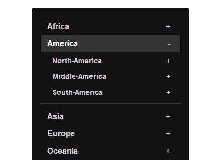
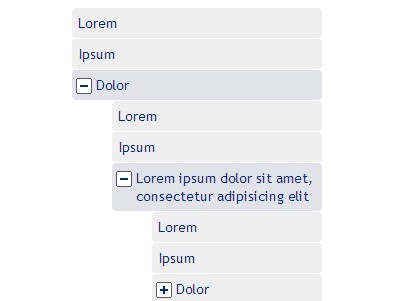
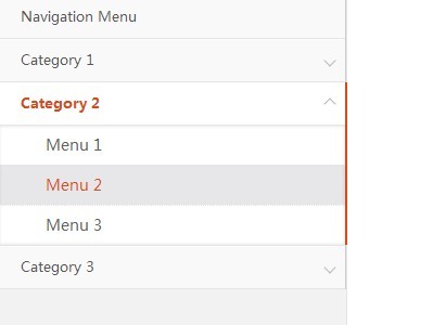
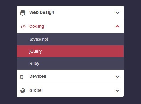
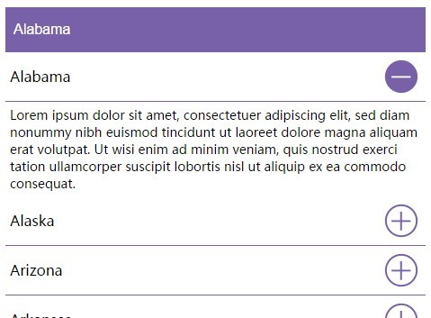
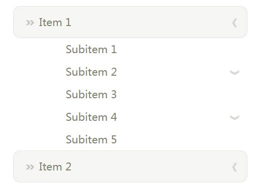
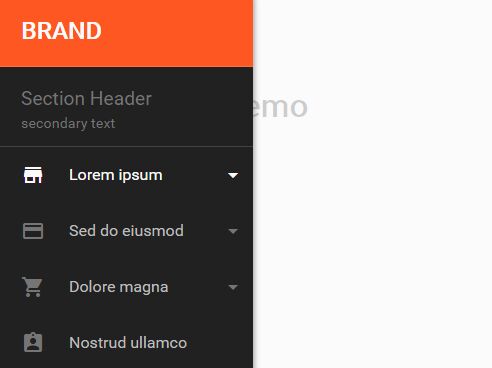
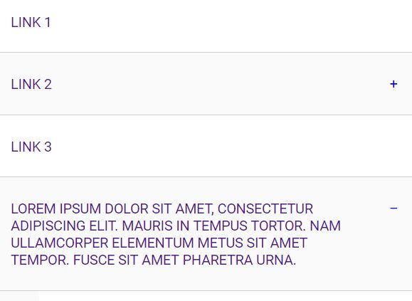
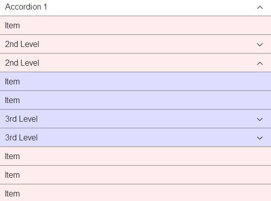
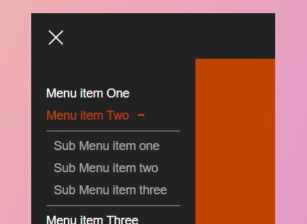
Collapsible.js is a lightweight (~1.7kb min) jQuery plugin that was created with the intent to expand on the functionality of the accordion effect found in jQuery UI. Primarily, allow the menu to either be an accordion or expand any/all of the available panels at the same time.
Installation
- npm:
npm install collapsible.js - yarn:
yarn add collapsible.js - Bower:
bower install collapsible.js - Download latest release
What you need
You'll need jQuery in your project, as well as a script tag referencing the plugin:
<script src="jquery.collapsible.js"></script>The menu styles can be customized however you would like after that. A stylesheet is included to give a basic example of how they can be customized.
Usage Examples
HTML
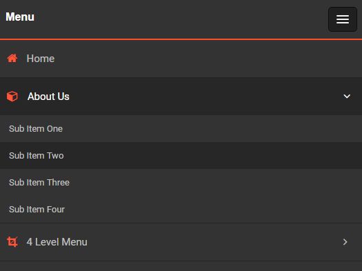
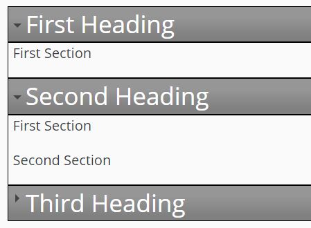
For the plugin to function properly, you will need to have your HTML set up in a certain manner. An example of the setup:
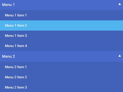
<div id="firstCollapseMenu" class="collapse-container"> <h1><span class="arrow-r"></span>First Heading</h1> <div> <p>First container paragraph</p> </div> <h2><span class="arrow-r"></span>Second Heading</h2> <div> <p>Second container paragraph</p> </div> <h3><span class="arrow-r"></span>Third Heading</h3> <div> <p>Third container paragraph</p> </div> </div>- The
collapse-containerclass can be named whatever you would like, just remember that it must have the CSS that was mentioned above tied to it. <span class="arrow-r"></span>is used when you would like a triangle (or something similar) in the heading that depicts whether the content is expanded or collapsed. You will need to set up a CSS class for this if you wish to use it. An example class is in the provided CSS stylesheet, otherwise you are welcome to write a custom one.
JavaScript
The simplest way to initialize a collapsible menu:
$('#firstCollapseMenu').collapsible();There are also several different options that can be set. All of the options and their default values:
$('#firstCollapseMenu').collapsible({ accordion: false, accordionUpSpeed: 400, accordionDownSpeed: 400, collapseSpeed: 400, contentOpen: null, arrowRclass: 'arrow-r', arrowDclass: 'arrow-d', animate: true });Explanation of each option:
accordion-trueif the menu should be an accordion (only 1 panel can be open at a time),falseif the menu should be a basic collapsible menu (any number of panels can be open at once).accordionUpSpeed- How fast the closing panel of the accordion is moving (milliseconds).accordionDownSpeed- How fast the opening panel of the accordion is moving (milliseconds).collapseSpeed- How fast the basic collapsible menu panels open/close (milliseconds).contentOpen- Used if you want a panel to be open by default. Index starts at 0. Basic collapsible menus can take an array of numbers. Accordions can also have a panel open by default, but don't take an array.arrowRclass- The CSS class name of the arrow that indicates a panel is closed.arrowDclass- The CSS class name of the arrow that indicates a panel is open.animate-trueif the menu should have opening and closing animations.falseif there shouldn't be animation, and instead the panels open and close immediately.
No Script
To avoid some potential issues in browsers that do not have JavaScript enabled, adding the follow to your code will allow it to fail more gracefully (the dropdowns will default to being open).
<noscript> <style> .collapse-container > :nth-child(even) { display: block; } </style> </noscript>License
MIT license.