Nav Accordion Plugin
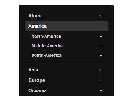
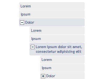
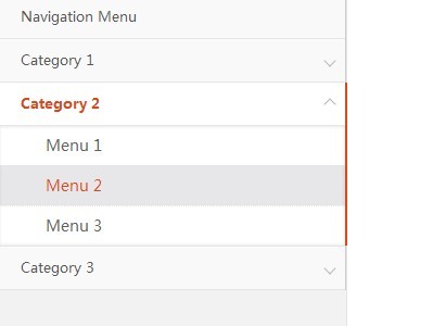
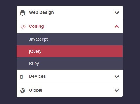
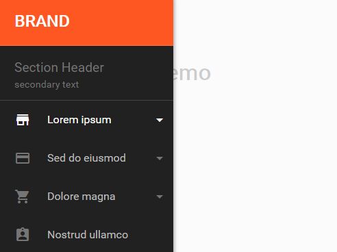
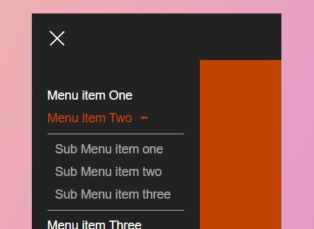
This project is a jQuery plugin that can be used to easily add accordion expand/collapse functionality to a navigation area. It is most useful for a navigation drawer or left navigation. It works best when the navigation pattern is similar to ul > li > a + ul.
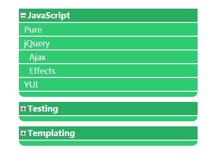
Features to note
This plugin has self contained styling for positioning the expand and collapse buttons, so there is no css that needs to be added to your template for this to work correctly. However, you will probably still want to do some styling to the accordion expand/collapse buttons such as applying a background color. Use the class
.accordion-btnfor stying the buttons.
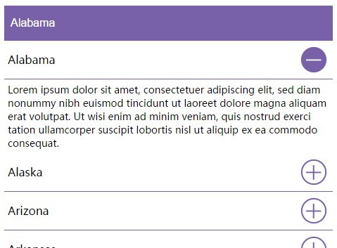
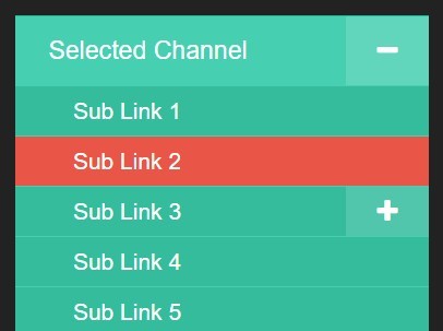
By default, the plugin will leave the parent page
hrefintact. So clicking the accordion button will expand the child navigation but clicking on the parent link text will go to the page. However, if a page is set to be a header only (no link on the<a>tag), the whole link will act as the expand/collapse button.
It will automatically expand the sub navigation for the currently selected channel (the
<li>that has the class "selected") when the page first loads.
How to use
To use this plugin, you must first have load the jQuery library on the page. You can next include the navAccordion.min.js script. The plugin should be called on the element that immediately wraps the first ul of the navigation. The following function contains the most basic options for calling the plugin, and this is what you will probably use a majority of the time.
//Basic function for calling nav accordion plugin $('.mainNav').navAccordion({ // Text inside of expand and collapse buttons // This can be HTML, such as a Font Awesome Icon, for example expandButtonText: '<i class="fa fa-plus"></i>', collapseButtonText: '<i class="fa fa-minus"></i>' });Plugin Options
-
expandButtonText- default is+- text inside of expand button - this can be HTML -
collapseButtonText- default is-- text inside of collapse button - this can be HTML -
buttonWidth- default is20%- width of accordion expand/collapse button as a percentage or pixels -
buttonPosition- default isright- position of button - you can also chooseleft -
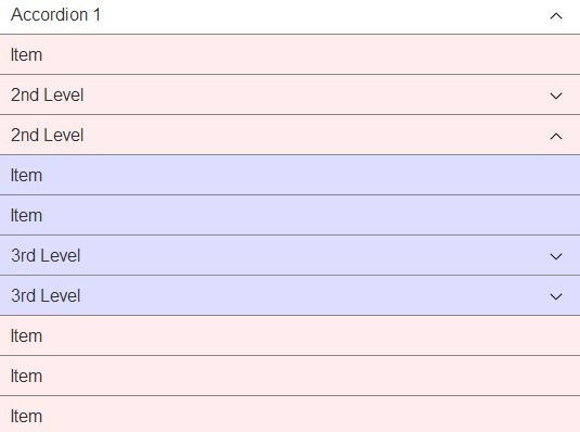
multipleLevels- default istrue- setting to false will add the accordion functionality only to the top level links -
selectedClass- default isselected- class name that will be used to detect the currently selected channel - this will check the "parentElement" for this class (the parent<li>by default) -
selectedExpand- default istrue- boolean to expand the selected channel or not -
headersOnly- default isfalse- setting to true will make any link with sub-nav behave as if it were set to a header only (no href), making the link inaccessible - this option is useful if you are using the plugin for a non-navigation area -
headersOnlyCheck- default isfalse- set to true to apply the accordion only to links that are set as "header only" (have no href) -
slideSpeed- default isfast- speed of slide animation -fast,slow, or a number in milliseconds such as500 -
parentElement- default isli- parent element type, class or ID - you don't need to change this if you're using a ul > li > ul pattern -
childElement- default isul- child element type, class or ID - you don't need to change this if you're using a ul > li > ul pattern -
delayLink- default isfalse- delays the browser from following the href of links that have sub-nav until after the accordion has expanded -
delayAmount- default is the same asslideSpeed- time in milliseconds to delay before following href - will use "slideSpeed" by default if nothing else is set - this only applies ifdelayLinkis enabled