#Label Better by Pete R. Label your form input like a boss with beautiful animation and without taking up space Created by Pete R., Founder of BucketListly
License: Attribution-ShareAlike 4.0 International

Demo
Compatibility
Modern browsers such as Chrome, Firefox, and Safari on both desktop and smartphones have been tested. I have not tested this on IE.
Basic Usage
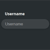
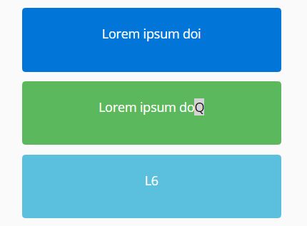
jQuery Label Better will let you create a beautiful unobtrusive label for your form's input fields. The uniqueness about this plugin is that all you have to do is add a placeholder text, and we will show the label only when the user needs it.
To add this to your website, simply include the latest jQuery library together with jquery.label_better.js into your document's <head>, and simply call the function like this:
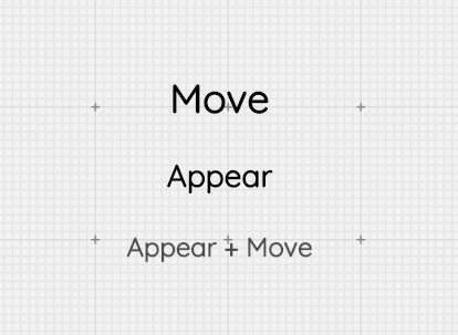
$("input.label_better").label_better({ position: "top", // This will let you define the position where the label will appear when the user clicked on the input fields. Acceptable options are "top", "bottom", "left" and "right". Default value is "top". animationTime: 500, // This will let you control the animation speed when the label appear. This option accepts value in milliseconds. The default value is 500. easing: "ease-in-out", // This option will let you define the CSS easing you would like to see animating the label. The option accepts all default CSS easing such as "linear", "ease" etc. Another extra option is you can use is "bounce". The default value is "ease-in-out". offset: 20, // You can add more spacing between the input and the label. This option accepts value in pixels (without the unit). The default value is 20. hidePlaceholderOnFocus: true // The default placeholder text will hide on focus });Markups
With this plugin, you can use a markup to override the global options defined in the function above. Here are all the markups you can use to customize your experience to your liking:
data-position
This markup will let you define the position of each input field individually.
<input type="text" class="label_better" data-position="top" placeholder="Username"> <input type="text" class="label_better" data-position="right" placeholder="Email Address">data-new-placeholder
There may be times when you want your placeholder text to be different from the label text. You can do that by defining the new placeholder text as follows and this value will be shown as the label instead.
<input type="text" class="label_better" data-new-placeholder="Type your username" placeholder="Username"> <input type="text" class="label_better" data-new-placeholder="Type your email address" placeholder="Email Address">And that's all for Label Better plugin. Stay tuned for more updates.
If you want to see more of my plugins, visit The Pete Design, or follow me on Twitter and Github.


