jQuery-contentToggle v0.3.1
A jQuery plugin for managing various kind of content toggling.
This librairy help you create cross-plateform and accessible (in the meaning of the W3C) content that can be shown and hidden with triggers.
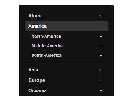
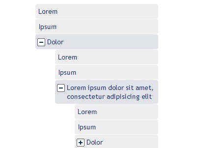
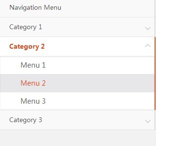
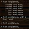
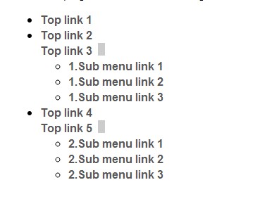
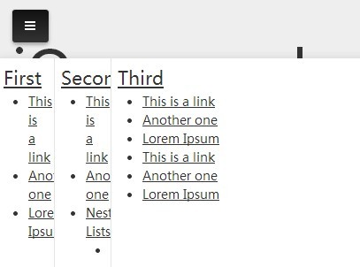
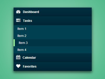
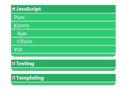
Usage examples :
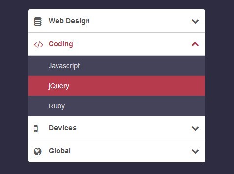
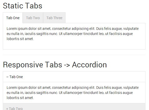
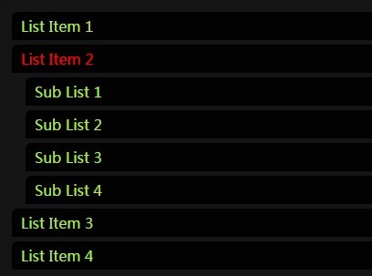
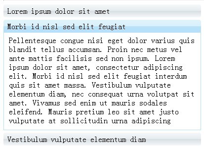
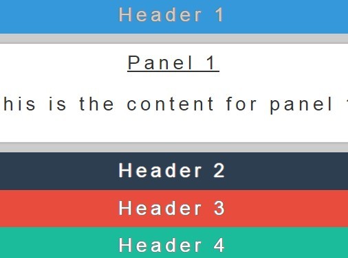
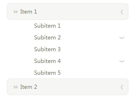
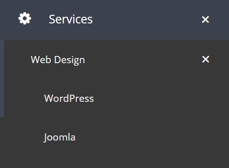
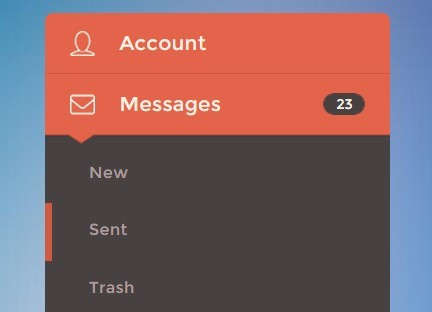
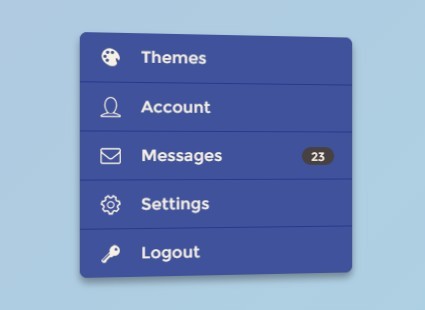
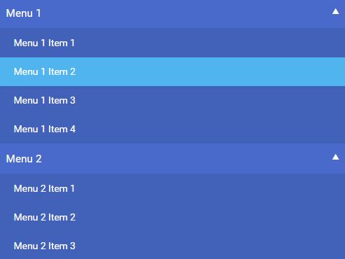
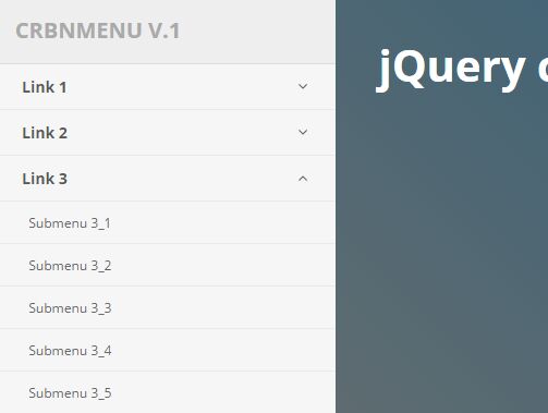
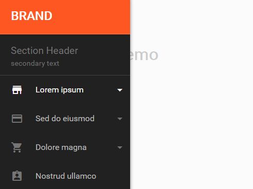
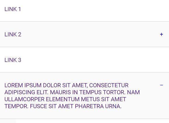
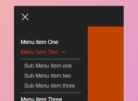
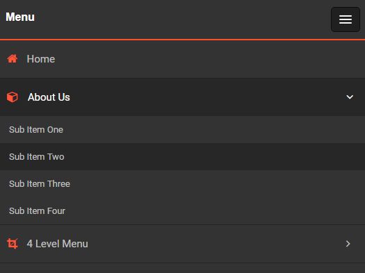
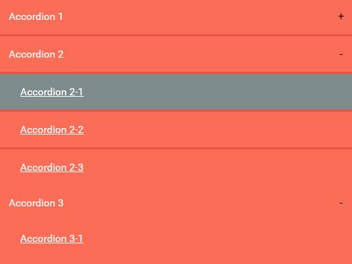
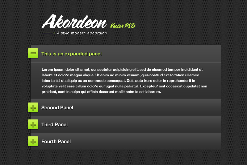
- Menu
- Tabs
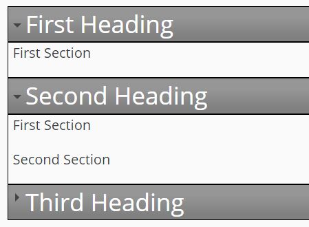
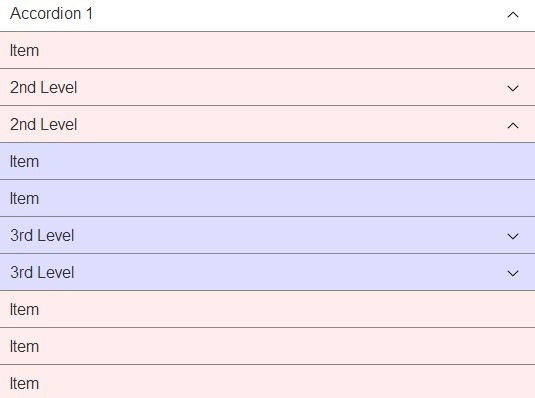
- Accordion
- ...
Installation
You can get it with Bower :
bower install --save jquery-contenttoggleThen include the script in your HTML (after jQuery) :
<script src="/path/to/jquery.contenttoggle.js"></script>Usage
General informations
Create new instances based on a DOM selector :
$('.js-contentToggle').contentToggle();The selector used above is important, because it will create some kind of a group, and each elements inside this group will be bound together.
There can only be one opened element at the same time inside a group.
When an element will be opened, all other elements will close.
Important information : Since jQuery 3, this automatic grouping can not be achieved anymore. You should use the group option to group the elements together or they will all be in the same group.
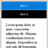
By default the associated contents of an element, that will be toggled, are all elements with the class js-contentToggle__content inside the main element.
Example :
<div class="js-contentToggle"> <div> <button type="button">Toggle !</button> <div class="js-contentToggle__content"> <p>Lorem ipsum dolor sit amet.</p> </div> </div> </div>All clicks inside js-contentToggle will toggle the content, but all clicks inside js-contentToggle__content won't propagate through the DOM.
If you want to specify which links will trigger the toggle action you can use the js-contentToggle__trigger class on them (by default).
Example :
<div class="js-contentToggle"> <div> <button type="button" class="js-contentToggle__trigger">Toggle !</button> <button type="button">Don't toggle !</button> <div class="js-contentToggle__content"> <p>Lorem ipsum dolor sit amet.</p> </div> </div> </div>Using group options
You can also pass options when instantiating the elements. Options are described in the section below :
$('.js-contentToggle').contentToggle(options);Those options will be initialized to all matching elements.
We will name this way of passing options as group options.
Using data options
But you can also override specific options by using HTML data on specific elements.
We will name this way of passing options as data options.
If the option you want to override is defaultState you will need to add a data attribute to the element named data-default-state.
Example :
<div class="js-contentToggle" data-default-state="open"></div>Those options should be set on the element matching the selector you will use when instantiating the plugin.
With dynamic content
If you need to dynamically add other elements (using AJAX for example) to an existing group.
You will need to use the same selector (or with the same group option) when instantiating the plugin like $('.js-contentToggle').contentToggle(options);.
It is not a problem if some elements have already been initialized, elements are protected against multiple instantiation.
Accessibility recommendations
It's preferable to use a button with type="button" as triggers, because it implicitly gets the button wai-aria role.
Following HTML tags are also accepted (they will automatically get the attribute role="button") :
- a
- div
- figure
- p
- pre
- blockquote
- img (with alt="some text")
- ins
- del
- output
- span
- summary
More informations on roles here.
Configuration
group & data-group
Type: string
Default: is equal to the original jQuery selector used for instantiation, sanitized to keep only following characters : a-z, 0-9, - and _.
Elements are grouped each other, meaning that only one element can be opened at the same time inside a same group.
You can't instantiate the plugin twice or more on the same element, for the same group.
Important information : Since jQuery 3, the automatic grouping can not be achieved anymore. You should probably use this option to define the group and avoid problems when defining other "toggling" elements.
independent & data-independent
Type: boolean
Default: false
If elements inside a group are independent, it breaks the rule of having only one visible content at the same time for a group.
This is useful for a Frequently Asked Questions list for example.
noSelfClosing & data-no-self-closing
Type: boolean
Default: false
If true the element will not close if the close request comes from itself.
This option helps for creating tabs style instances.
defaultState & data-default-state
Type: string
Default: null
Use this option if you want to enforce the default state of an element (open or close).
By default the default state of the plugin will be initialized using jQuery is(':visible') test on the first associated content.
For example this can be use for accessibility compatibility by having the content shown in the HTML document and by hiding it with JavaScript.
The open option defined as group option will not break the rule of one visible content at the same time, unless elements are independent.
If your elements are not independent, use one data option on the element you want to be opened by default.
globalClose & data-global-close
Type: boolean
Default: false
When setting this option to true a click event listener will be added to the document with the associated action of closing all elements.
Remember that all clicks inside the contents won't propagate through the DOM (same for triggers).
This is useful for a mobile compatible menu for example.
beforeCallback & data-before-callback
Type: function or string
Default: null
A function to be called before an action (toggle, open or close).
Return true or false inside this callback to prevent or not the action.
Use this inside the callback to refer to the plugin instance.
If you use a string instead of a function, the plugin will search for a function with the given name. This function must be accessible on the global scope.
stopPropagation & data-stop-propagation
Type: boolean
Default: true
Usefull when your content element is inside your trigger element.
It prevents the content to close itself when the user click inside.
But it can have side effects when you have clickable elements inside your content with JS behaviours.
triggerSelector & data-trigger-selector
Type: string
Default: .js-contentToggle__trigger
The selector of the triggers.
If no elements match, the triggers will be equals to the main element.
triggerSelectorContext & data-trigger-selector-context
Type: boolean
Default: true
If true the main element will be used as context for the query selector like this :
this.$triggers = $(this.options.triggerSelector, this.$element);Set it to false if you want to use triggers outside of the main element.
labelSelector & data-label-selector
Type: string
Default: null
The selector of the labels.
If null, labels are equals to triggers.
labelSelectorContext & data-label-selector-context
Type: boolean
Default: true
Same as triggerSelectorContext & data-trigger-selector-context but for labels.
contentSelector & data-content-selector
Type: string
Default: .js-contentToggle__content
The selector of the contents.
contentSelectorContext & data-content-selector-context
Type: boolean
Default: true
Same as triggerSelectorContext & data-trigger-selector-context but for contents.
elementClass & data-element-class
Type: string
Default: is-open
A class that will be added to the main element when its state is open.
triggerClass & data-trigger-class
Type: string
Default: is-active
A class that will be added to the active trigger.
openedLabel & data-opened-label
Type: string
Default: null
If not null, the labels will be updated with that value when the state is opened (HTML allowed).
closedLabel & data-closed-label
Type: string
Default: null
If not null, the labels will be updated with that value when the state is closed (HTML allowed).
toggleProperties & data-toggle-properties
Type: array or string
Default: [height]
An array of CSS properties to be toggled. This properties will then be used as first argument of the jQuery animate(properties, options) function.
Available properties : height, width and opacity with the toggle value. More informations here.
If you use a string instead of an array, the plugin will consider your are passing a serialized JSON.
toggleOptions & data-toggle-options
Type: object or string
Default: {duration: 0}
The options object to be used as second argument of the jQuery animate(properties, options) function.
More informations on available options here.
If you use a string instead of an object, the plugin will consider your are passing a serialized JSON.
Custom events
you can trigger custom events to control the plugin instances with JavaScript.
Example :
// Opening the first element. $('.js-contentToggle').eq(0).trigger('open');Available events :
open: open an elementclose: close an elementtoggle: toggle the state of an elementdestroy: destroy the plugin instance
Special event :
isOpen: return the state of an element (trueorfalse)
To get a return value from an event with jQuery, you can use the triggerHandler method.
Note : triggerHandler only operate on the first element of matched element.
Example:
// Get the state of the first element. if ($('.js-contentToggle').triggerHandler('isOpen')) { console.log('opened'); } else { console.log('closed'); }If you have multiples instances on the same element (with different groups), you can trigger a specific instance by using the group as namespace.
Example :
// First instance (with group 'left-sidebar'). $('body').contentToggle({ group: 'left-sidebar' }); // Second instance (with group 'right-sidebar'). $('body').contentToggle({ group: 'right-sidebar' }); // The following code will only trigger the second instance of contentToggle and open it. $('body').trigger('open.right-sidebar');Examples
Examples are available here.
Release History
See the CHANGELOG.txt


