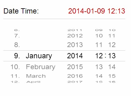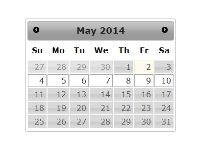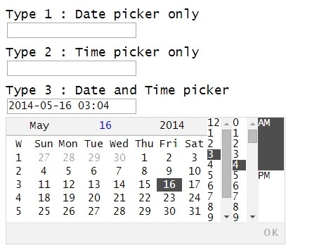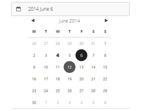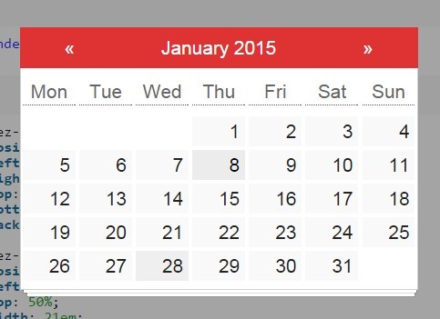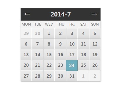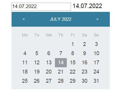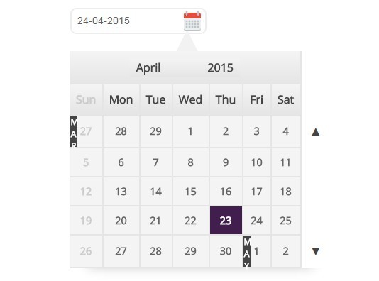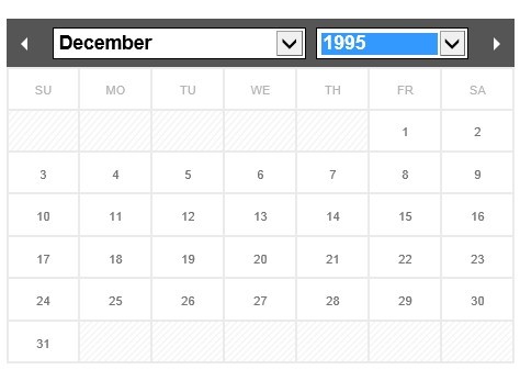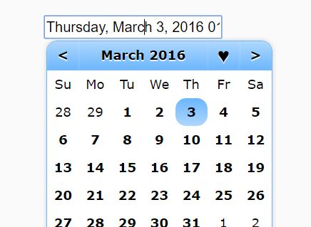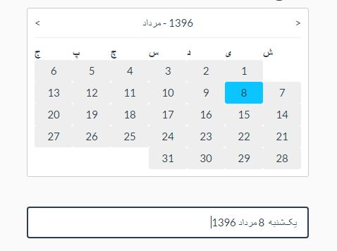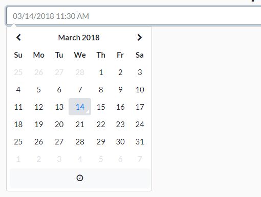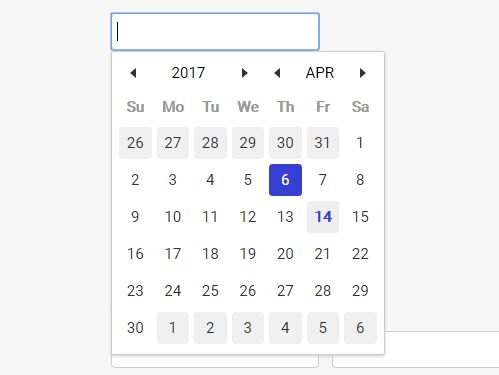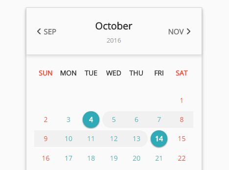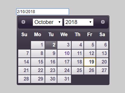
jQuery DatePicker
An awesome, lightweight and customizable calendar! (Now with more awesomeness!)
This new version brings an updated API, more customization and a better user experience.
Requirements
- jQuery 1.8+
- A recent/decent web browser (Firefox, Chrome or Opera suggested)
- A valid HTML 5 DOCTYPE (strongly recommended)
Installing
Download the required CSS and JS files, add them to your HTML file and you're done.
<link rel="stylesheet" href="css/jquery.datepicker2.css"> <script type="text/javascript" src="js/jquery.datepicker2.js"></script>Basic usage
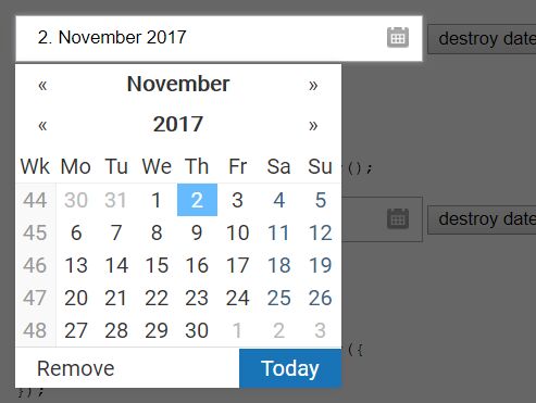
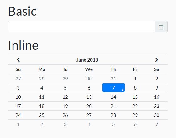
Automatic mode
Create an input, and add the data-select="datepicker" data attribute.
<input type="text" class="form-control" name="date" id="date" data-select="datepicker">Advanced usage
Options
In this version there are a handful of customization options, available through the $.datePicker.defaults option; you may pass an options object if you call the API directly or by overriding the defaults object.
The options are:
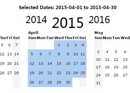
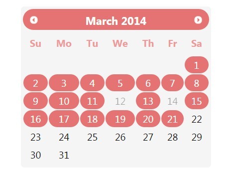
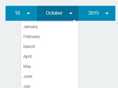
container- Selector for the element that will contain the generated markup, defaults tobodymode- The display mode of the widget, can be eitherpopuporinline, defaults topopup.select- Selection mode, eithersingleormultiple, defaults tosingletheme- Visual theme, can be eithertheme-lightortheme-dark, defaults totheme-lightshow- Which view to show by default, can bedecade,yearormonth, defaults tomonthdoubleSize- Whether to enable double-size mode or not, defaults tofalserestrictDates- Quick date-restriction mode specifier, can bepast,futureorcustom, defaults tofalse. More on this belowdisableAnimations- Whether to disable animations or not, defaults tofalsestrings- An object with two dictionaries:monthsanddays, used to localize your calendarview- Contains three objects with several options each, more details belowtemplates- This contains the templates for the widget and some elements,callbacks- The callbacks object, more on this belowanimate- The animation object, currently is not advised to modify thisdateFormat- Function to format dates, more info belowdateParse- Function to parse dates, more info below
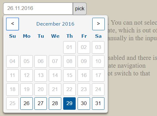
Restrict date selection
By default, the calendar will let you select any valid date for the current month, but you may change this behaviour easily by using the restrictDates option, which can take one of the following values:
past- Only allow past datesfuture- Only allow future datescustom- Use a callback to check if the date should be allowed or not
The custom value will trigger the following callback from the callbacks object:
onCheckCell: function(cell, date, type) { return true; }That way you may restrict specific dates, weekdays, weekends, etc. Just return either true or false for each cell on the current month.
Just a quick heads up: as this callback will be fired for each day of the currently visible month, is not advised to do any lenghty process and/or web requests as you may block the UI and/or generate an empty state. It is best to get your data beforehand (into a JSON object for example) and load it to the calendar using the appropiate callback methods.
Customizing the views
The defaults object contains a views object which in turn contains three option objects (decade, year, month), one for each calendar view.
All the three contain a show item, which determines which date will be shown on the view. This can be a parseable date or a Date object.
The month object also contains the following options:
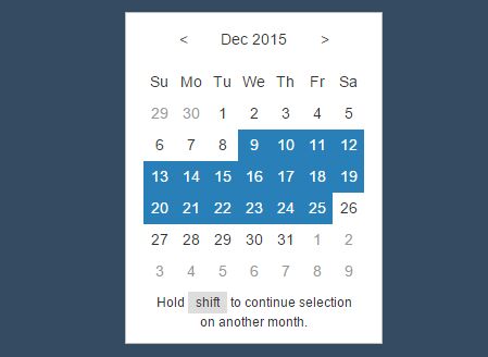
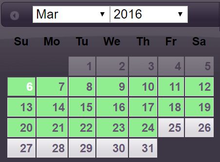
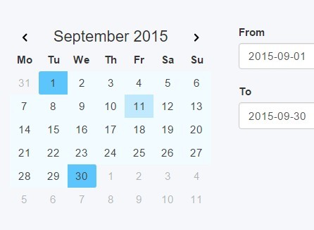
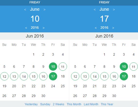
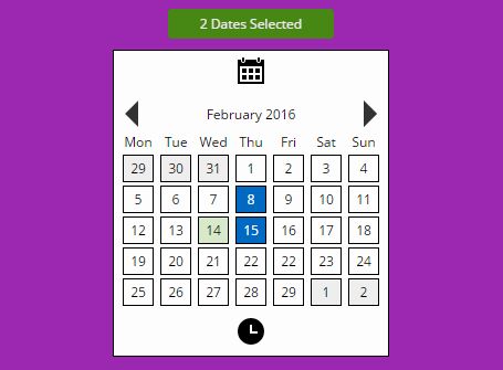
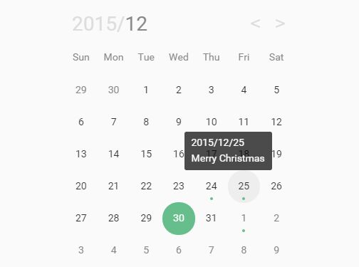
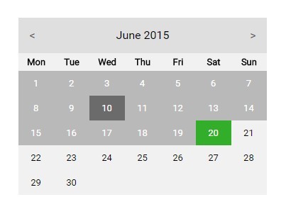
selected- An array with the selected date(s), depending on the selection modedisabled- An array with disabled (grayed) dates, these are not selectableforbidden- An array with disabled (red) dates, these are not selectableenabled- An array with enabled (not grayed) dates, these are the only selectablemarked- An array with marked (yellow) dates, these are selectablefirstDayOfWeek- Which day of the week to use as the start of the week (0: Sunday to 6: Saturday)
The arrays can contain either parseable dates or Date objects.
If you specify disabled dates, these dates will be disabled on the calendar; on the other hand, if you specify enabled dates, only those dates will be enabled on the entire calendar.
If you'd like a simpler approach, check the restrictDates option as it may be a better fit to your requirements.
Callbacks
The callbacks object provides a powerful way to interact with the control.
You can control the appearance, behaviour and funcionality if you know where to hook into.
The available callbacks are:
onCreate: function(calendar)- Called when the widget is createdonShow: function(calendar)- Called when the widget is shownonViewDecade: function(calendar, date)- Called when showing the Decade view. It must returntrueorfalseto show or not the viewonViewYear: function(calendar, date)- Called when showing the Year view. It must returntrueorfalseto show or not the viewonViewMonth: function(calendar, date)- Called when showing the Month view. It must returntrueorfalseto show or not the viewonChangeDecade: function(calendar, date, direction)- Called when changing the Decade. It must returntrueorfalseto allow or deny the changeonChangeYear: function(calendar, date, direction)- Called when changing the Year. It must returntrueorfalseto allow or deny the changeonChangeMonth: function(calendar, date, direction)- Called when changing the Month. It must returntrueorfalseto allow or deny the changeonChangeDay: function(calendar, date, direction)- Called when changing the Day. It must returntrueorfalseto allow or deny the changeonCheckCell: function(cell, date, type)- When using thecustomvalue on therestrictDatesoption this will be called for each day of the currently visible month to enable or disable the cell. Returntrueorfalseto do so, defaults tofalseonRenderCell: function(cell, date, type)- Called when a cell is renderedonHide: function(calendar)- Called when the widget is hidden
Custom date formats
You can specify your own date formats if you want; to do so, you will have to override two functions, the one that formats the selected date and the one that parses the input value into a Date object.
The default implementation uses the mm-dd-yyyy format, with the following functions:
dateFormat: function(date) { return (date.getMonth() + 1) + '-' + date.getDate() + '-' + date.getFullYear(); }, dateParse: function(string) { var date = new Date(); var parts = string.match(/(\d{1,2})-(\d{1,2})-(\d{4})/); if ( parts && parts.length == 4 ) { date = new Date( parts[3], parts[1] - 1, parts[2] ); } return date; }As you can see, it's pretty straightforward to override them, but it's strongly recommended to use a date manipulation library such as moment.js to avoid localization/crossbrowser issues.
Just make sure to return a valid formatted date in dateFormat and a valid Date object in dateParse
More customization
You may change the strings object to localize your calendar, for example:
$.extend(true, $.datePicker.defaults.strings, { months: ['Enero', 'Febrero', 'Marzo', 'Abril', 'Mayo', 'Junio', 'Julio', 'Agosto', 'Septiembre', 'Octubre', 'Noviembre', 'Diciembre'], days: ['Domingo', 'Lunes', 'Martes', 'Miércoles', 'Jueves', 'Viernes', 'Sábado'] });Will render the calendar using spanish month and day names.
You may also mess with the templates or event the animation functions, but for now is not advised to do so as they are not documented and/or even finished yet.
Licensing
This software is released under the MIT license.
Copyright © 2019 biohzrdmx
Permission is hereby granted, free of charge, to any person obtaining a copy of this software and associated documentation files (the "Software"), to deal in the Software without restriction, including without limitation the rights to use, copy, modify, merge, publish, distribute, sublicense, and/or sell copies of the Software, and to permit persons to whom the Software is furnished to do so, subject to the following conditions:
The above copyright notice and this permission notice shall be included in all copies or substantial portions of the Software.
THE SOFTWARE IS PROVIDED "AS IS", WITHOUT WARRANTY OF ANY KIND, EXPRESS OR IMPLIED, INCLUDING BUT NOT LIMITED TO THE WARRANTIES OF MERCHANTABILITY, FITNESS FOR A PARTICULAR PURPOSE AND NONINFRINGEMENT. IN NO EVENT SHALL THE AUTHORS OR COPYRIGHT HOLDERS BE LIABLE FOR ANY CLAIM, DAMAGES OR OTHER LIABILITY, WHETHER IN AN ACTION OF CONTRACT, TORT OR OTHERWISE, ARISING FROM, OUT OF OR IN CONNECTION WITH THE SOFTWARE OR THE USE OR OTHER DEALINGS IN THE SOFTWARE.
Contributing
Fork the repo, add an interesting feature or fix a bug and send a pull request.
Troubleshooting
The calendar works on almost every modern browser but MAY NOT WORK on IE/Edge. This is not a concern and will not be fixed.
Credits
Lead coder: biohzrdmx (github.com/biohzrdmx)