responsive-youtube
A jQuery plugin to make all your Youtube embeds responsive, regardless of their aspect ratio.
Required
- jQuery 2.0+
How to use
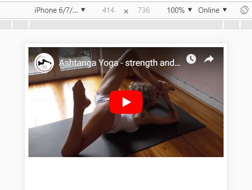
- Add Youtube embeds to you HTML page as normal, using the embed code generated by Youtube.
- Add jQuery and responsive-youtube.js to your page.
- Add the following to your page:
...
$(function(){ $('body').responsive({key: 'your-api-key'}); }); ...
...where 'your-api-key' is the Youtube Data API key you (you can get one free by signing up here).
How it works
On pageload the plugin identifies any Youtube embeds on the page and then queries the Youtube Data API to find the correct aspect ratio of each video. It then wraps the Youtube iFrame in a correcly-proportioned DIV and injects a small amount of CSS into the page which makes the iFrame match the dimensions of the DIV.
FAQs
- Why not just use fitvids.js? Fitvids makes videos responsive, but assumes that all videos are in the same aspect ratio. This means that videos in non-16:9 aspect ratios (such as videos shot in portrait on a phone) have black bars added around them to make them fit the 16:9 size. If you are sure all the videos you embed will be 16:9, then you should definitely use fitvid.js instead. If you want to banish the black bars from non-standard Youtube videos then this plugin is here to help.