Responsive Cropper Jquery Plugin
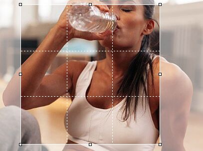
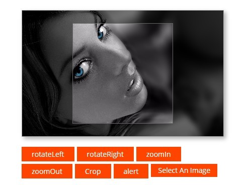
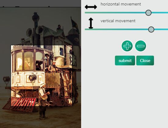
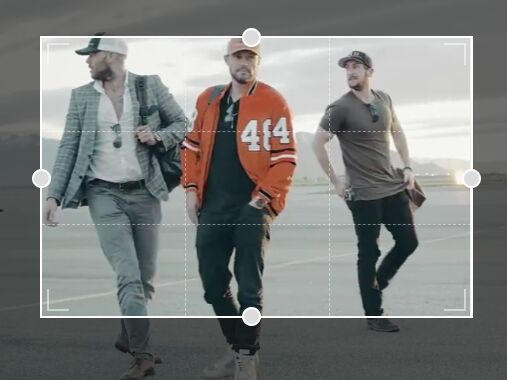
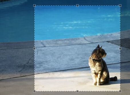
Responsive Cropper is a JQuery plugin that lets you select an area from an image and prepare crop information to send it to the server.
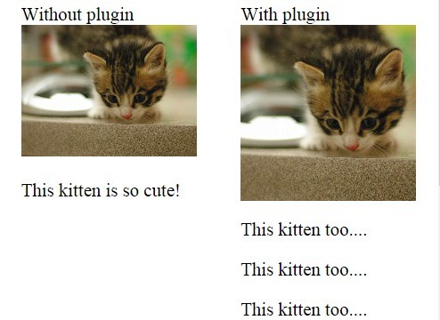
You don't need to trigger any event to update crop area when image is resized: this plugin is full responsive. Crop area uses percentages to guarantee full responsiveness, while crop data is stored separately in absolute values.
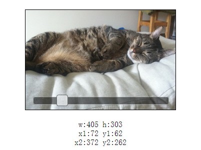
You can access to crop data easily throw methods, but also plugin makes things easy for you: inputs are are generated and filled with crop information to send to the server.
Last, you can activate a preview or, even, get a base64 image encoded. All that on the client side.
Demos
- Basic: https://rawgit.com/aewebsolutions/rcrop/master/demos/basic.html
- Advanced: https://rawgit.com/aewebsolutions/rcrop/master/demos/advanced.html
Features overview
- Responsive (percentage values)
- Preserve Aspect ratio: shift key or from options
- Easy CSS/SCSS full customization
- Grid
- Minimum and Maximum crop area
- Mobile compatibility
- Methods and Events
Installation
Include JQuery js and plugin’s css and js files in your HTML code.
<script src="/lib/jquery.js"></script> <link rel="stylesheet" href="/dist/rcrop.min.css" type="text/css" /> <script src="/dist/rcrop.min.js"></script> Alert: Responsive Cropper uses Clayfy JQuery Plugin to drag an resize selected/crop area. So, if you are thinking to use Clayfy, you wont need to install it twice: just include rcrop files.
Usage
There is a basic usage for Responsive Cropper next. Further information you can find inside demos and options and events tables below.
$(document).ready(function(){ $('#image').rcrop(); });Defining a minimimum size you are not only setting bounderies for the crop area, but also the aspect ratio that can be preserve.
Also, lets add a preview and a grid helper.
$('#image-4').rcrop({ minSize : [160,90], preserveAspectRatio : true, grid : true, preview : { display: true, size : [80,45] } });Options
Options can be set locally as a paramater or globally through $.rcrop.settings object.
| Name | Type | Default | Description |
|---|---|---|---|
| grid | bool | false | Generate a grid over crop area. |
| full | bool | false | Whether crop area must cover all image when is initilized. |
| maxSize | array | [null, null] | Maximum width and height of crop area. If not bounderies are required, set null. |
| minSize | array | [20, 20] | Minumum width and height of crop area. Also, this defines aspect ratio when preserveAspectRatio is turn on. |
| preserveAspectRatio | bool | false | Force to preserve aspect ratio of crop area |
| inputs | bool | true | Generate inputs with crop data (usefull to send to server) |
| inputsPrefix | string | void | A prefix to inputs. |
| preview.display | bool | false | Display a preview image of the crop area |
| preview.wrapper | string | void | a CSS selector (or a JQuery object) where append preview to. |
| preview.size | array | [50, 50] | Width and height of the preview image. |
Events
| Event | Params | Description |
|---|---|---|
| rcrop-ready | event | When image has been read and Responsive Crop is ready. |
| rcrop-change | event | When crop area is being changed. |
| rcrop-changed | event | When crop area has been changed. |
Methods
You can call methods like : $('#image').rcrop('resize', 200,200)
| Name | Params | Return | Description |
|---|---|---|---|
| resize | width, height, x, y | void | Set a size and position of the crop area |
| getValues | void | Object | Get width, height, x, y values of the crop area. |
| destroy | void | void | destroy instance |
License
Responsive Cropper has been developed by Ángel Espro. It is licensed under the MIT license
