


React Rating
React Rating is a React rating component built with StyledComponents
Installation
You can install @prontopro/react-rating component using the yarn package manager:
yarn add @prontopro/react-ratingDependencies
The @prontopro/react-rating component peer depends on the React library.
You can install React using yarn:
yarn add --save react react-domUsage
Import Rating Component
import Rating from '@prontopro/react-rating'Start using it:
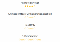
<Rating />Pass some config props:
<Rating animateOnHover disableAnimation initialRate={3} stop={10} />Properties
| Property | Type | Default | Description |
|---|---|---|---|
animateOnHover | Boolean | false | Whether to animate rate hovering or not. |
disableAnimation | Boolean | false | Disable stars animation onClick or onHover. |
emptyRate | React Element | Empty Star | React Element |
fractions | Number | 1 | Number of equal parts that make up a whole symbol. |
fullRate | React Element | Full Star | React element |
initialRate | Number | 0 | Initial rate value. |
readonly | Boolean | false | Whether the rating can be modified or not. |
start | Number | 0 | Range starting value. |
step | Number | 1 | Step increment (must be between start and stop). |
stop | Number | 5 | Range stop value. |
Callbacks
| Callback | Type | Parameters | Description |
|---|---|---|---|
onChange | Function | rate: Number | Called when the selected rate is changed. |
onClick | Function | (rate: Number, event: Event) | Called when a rate is clicked. |
onRate | Function | rate: Number or undefined | Called when a rate is entered or left. When a rate is left it is called with undefined. |


