Pure JS lightbox component for Vue.js
Table of contents
Demo
The live demo is available here: https://codepen.io/DCzajkowski/pen/rzOErW.
Installation
With NPM:
npm i vue-pure-lightbox --saveWith a CDN:
<!-- In <head> --> <meta rel="stylesheet" href="https://unpkg.com/vue-pure-lightbox/dist/VuePureLightbox.css"> <!-- In <body>, after Vue import --> <script src="https://unpkg.com/vue-pure-lightbox/dist/VuePureLightbox.umd.min.js"></script>Usage
With an ES6 bundler (via NPM)
Importing a component
import VuePureLightbox from 'vue-pure-lightbox' /* @vue/component */ export default { components: { // ... VuePureLightbox, }, }Importing CSS styles
If you are using an ES6 bundler, you will need to manually import the styles.
Via an import
import styles from 'vue-pure-lightbox/dist/VuePureLightbox.css'Via a <style> tag
<style src="vue-pure-lightbox/dist/VuePureLightbox.css"></style>With a CDN
<script> new Vue({ components: { 'vue-pure-lightbox': window.VuePureLightbox, } }).$mount('#app') </script>Simple example
<VuePureLightbox thumbnail="/path/to/thumbnail.jpg" :images="['/path/to/image1.jpg', '/path/to/image1.jpg']" />Note: if you are not using a vue-loader (e.g. you are using a CDN), you have to use the kebab-case'ing for the component i.e.
<vue-pure-lightbox>instead of<VuePureLightbox>.
Example using content slot and custom loader
<VuePureLightbox thumbnail="https://via.placeholder.com/350x150" :images="[ { link: 'https://placekitten.com/1080/910', alt: 'Cat 1' }, { link: 'https://placekitten.com/1080/920', alt: 'Cat 2' }, ]" > <div v-slot:loader>Loading…</div> <div v-slot:content="{ url: { link, alt } }"> <img :src="link" :alt="alt"> </div> </VuePureLightbox>Note: if you are not using a vue-loader (e.g. you are using a CDN), you have to use the kebab-case'ing for the component i.e.
<vue-pure-lightbox>instead of<VuePureLightbox>.
Available props:
| Prop | Type | Value |
|---|---|---|
| thumbnail | string | Path to a file being your thumbnail |
| images | string[] or array | Array of paths to files visible in the lightbox |
| alternate-text | string | (Optional) alt="" text for your image |
| value | boolean | (Optional) reactive visibility prop |
| open-at-index | integer | (Optional) index of an image to show when opening the modal |
Available slots:
Contents
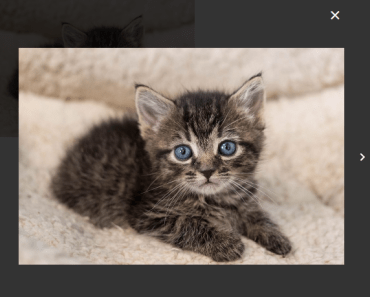
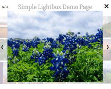
This package consists of just one .vue file. It is meant to be as small and simple as possible. In return you get a <VuePureLightbox> Vue component that allows you to show images in a nice, responsive lightbox.
Supported keys:
- Arrow right - Go to the next image
- Arrow left - Go to the previous image
- Escape key - Close the modal
- Arrow up, Arrow down and a Space Bar - inactive when the lightbox is visible
CSS is being used in the component, but each class is prefixed with a lightbox keyword. You can overwrite them as you wish.
License
Issues
If you find any bug or problem with the plugin please open an issue or create a pull request on the Github repo.
