notivuecation
Promise-based alert and confirm modal for Vue.js.
install
npm install notivuecationexample
Run the demo in the example folder:
cd example npm install npm run devOr you can check out that exact same page here.
basic usage
1 - Activate the plugin.
import Vue from 'vue'; import notivuecation from 'notivuecation'; Vue.use(notivuecation);2 - Add the component that renders the notifications. You probably want to put this somewhere in the root component of your site, so it can always be visible. There is a simple component (named notivuecation) available, but you can also create and use your own.
<notivuecation /> 3 - Call $alert or $confirm from any Vue component:
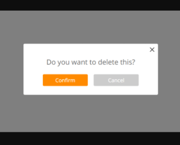
this.$alert('You are the 1 millionth visitor!').then(claimPrize); this.$confirm('Are you sure?').then(result => { // result is true/false });overview
The plugin adds three methods to the Vue instance, these can be called from any Vue component:
$notify$confirm$alert
If you want to use these methods from outside a component, you can also import them:
import { confirm, alert, notify } from 'notivuecation';(this will obviously replace the native confirm and alert methods in the current scope)
notify
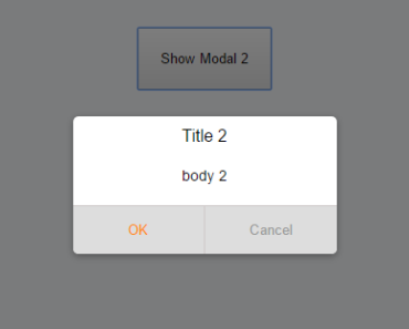
The notify method is the base of the plugin and is internally always used to show any notification. It accepts an object that defines the title, a message and all buttons to show:
this.$notify({ title: 'Claim prize', message: 'Pick a color for your car!', buttons: [ {label: 'red', value: 1, css: 'red'}, {label: 'green', value: 2, css: 'green'}, {label: 'blue', value: 3, css: 'blue'}, ] });The optional css property on the buttons will be set as css class on the button, while the value (also optional) will be used when resolving the promise (i.e. this is the value that will end up in the then when clicking the button).
confirm and alert
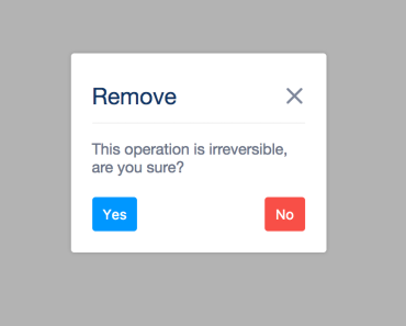
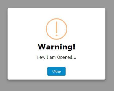
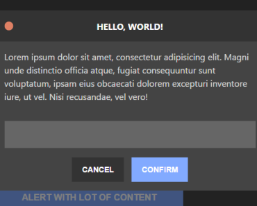
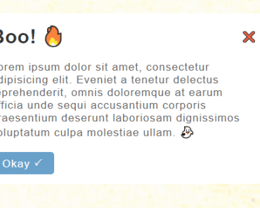
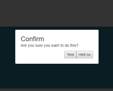
confirm and alert are shorthand methods that call notify with some predefined data to cover most usecases. Use these methods to show either a notification with Ok/Cancel buttons or just a single Ok-button. Both accept roughly the same parameters object:
this.$confirm({ title: 'Warning!', // default is either 'Confirm' or 'Alert' message: 'Please confirm that you have read this.', confirm: 'Sure man', // default is 'Ok' cancel: 'No way', // default is 'Cancel', not used for $alert }).then(result => { // result is true/false when using $confirm, and not set for $alert });Both methods can also be called with a string as argument, which is the same as using an object with only the message property set. So these two are equal:
this.$confirm('Are you sure?'); this.$confirm({message: 'Are you sure?'});When using confirm or alert, all confirm buttons will have the css-class confirm and all cancel buttons cancel.
styling
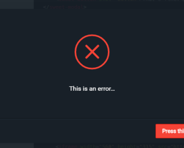
The default component has some basic styling to overlay the content and show the message. For your own project you might want to use custom styling for the notification itself. There are some basic styles and simple classes which you can override easily. A small example when using CSS Modules (with SCSS) in your Vue project.
<notivuecation :class="$style.notification" /> :local { .notification { background: rgba(#000, 0.3); :global { .notivuecation-content { background: #000; color: #fff; } } } }Which would make the notification mask lighter, the content background black and the content contrasting white.
custom component
If you want to use your own component for displaying the notification, just add the componentMixin to your component's mixins. It will add the following properties to the component: title, buttons, message, type, resolve and notification.
import { componentMixin } from 'notivuecation'; Vue.component('custom-component', { mixins: [componentMixin], template: `<div v-if="notification"> <h1>{{title}}</h1> <p>{{message}}</p> <button v-for="button in buttons" :class="button.css" @click="resolve(button.value)" >{{button.label}}</button> </div>`, });Make sure to use v-if="notification" (or v-show) to show or hide the notification.
If your component needs to do specific logic (like validation or animations), the only thing you need to call in the end is this.resolve(someValue).
Vue.component('my-custom-component', { mixins: [componentMixin], methods: { onButtonClick(button) { doAnimations().then(() => { this.resolve(button.value); }); }, } });queueing
While the idea of a modal window is to prevent all interaction until the user has interacted with the modal, it can occur that a notification is opened while there is already one visible.
What happens is that every new notification is simply added to the end of a queue. When closing a notification and there are more waiting, the next one will simply show up until the queue is empty.
events
If your application needs to react to notifications, you can listen to the show and hide events:
import { getEventBus, events } from 'notivuecation'; getEventBus().$on(events.SHOW_NOTIFICATION, () => {}); getEventBus().$on(events.HIDE_NOTIFICATION, () => {}); options
When initializing the plugin, you can supply an object as second argument to set some options.
Vue.use(notivuecation, { someOption: 'someValue', });The available options are:
addMethodsToVue: Whether thenotify,alertandconfirmmethods should be added to the Vue instance. Default:true.componentName: Name of the default component. Default:'notivuecation'. This defines the element name you should use for the component:<notivuecation />getButtonForEscape: Can make the escape-key close a notification in certain cases. A function should be set (which receives the notification-data as argument) that returns the button that will be used when pressing the escape key. The default will make the key work in two cases: the cancel button for aconfirmcall, or the single button when there is only one. If you don't want the escape key to do anything, you can set the property to null.