vue-modaltor
Changelog
All notable changes to this project will be documented in this file.
vue modal component for vuejs and i hope it be useful for everyone ...
you can see example usages here Demo or
see

Features
- no need to handle modal's height manually it extends as the content of modal increases .
- manage modal's size on diffrent dimenstions with one single attribute see responsive
- scrollable modal, modal will get scroll if conntent is more than current view page height see close-scroll
- modals has multiple parent animations parent-animation
- edit icon close svg or icon font parent-animation
- hide icon close parent-animation
Installation
npm install vue-modaltor --save yarn add vue-modaltor then you can import modaltor like this ...
import Vue from "vue"; import VueModalTor from "vue-modaltor"; Vue.use(VueModalTor);if you are not using any build system you can include it in your project
<script src="/vue-modaltor/dist/vue-modaltor.js"></script>Example
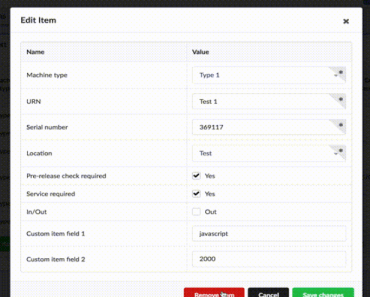
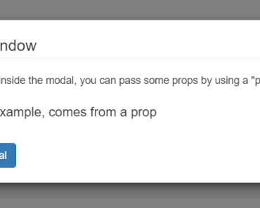
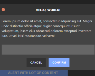
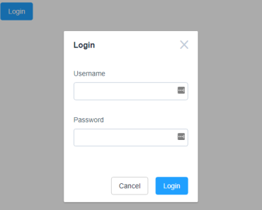
<vue-modaltor :visible="open" @hide="hideModal"> <template slot="close-icon"> <svg version="1.1" xmlns="http://www.w3.org/2000/svg" viewBox="0 0 40 40" width="20" height="20" xml:space="preserve" > <path class="st0" fill="#41b883" d="M8.7,7.6c-0.4-0.4-1-0.4-1.4,0C6.9,8,6.9,8.6,7.3,9l11,11l-11,11c-0.4,0.4-0.4,1,0,1.4c0.4,0.4,1,0.4,1.4,0 l11-11l11,11c0.4,0.4,1,0.4,1.4,0c0.4-0.4,0.4-1,0-1.4l-11-11L32,9c0.4-0.4,0.4-1,0-1.4c-0.4-0.4-1-0.4-1.4,0l-11,11L8.7,7.6z" /> </svg> </template> <p> Lorem ipsum dolor sit amet, consectetur adipisicing elit, sed do eiusmod tempor incididunt ut labore et dolore magna aliqua. Ut enim ad minim veniam, quis nostrud exercitation ullamco laboris nisi ut aliquip ex ea commodo consequat. Duis aute irure dolor in reprehenderit in voluptate velit esse cillum dolore eu fugiat nulla pariatur. Excepteur sint occaecat cupidatat non proident, sunt in culpa qui officia deserunt mollit anim id est laborum. </p> </vue-modaltor> <button @click="open=true">modal-basic</button>var app = new Vue({ el: "#app", data: { open: false }, methods: { hideModal() { this.open = false; } } });Props config
props: { // this is for toggle show modal // :visible:false visible: { type: Boolean, required: false, default: false }, // this is for responsive modal and // :resize-width='{1200:"50%",992:"70%",768:"90%"}' resizeWidth:{ type:Object, }, // this is for anaimating modal // :animation-panel='modal-slide-right' // :animation-panel='modal-slide-left' // :animation-panel='modal-slide-top' // :animation-panel='modal-slide-bottom' animationPanel:{ type: String, required: false, default: 'modal-fade' }, // this is for anaimating animationParent modal // :animation-parent='modal-scale' animationParent:{ type: String, required: false, default: 'modal-fade' }, // this is for bgcolor overlay bgOverlay:{ type: String, required: false, default: '#fff' }, // this is for bgcolor panel bgPanel:{ type: String, required: false, default: '#fff' }, //set default width modal // :default-width="'50%'" // :default-width="'495px'" // :default-width="'40em'" defaultWidth:{ type: String, required: false, default: '50%' }, // this is option for close scroll body when show modal // :close-scroll="false" // if true close scroll body closeScroll:{ type: Boolean, required: false, default: true }, // this is option for showing/hiding close button on modal // :show-close-button="false" // if true close button will show showCloseButton:{ type: Boolean, required: false, default: true } }, TODO List
- multiple animations on diffrent device size
- 3D Animations